(It is interesting and saddening to see how years of UI research just went down the drain after Apple "resurrection". In my impression Apple was the first that started to lose their carefully collected UI expertise and replace it something that was original for the time, but that was all. E.g. I remember the very first ads after Jobs' comeback. They still had the beige Macintoshes, but their ads changed. Instead of a typical computer ad that showed a computer with a turned on screen and some desktop picture Apple's ads pictured turned off computers photographed from unusual angles or in unusual positions, like keyboard standing on its side leaning on the box, mouse hanging on its wire and so on. It was different, indeed, it stood out. Thing is, to always strive for that is harmful. Especially for user interface, where the motto is: do not make it original, make it right.)
One of first programs that put pictograms in menus was Microsoft Word. But the way Word did it was entirely different from what we do now. Microsoft Word had toolbars and their buttons, of course, were mostly pictorial. Toolbars could be turned on and off and users could assemble their own toolbars. Microsoft Word's menus displayed pictograms only for the commands that could also be called with currently visible toolbars. Have a toolbar visible? Its pictograms will appear in the menu. Closed that toolbar? The pictograms disappeared. The pictogram did not merely decorate a command, but also provided a hint that the user could call the command with a toolbar. This is informational. This is the right use.
That's the reason why pictographic additions are so useful. Its the reason why we distinguish different kinds of UI elements at all, because colour and graphics are incredibly powerful shortcuts for parsing information
It's also the reason why some menu entries get icons and others don't.
If the icon doesn't convey information by itself (like a "move to top" icon example), then it's there as a visual anchor - and you don't really need to have 4 of the same "delete" icon if a menu has 4 different "delete" options next to each other. Just one is enough of an anchor to draw your attention to the "delete group", and having just one keeps the visual noise low.
Likewise, you don't need visual anchors for every single option - just the commonly used ones, the ones you expect people to be looking for, and the ones that already have established pictography.
Even though floppy disks were a bit before my time and I rarely ever used them, seeing them be called ancient disk makes me wanna find the nearest coffin and just go lie down. :D
No you can’t.
If your software is in some language and you are looking at docs or a videotutorial or something in another language, it's often hard to translate specific terms, Icons don't change language. They also help if you have to do something in another machine that uses a different language for some reason.
If the text on the button is always the same, then as in Shannon's model, it conveys no information, and thus is decorative. Discard it. Just use the position.
Or keep it since decoration makes interfaces feel more alive.
Not everything NEEDS to be useful
Then again it was named Monty Python's Complete Waste of Time, so maybe it's not such a good idea for the default environment of a general-purpose operating system.
[0] https://www.mobygames.com/game/1975/monty-pythons-complete-w...
We all recognise an icon in a menu as a meaningful element. Treating it as a decorative element is wrong and adds mental overhead, as we tend to scan every one of those icons (putting it at the beginning of menu text, i.e., to the left for LTR languages, makes it worse). It is well-known we do tend to scan these icons because that is the reason icons work: repeated exposure creates intuition. If this intuition is not put to use, then all such icons are a waste of our attention.
For example, a bullet in a list: fine (differentiates where each list item starts), window shadow or the 3D effect on window close buttons: fine (meaningful in terms if differentiating areas in the GUI, not pretending to do more); whitespace to set apart one thing more from another thing than from the third thing: fine (if that reflects the relationship between those things).
This is all somewhat simplified.
Purely decorative parts are also possible (and even desirable), but they should be personal. A set of colors chosen by the user, a background texture, a picture that the user keeps on the desktop and so on.
... until the not-useful becomes distracting and/or causes information overload.
In the case of Apple, I've been a user of the Accessibility menu ever since they introduced the stupid parallax wiggling of the icons. Right now i use: reduce motion, bold text and reduce transparency. Because I want to see what I'm looking for when using the phone and not squint through pointless effects.
No, that's only one of their purposes. Another one is faster visual parsing of shape recognition instead of reading even if space is not an issue (just like with all of these menus, they waste so much space on padding they could fit command names 3 more times)
In the first example, when I want to find the option to add or delete a row in this massive menu, the icons clearly convey the purpose. I can instantly filter a huge list of possibilities down to a few relevant entries.
Agreed. It just doesn’t sell.
So icons make power users faster. It's not "clutter". Your argument about "don't use it for aesthetics" is ironic because you're making it because of aesthetics. For me it's about user speed.
I say this because I agree, the pictogram icon is much easier for me to find. I also like having a word there though, if they change the picture on me. If its not color, almost all bets are off, since I dont even look at the icon, just look for a color and go for it if thats available.
Using the label-less example in the article with the 10x10 monochrome icons I doubt many other people feel the same.
I don't mind the size, but lack of colors is annoying. If common icons where color-coded, like green to save, blue to download/print/export, red to delete, UI would be friendlier to use.
As a colour-blind person, this sounds like accessibility hell. Don't forget your UIs still need to be friendly in what amounts to monochrome
Making everything monochrome is surly not more accessible, because there sure are people who find it easier to distinguish by color than shape.
Because pretty much as soon as one starts colour coding items in the UI, people start using the specific colours to encode meaning. If your UI requires someone to discern between the red and green versions of the same icon in your UI twice, congrats, you just lost 8% of male users!
> Would a pedestrian traffic light be better if it wasn't color coded?
If they weren't colour-coded, they would have to be differentiated by shape, and then when I traveled to Canada, I wouldn't have to guess whether the fancy horizontal traffic lights are ordered left-to-right or right-to-left
> Would a white car be preferable to a red car?
Even fully colour-sighted folks can't see red very well at night, so yes, white car > red car
> If your UI requires someone to discern between the red and green versions of the same icon
Color coding has never been about this, only when implemented wrongly. It is just an extra differentiator for GUI elements which are already differentiated by icon shape and text labels.
>> I'm much faster
Words create better beginners than icons alone.
UI/UX can evolve as the baseline digital literacy of users evolves usually very slowly, to remain maximally inclusive.
One thing that I'd consider is start with text labels, and the more they are used, start showing an icon. Just hold a left bar for them to start appearing so that learning can happen.
The screenshot where there was only some menu items with icons feels more memorable for that reason.
Steve Jobs was forcing design discipline across Apple products with furious determination because he actually cared.
That's how it ends, everything becomes an unmanageable, constantly changing mess because every manager likes something else and big firms are rotating their personnel every 3 years.
Because the above products of the same company are losing cohesion and consistency even if they are in the same product line which results in bad UX.
Design departments are not disciplined enough...
Also, I disagree with:
> This posture lends itself to a practice where designers have an attitude of “I need an icon to fill up this space”
Sure, that does technically happen, but is in no way preventative or mutually exclusive with the follow on thought:
> Does ... the cognitive load of parsing and understanding it, help or hurt how someone would use this menu system?
That still happens, because if they mismatch an icon with text, that can result in far worse cognitive load/misunderstanding than if no icon was present at all. This becomes readily apparent in his follow on thought experiment where you show someone a menu with icons+text, but "censor" the text. Icons+text is also superior to [occasionally icons]+text in the same thought experiment. From my perspective, the author just argued against their own preference there.
I'd argue that the thought process behind determining an appropriate icon is even more important and relevant when being consistent and enforcing icon+text everywhere, not diminished. It also has the broadest possible appeal (to the visual/graphically focused, to the literary focused, to those who either may not speak the language, and/or to those who are viewing the menu with a condensed/restrictive viewport that doesn't have room for the full text). Now, if the argument is predicated on "We aren't willing to pay a designer for this" then yeah, they have a point. Except they used Apple as an example so, doubt that was the premise.
We did extensive experimentation, and later user studies to find out that there are roughly three classes of people:
1) Those that use interface items with text 2) Those that use interface items with icons 3) Those that use interface items with both text and icons.
I forget details on the user research, but the mental model I walked away with this that these items increase "legibility" for people, and by leaving either off, you make that element harder to use.
If you want an interface that is truly usable, you should strive to use both wherever possible, and ideally when not, try to save in ways that reduce the mental load less (e.g. grouping interface by theme, and cutting elements from only some of the elements in that theme, to so that some of the extra "legibility" carries over from other elements in the group)
This is the bane of my existence since icons aren't standardized* and the vast majority of people suck at designing intuitive ones. (*there are ISO standard symbols but most designers are too "good" to use them)
It's amazing that even in a space like this, of ostensibly highly analytical folks, people still get caught up arguing over things that can be settled immediately with just a little evidence.
The first time I noticed that is the time I needed to operate a Finnish Windows machine and I could get it working pretty good by sheer memory
The 20% statistic is about people who have great trouble reading and comprehending simple sentences, not discerning individual words. It's tragic and debilitating, but such people could muddle through a simple interface with textual labels. A truly illiterate person couldn't.
(Not the literacy stat but the fact that illiterate people "figure out how to use tech by memorizing the icons and locations of buttons").
Further, if you have difficulty reading, it's easier to parse the meaning of an abstract symbol, so you'd use that instead of a textual label when available. (I say this as someone who is a really slow reader. I use icons when I can)
Without icons, you have to read many or most of the words.
Without text labels, icons are difficult or even impossible to interpret.
But with both icons and text, you have quick visual search and filtering that involves the whole brain.
It then got copied into Visual Studio, where making all of the thousands of things you could do and put into custom toolbars or menus have visually meaningful icons was clearly an impossible task, but it didn’t stop Microsoft trying.
I assume Adobe, with their toolbar-centric application suite, participated in the same UI cycle.
By the time of Office 2007 Microsoft were backing off the completely customizable toolbar model with their new ‘Ribbon’ model, which was icon-heavy, but much more deliberately so.
…ripped out when the Office Ribbon was introduced in 2007; the now-limited customisation is now considered an improvement because of the IT support problems caused by users messing up their own toolbars.
I mean, yes; but that’s what Group Policy is for! And the removal of the icon editor is just being downright mean to bored school kids.
I realize it may be generational and privilege based, as I can read English and have a good deal of computer literacy. To my eyes the icon trend of flat, minimal icons paradoxically ask a user to possess a higher degree of computer fluency to successfully parse the artistic intent of the icon and map it to its function. When these icons don’t accurately convey their function (the Paste icon is a blank clipboard. What’s that do?) and when the design language is inconsistent within the same application and OS (do cogs mean Preferences? Services? you’re building a very confusing world for most of the user group types you claim to be helping.
The function of the icon is to have distinct shape so you are able to visually distinguish menu items quickly in future (more you use the app).
There are other factors like consistent placement that can help. This icon approach is good especially if you have common shared menu items over the OS or they change their placement throughout the app.
And there’s a consistent metaphor: for example the web browser is represented by a globe for the world wide web. So the “hyperlink” function is a globe with a chain. This the “preview as web page” is a globe with a magnifying glass (whereas the print preview command is a sheet of paper with a magnifying glass.).
This icon language hints at function through its form and helps serve as a cue, a reminder, or a visual representation of its function.
And it all worked on 640x480 256 color screens. They are thoughtful and useful. These plain flat uninformative icons are just rude.
I assume you were very familiar with Office 97. I can tell you people born in 97 are probably not. High chance they might not like and understand the icons because they aren't familiar with them.
It's like when everybody wants to design logo as unforgettable as Nike. But in reality anything people see 20 times a day people will remember.
In theory, yes. But if you look at the examples in the article, the shapes are basically all similarly-sized circles.
In the Apple example, "System Settings" is circle (A gear with barely discernible teeth.) "Recent Items" is a circle (a clock.) "Force Quit" is a circle (a rounded! octagon.) "Sleep" is...a circle with a line through the bottom third. "Log Out" is...a human silhouette in a circle! (Why?)
It doesn't matter what the icon is as long as the icons are distinct, and today's icons aren't.
I wrote it in a different comment elsewhere: this is exactly why you don't want icons on every menu item. When everything tries to be stand out, nothing does. It's much easier to distinguish groups and "it's the third item below the icon" than "out of these identical looking icons one of them points to a menu item that does what I want".
What i was mainly saying is that the icon does not have to describe the label for it to be effective. That doesn't mean that usage/quality of the icon suddenly doesn't matter.
I wouldn't be surprised if there's computer users out there that wouldn't recognise the "save icon".
RIP in peace
I recently had a discussion about replacing the "save icon" (IE. the old floppy disk icon) for an icon with an arrow pointing down, for a button that saves (don't download!) a custom query of the user in the system. Perhaps it could be replaced with another icon, but not by someone that everyone would think is "Download".
One of the things I'm seeing in some of these examples is icons with the same silhouette doing nothing or less than nothing for scannability. This is the same problem AWS has. Their dashboard is just noise, because the icons are neither visually distinct nor descriptive of the project.
I've also seen some of this same problem with card and board games as well. You can see that some designers care about accessibility. This type has both a distinct color AND shape so colorblind people can see it, all the icons are big enough that people can make them out sitting upside down in front of the person across the table from them, even if they're over 40.
His first example, Google Sheets, does well by this metric IMO, but the next few are kinda bad.
No silhouettes. If your icon isn't a squircle, it will be shrunk to fit inside a default shape. The penalty box.
https://lapcatsoftware.com/articles/2025/6/2.html
The loss of icon silhouettes is a big step down in usability. Erases decades of design guidelines.
https://pxlnv.com/blog/roundrect-dictator/
Frankly it's senseless.
https://www.flarup.email/p/through-the-liquid-glass
Insane but still working legacy workaround:
https://simonbs.dev/posts/how-to-bring-back-oddly-shaped-app...
…
macOS isn't fun anymore.
Finally we lost the background and legibility.
Pepe prayge now than Alan is out that things will improve.
We need to get back to Dieter Rams 10 principles for good design.
It was always closed source. That hasn’t changed. That should be a hint.
I have this issue with Google apps on my phone. Once they decided that all icons should have the same four blurred colors with low contrast, you just can't tell which app you're looking at without the text label below. And I'm not visually impaired.
This is something visual artists usually learn and are good at and it's not primarily for accessibility, it's simply good design. Accessibility improves as a side effect.
However it is another language to learn and as such needs standardisation to be useful. If I go to another country and start driving the road symbols mean something else.
Its the same in the GUI. The symbols should allow me to move quicker around the interface, even if I've not used the software before.
The issues I see are each OS/App can, and does, use their own symbols for the same functionality (sure there are some universals like cut/copy/paste). And like the article these symbols now appear to be getting used as bullet points, so each item needs it's bullet points.
In my opinion, and like the greyed out keyboard shortcuts over to the right of some menu items, these symbols should only be there when they denote actions that can be done by clicking a button. They should be imparting the mouse equivalent or those keyboard shortcuts, a way to navigate and do actions; not as some decoration. Imparting the language of the GUI.
So yeah I agree with the article. Function over design aesthetic every time.
A lot of countries seem to standardise on similar signs. I have not had a difficulty driving in different countries and visiting more.
Cars are even more standardised. The controls vary very little.
There is a definitely problem with GUIs and the problem seems to be aesthetics and branding trump function.
In many AI chatbots ..i see the "paste" icon used for the function of "copy"
So, with the greatest of respect, I don't believe you. It does not take you "a couple more milliseconds to scan", since a couple of milliseconds is well below human perceptible thresholds for almost every sense.
There is no accessibility improvement here — you just like the consistency.
Challenge accepted. If a user (esp. one whose cognition generally prefers visual media) uses a menu item frequently, they can remember its icon and that makes it easier to find in the future.
(Doesn't apply to me personally though because I'll instead remember the underlined letter and press it next time. My pet peeve in menus is not icons, but missing or clashing hotkeys.)
If you're going to use many icons, then they need to be visually distinctive. That means ditching the flat designs, and embracing colour again.
It is the reason for removing colors and shadings from all icons.
I would argue that menu icons are more useful than dark mode in several situations.
They changed it recently for attachment to look like a paperclip on a document which is much better. But before, I almost always clicked on one when I wanted the other (or hovered my mouse over it for longer than I'd care to admit).
He complained - Why do they have these symbols, why can't they they just write Open and Close?
I've wondered about this every since - is it an American thing to have an expectation to have text everywhere? I have never heard anyone complain about those symbols before or since!
It takes noticeable processing time to know which is which. Especially with a button that you need to hit as quickly as possible to hold the door for someone, those icons should be widely different from one another. I can't count the number of times I've meant to hit the open button to hold the elevator for someone only to accidentally hit the close button just in time to make eye contact with the person we've left behind.
Some of the Apple ones really are ridiculous, like the ones around window management and copy/pasting. Even blown up to fullscreen size, you wouldn't have a chance of guessing what they do. But at display size, they are just plain illegible. Having them there is just a visual distraction.
Icons aren't large enough to then also distinguish between deleting a row or column or table. That's what the label is for.
It's not laziness, it's good design.
Same with "add row above/below" or the completely distinct action Create Filter/Filter by cell value.
They can be trivially improved with about 1 millisecond of conscious thought. Especially given the fact that these actions have been around in office software for literal decades, and more often than not with their own distinct icons.
I vaguely recall seeing some product with toolbar icons that attempted to depict a cell as part of a row, or column, with an "x" in the corner to indicate delete. I could never decipher them. It was all too small. Plus the "x" looked just like the "+" at a glance since it was so small. Even though every icon was distinct and meaningful, each icon was also ultimately a complicated jumble that took longer to decipher than just reading the label next to it.
So when you say "They can be trivially improved with about 1 millisecond of conscious thought," I completely disagree. It's actually really hard and there's a good reason they choose not to. And maybe don't be so insulting?
I can also be helpful for non-English (or non-language of your choice) when you haven't had time to localize or don't have perfect localization. Let's assume the user has Japanese as their second language. It's much easier to find the option you want with icons than without
https://www.youtube.com/watch?v=z7kXUbwngB4
Somewhere in there, I think he does have a point.
Referring to the examples provided in the article, I'd suggest that the impact on the Safari app menu should be minimal (so these are non-functional icons), while the impact on the Move & Resize submenu would be devastating and should result in confusion (so these are essential).
If you can remix with minimal impact, don't do icons. (In the case of the app menu, these are apparently meant to add structure, which is already established by other means like menu separators, so you have now two – or, including indentation, three – systems of structure and visual hierarchy that are fighting each other.)
Moreover, if you put icons everywhere, you're forgoing the facility to convey state, like active state checkmarks, since these, instead of standing out and signalling change, would be just drowned in the decorative clutter. (So what's next? Add color and/or animation, like swirling checkmarks?) And this, BTW, is also why the icons in the Move & Resize menu are effective: they are conveying and illustrating state (in terms of a preview), while most of the other menu icons (mostly referring to activities) do not. So, as a rule of thumb: icons referring to state may be useful and even desirable, while icons referring to activities are probably better left out. (And, if you feel the need for something like bullet points to mark your most important menu items, there's probably a deeper problem with your menu structure.)
I think this is a useful pattern, but I'm not convinced that having specific distinct icons for menu items to highlight them as important is useful. Presentation order and/or simply a consistent difference in presentation for the highlighted items makes more sense.
Some things are only occasionally what you are looking for, and making them require a full scan of every menu entry is fine.
The thoughtful inclusion and exclusion of icons in menu items builds hierarchy. When every item is special, none are. You've lost the ability to differentiate.
Icons everywhere is a hallmark to me of "webby" UI.
There are several reasons I made the switch, but the primary reason is that it makes it easier to build a kind of muscle memory for navigating and performing particular actions. In essence, the text is there for new users and the icons are there for experienced users.
Like I open the app drawer on my Android phone and there are like 16 different icons, all different Google apps, all are round and various abstract configurations of the same exact four colors.
Feels like we're falling into the same trap that Gothic handwriting did with the minims. Yeah it looks very pretty but it's almost completely illegible since we've taken away all the things that help set icons apart. https://en.wikipedia.org/wiki/Minim_(palaeography)#/media/Fi...
Here are some icons I screenshotted off a website. I challenge you to tell me what they mean
http://www.marginalia.nu/junk/icons.png
http://www.marginalia.nu/junk/icons2.png
Hint: „ǝsıɹdɹǝʇuǝ ʎɹʇ„ sı dn oʇ ƃuıʇuıod ʍoɹɹɐ ǝɥʇ puɐ „sǝsıɹdɹǝʇuǝ„ sı ǝqoʃƃ ǝɥ⊥
The recent Android releases where everything is a squircle really sucks too.
I like icons (and colors, but those are still mostly missing) to quickly find a frequent action. If the menu is always the same you can learn the position, but with dynamic entries it's way more difficult.
https://www.youtube.com/watch?v=8Gv0H-vPoDc
https://news.ycombinator.com/item?id=22820457
https://web.archive.org/web/20150406073147/https://jarretthe...
I tend to assume that anyone who objects to “I could care less” has never lived in the New York City area. See the mention of Yiddish in the above link. But for some who object to it, that’s the issue: it’s a shibboleth of a culture they’re not part of.
I loved MrHeather's comment (who worked with Weird Al to animate Word Crimes):
https://news.ycombinator.com/item?id=22823632
MrHeather on April 9, 2020 | parent | next [–]
When I first met with Al about this project, I was quick to point out that linguists would disagree with about a third of the "advice" he's giving out. His immediate reply was "WELL THEY'RE WRONG"--really loudly in the "Weird Al" character voice.
In my mind the joke is that the song's narrator is a know-it-all character that shouldn't be taken entirely seriously. But on the other hand, a lot of educators have contacted me to tell me they use the song as a learning tool.
Have you ever traveled outside the US? I don't just mean to CS conferences, I mean really traveling.
The objections to it, though, fall broadly into two categories: ignorance, and bigotry. The former becomes the latter when someone refuses to recognize their ignorance, and doubles down on it.
It also makes me think about the classic Save icon: the floppy disk. That was certainly descriptive at its origination, but is it still so? In the age of natively storing documents in the cloud or copying to a USB drive, it seems like we might want more than one save menu or an appropriate icon for where the file resides on the single Save menu item. Microsoft Office has the Autosave toggle switch that serves some of this purpose, but it could definitely be better.
I also think about the Zune UI where sometimes a menu consisted only of the icons. How do you enable unique menu designs like Zune without icons for everything?
It originated from when floppy disks were still widely used, yes.
Nowadays, people associate the icon of a floppy disk more with "saving locally" than the floppy itself. Changing it will just cause confusion.
Another example is how the icon for Database was chosen to resemble an old-timey stack of hard drive platters. Everyone knows what it means, even if your database isn't stored on HDDs, so there is no need to change it.
Even the telephone icon on your phone resembles an old-fashioned telephone horn, despite these getting less and less common.
It's a symbol, it could be a 7-pointed star and people would associate it with Save.
Even when you knew what a floppy disk was, why would you push that button? You haven't seen a floppy in years, don't have a floppy drive and don't want to create a floppy disk.
This is a pet peeve of mine and it feels like some cargo cult within the UI design "field". There's nothing wrong with the floppy icon. It's perfectly fine. Even if someone doesn't get it, the consistency of its use across apps is enough for its meaning to be clear, which is what really matters.
But after reading the article I find myself asking if that's really true? I'm doubting it now. Certainly, the Floppy disk icon is clear to computer users who experienced at least a few years of the 90's or early 2000's. That's becoming less and less a percentage of computer users. For most users, that floppy disk has receded into being just a nonrepresentative shape associated to save.
I think it's that the blog post convinced me to reject nonrepresentative shapes as icons. You can't look at the extremely illustrative menu filled with icons that clearly describe window management actions or text formatting actions - where the icon itself conveys clearly, if abstractly, exactly how reality will look after you take the action - and tell me that a menu filled with random nonillustrative shapes has even a similar experience. I can't shake the idea that the menu icon needs to be more than just a logo or branding - it needs to be self-explaining.
The floppy disk did exactly the above when floppy disks were where the data was actually saved. But in 2025, we have to accept that it no longer illustrates anything. Today its just a nonrepresentative shape.
Every operator has:
Identifier: mesh.extrude_region_move
Label: human-readable string, like "Extrude Region"
Description: tooltip text, like "Extrude selected vertices, edges or faces along their normals"
Icon: optional enum from Blender’s built-in icon set, like ICON = 'MESH_EXTRUDE_REGION'
RNA properties: parameters / flags like direction, axis, booleans
Poll function: whether it is available in current context, like only enabled when a mesh is in edit mode
Execution logic: the actual command code
Blender’s designers generally follow these principles:
Operators always have labels. Icons are optional. Most menu items use no icon by default. Only well-established visual operations (cursor, transform tools, viewport shading modes, etc.) get icons.
Unlike macOS Tahoe’s vague "everything gets an icon" ideology, Blender uses icons when they convey meaning, but not when they’re decorative filler.
A rarely used UI needs to be easy to navigate. Remove clutter, place the often used feature front and center and the rarely used features behind multiple navigation steps. The user primarily _navigates_ this UI, they don't _memorize_ it.
A constantly used UI such as an application that a professional uses from 9 to 5 five days a week (An IDE, a Cad Program, a video editing thing) is a completely different beast. The speed of accessing a feature is more important than the discoverability. The user internalizes the UI and the UI needs to aid the user in doing so. Icons in menus means the user eventually doesn't need to read the text label.
I actually use Zen browser and thankfully someone made a "mod" to bring them back: https://github.com/SivanTechDev/zen-themes/tree/main/BringBa...
Maybe it's just me, but the icons are NOT noise or a distraction, they actually make it quicker and easier for me to find what I want. Yes, I can read the words, but sometimes things blend together, such as "unload tab" and "unpin tab". The icons make it easier to tell them apart. Also, again maybe just me, but I remember the icon for the action I want and it's much quicker for me to scan the menu to find the icon than to have to read every piece of text.
Anyway, lots of people don't like the removal of icons, me being one of them, and I think the icons are nice and should stay in the menus.
Our customers hated it, and it was quickly taken behind the woodshed, and buried in a shallow grave in the desert.
Icons are really difficult.
Designing icons is really hard. They need to be immediately recognizable, when very small, and also, retain coherence, when made very large. They need to be recognizable, when displayed as transparent, monochrome templates, and they need to be culturally relevant.
In some cases, there may be legal ramifications for icon choices. For example, branding. I remember someone complaining about Apple rejecting their app submission, because they changed the tint of the Sign in with Apple button to match their color theme.
Selecting from a set (like SF Symbols) takes a lot of thought. I have to be careful not to use one that is already a common icon for something other than the feature I’m attaching it to. I often see apps that make weird choices.
One of the apps I wrote, uses a “long press to learn more” feature. If you long-press on almost any item in a screen, you get a haptic, and a small popover appears, displaying the accessibility label and hint. Works nicely. Ensures that I have good accessibility support, doesn’t interfere with other gestures, and also forces me to be thoughtful about accessibility text.
Kind of a pain to implement and maintain, though. I don’t do it in most of my apps.
The problem is that you only have so many ways to draw the shapes and at your average resolution it ends up looking like "this group of squares with squiggles in them" and "this other group of circles with squiggles in them".
In some cases like a power menu or window snapping menu (like in the Mac Rectangle app) they can be insanely useful, though maybe those are easy to do because the count is kept to a reasonable amount. Maybe there are exceptions where the same icon can be used for multiple items, like in the insert/delete action groupings, to make the group distinguishable from the other options.
But in general, it just seems like the menus have perhaps too many items in them.
I think that to a certain superficial level of analysis, a matched set of icons looks "complete" and indeed impressive. Designers and implementers of the interface can fool themselves through customary use that they're creating a language of ideograms. Their users, who interact with their product only a few hours per week, only perceive visual noise and clutter.
At least based on the trajectory of macOS's design decline.
For those who might not be aware, a long-standing design pattern on macOS is for menu item labels to have a "..." at the end when a click will take you somewhere, rather than taking immediate action. So you can click more confidently.
It's an example of the subtle quality and attention to detail you get with native UI, that gets lost when you build a web app and re-invent the wheel.
Most "web" UIs don't include this detail, as evidences by the screenshots in the article.
Yesterday I booted my 350MHz Power Mac G4 for the first time in 13 years. I booted into Mac OS 9.2.2. I remember the Apple menu having icons for every item. Once again, though, every icon was in color.
It's not really visual "clutter", the shadows / pseudo-3d elements help the brain distinguish between different types of elements, providing contextual information.
rant:
But in the end, user interfaces are mostly “dead” anyway. No more structure, no more colors, no more icons. Everything is a flat sea of labels and boxes (or sometimes even just lines) floating(!) around. And no two user interfaces use the same style, even from the same vendor.
/rant
In the top ribbon menu there are icons only. And not any familiar ones at all.
Icons, text representations of the action behind the menu items…
It's a designer hell in which you have no chance to please everyone. Like someone using a vim editor for 20 years... some people are using icons, other want text and the third group wants combination of both.
These are technical programs for technical work performed by trained technical people. They have different workflows, goals, mindsets and ways of reasoning about things than developers do, and that’s fine.
A lot of shade gets thrown at nontechnical software users for not grasping things developers find intuitive. Yet, when many of those same people throwing that shade encounter a technical environment they can’t grasp immediately, it’s the interface's fault.
Globally, I had a pleasant time reading this article which was way too dedicated to something that is almost invisible in its current state (ie: I don't notice those icons and surely think they aren't _that_ helpful for any type of user unless used in a rare way).
The point is, if every item in a long menu has an icon, then they typically can’t all be very distinguishable and recognizable, and blur together visually. It creates more visual noise, and less structure, than if only some items had an icon.
As for finding groups quickly, for example it doesn’t make sense give all of “Save”, “Save as…”, “Save all” an icon, but giving the first one an icon helps to recognize the “Save” group of operations.
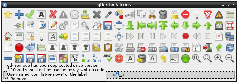
First thing I found: https://raw.githubusercontent.com/step-/gtk-stock-icons2/ref... See the last row.
Here is what I would think is a fairly good use of icons: https://learn.microsoft.com/en-us/windows/win32/uxguide/imag... The icons are positioned such that they introduce groups of menu items, and they create a visual structure that one learns to recognize with repeated use.
At work we do sometimes design custom icons for specific things, but that's very rare and relatively costly. Most developers on our team don't have that capability, and we are left trawling through Google's admittedly-large icon library to find something that seems plausible.
I believe different people literally see the world different and there should be an option to remove icons if they prefer this way. It used to be this option at least in some programs.
But of course this person doesn't like it, and it wants everyone to follow his taste.
> In so many of these cases, I honestly can’t intuit why some menus have icons and others do not.
I understood this the first time I had to explain to a non-technical user how to get to a certain menu item. Fortunately whoever made the Wordpress admin dashboard nailed the design so icons are sufficiently visually distinct.
You can only have so many of them though, so you use icons to draw attention to the most important features from a non-power user's perspective.
Of course not everyone places them with sufficient care and I think that's what's lacking at Apple, but it's not like they're there purely for decoration.
It’s much easier to recognize the funnel icon to make a filter, than to skim all that text.
The author doesn't ask for _no_ icons at all. So I really don't get this critique.
Intentionally omitting some icons is a really powerful tool to draw attention to the actions that the user wants to do most of the time. I think that pattern went away in some places because it looks more consistent (that doesn't mean that usability is better) and some designers have some kind of OCD. At least that's what I have experienced in that exact case.
Consider providing menu item icons for:
- The most commonly used menu items.
- Menu items whose icon is standard and well known.
- Menu items whose icon well illustrates what the command does.
If you use icons, don't feel obligated to provide them for all menu items. Cryptic icons aren't helpful, create visual clutter, and prevent users from focusing on the important menu items.
From: https://learn.microsoft.com/en-us/windows/win32/uxguide/cmd-...
Apparently other people notice the hot girl and the puppy and the fried chicken sandwich first. Meanwhile, I've already read all the fine print.
No idea why I'm like this.
It seems though that a combination of samey-sameness (greyscale, shape, etc...) and the constant bombarding of attention-grabbing imagery (emoji, gif, ads...) has desensitised me from visual cues and I zero in on text instead now.
1. Remove all icons from menus.
2. Make mouse-over do nothing - I should be able to move the mouse anywhere on the screen, and nothing should change colour/pop out etc.
Toolbars could be customized. You could select any item from any menu and place it on toolbar for quick access. So unique icons for every menu option were useful.
Even now i think MS office has a quick access toolbar on top that can be customized that way. Tad limited.
In terms of accessibility, too, icons are a win. Colors on top of this also help with that.
Showing a check mark for if something is active can make sense, and other status indicators, but then it should also indicate if the status is currently absent. (On Windows, some menu items can have a check mark, but if there isn't, it does not tell you if it is one that could have a check mark or not. Indicating this could be useful.)
Another thing that the menus do have, and which they should have because it is good to have, is specifying which keys are used to operate those commands. Windows also has one underlined letter so that you can select it when the menu is displayed, which can also be useful (especially since not all commands have keys assigned normally, so using the keys to activate the menus can be used in this case).
My own programs with menus do not use icons (and do not usually use icons outside of menus either).
I think the idea was the most common ones had icons which matched the toolbar button so you could start with the slower-but-more-comprehensive menus and then notice the quicker toolbar equivalent through their matching icons.
Welcome to Apple of the last decade. As an avid user of many Apple products, this has been extremely frustrating to experience. Hopefully Alan Dye's departure will see at least partial return to obeying Apple's own HIG.
The author is criticising 2025 macOS for not following the 2005 HIG. This is not reasonable criticism, the HIG are not set in stone and they have changed many times in the past 20 years.
> Don’t display an icon if you can’t find one that clearly represents the menu item
> Not all menu items need an icon. Be careful when adding icons for custom menu items to avoid confusion with other existing actions, and don’t add icons just for the sake of ornamentation.
> Instead of adding individual icons for each action, or reusing the same icon for all of them, establish a common theme with the symbol for the first item and rely on the menu item text to keep the remaining items distinct
2014:
"Avoid displaying an icon for every menu item. If you include icons in your menus, include them only for menu items for which they add significant value. A menu that includes too many icons (or poorly designed ones) can appear cluttered and be hard to read."
Newer versions seem to have escaped being properly archived anywhere, so Apple can gaslight us all into believing the HIG has never changed, that we have always been at war with East Asia, that giving a bad icon to every single menu icon has always been good, and that rule was never arbitrarily changed at the whims of a cardboard box designer and his liquid glarse aesthetics.
It works out though because it does give me ammo when people use these guidelines to thoughtlessly defend poor design as if they are axiomatic rules. For 20+ years having lots of icons in a menu was bad...but now...it's good! Why? I dunno! It just is!
Icons are also very useful if you're trying to use software in a language that you're learning, becoming the common language bridge.
Isn't it obvious? Because compared to "Settings" it is a far less important infrequently used setting.
Only text/Only icons/Only icons (with tooltips)/Some icons with text
There are `ibtool` and `plutil` CLI commands built-in to macOS these days too, but to get some graphical editor, u would need to download 3GB of Xcode and u would invalidate the code signatures, etc...
Plus there is a huge churn in the application versions, so any customizations would need to be applied repeatedly to newer app versions.
Sad, really...
I honestly really like that this has a tell-tale and hope we maintain this convention.
If the author didn't care about their project enough to write the README themselves, I don't usually spend the energy to consider the project at that point.
- the part where the reader is invited to guess what a menu item does based on the icon alone was very interesting
- how come the floppy disk survived as as "save" icon when floppy disk use is not the default save medium ?
- has there been any global study (dis)proving that icons and emojis are truly understood and carry the same meaning everywhere on the planet ?
What will you gain from removing the icons?
> What I find really interesting about this change on Apple’s part is how it seemingly goes against their own previous human interface guidelines (as pointed out to me by Peter Gassner).
> They have an entire section in their 2005 guidelines titled “Using Symbols in Menus”
2005?? Guidelines evolve.
> Use text, not icons, for menu titles. Only menu bar extras use icons to represent menus. See Menu Bar Extras. It’s also not acceptable to use a mixture of text and icons in menu titles.
> Avoid using custom symbols in menus. People are familiar with the standard symbols. Using nonstandard symbols introduces visual clutter and could confuse the user.
The notable thing here is how recent of a shift this is, and how longstanding the prior rule was. Navigating internet archive is slow/tedious, but I think the rule/guideline was explicitly called out in the guidelines up until a year or two ago. So it was probably the guideline for ~20 years on macOS and has just now been changed.
People are saying they miss Steve Jobs but they probably just miss the product having actual direction.
But they really should keep the indentations consistent, they're increasing cognitive load for no reason by not doing that.
I also like the hotkeys or whatever (the underlined letter in menu items and dialog box buttons), and maybe that is a fringe opinion among Apple users.
Right now icons indeed just add clutter.
They also make you think how could the designer depict a concept.
For example, why should "Save" button look like a diskette. What if it was Jesus, like the Christ Redeemer statue. That actually could be a funny game, like in the post, to invent icons.
The explanation for why they do it is pretty simple: localization hinting. From country to country, the text will change but the icon pictures won't. So if you find some how-tos or guidance online that has screenshots but wasn't made in your language, you can still follow along by lining up the icons.
There are other reasons too but that's a big one.
I wonder how much variance is driven by zoom level (icons may be more distinct when bigger, text is easier to pattern match vs. read when small).
Its really difficult to help someone on tech issues if their device is configured for a language you don't understand. Simply changing the language is annoying, b/c then they can't understand the workflow I'm showing them in their language.
IIRC that standard was to put the toolbar icon next to any menu item that was also a toolbar button. Otherwise, don't put one.
This is misguided.
But I do feel like he’s hurting his case here:
> You know what would be a fun game? Get a bunch of people in a room, show them menus where the textual labels are gone, and see who can get the most right.
That’s an excellent example of how effective icons actually are! I can mostly read that menu at a glance with no text lables, because good use of iconography doesn’t assign “arbitrary” icons to options, jt fields well-known icons that are easily recognizeable. Take for instance the ‘save’ icon - everybody knows what the floppy disc means, even if they have never seen, touched, or used a floppy disc IRL. A 15 year old born in 2010 knows what the ‘save’ icon is. My nearly 70 year old mother knows what the ‘share’ curly arrow icon means.
They’re not arbitrary at this point - they’re standard.
Ok, but not by intuition. This is learned pattern recognition, which started with seeing those icons adjacent to text labels.
That's when I realized that, much like advertisements on a web page, my brain had utterly filtered them out.
The habit has adapted and evolved very strongly with the amount of exercise it gets from UIs, textbooks, signage, and basically every other visual medium possible these days. It has actually become a problem with how often I overlook important information due to it being situated in a "nothing useful will ever be here" zone. But it's difficult to consciously control that instinct when it's correct 99.999% of the time.
Come on, could we get back to hating Cloudflare or something?
Then they are wrong. And are bad UI designers following folklore instead of sound ergonomy.
I absolutely hate icons, and parsing and remembering them causes great cognitive load on me. Also, icons like to change with each revision of the apps, with styles etc., and are not uniform across apps. This makes them completely useless to me. Maybe I can cope with an '[X]' to close a window, but that's about it. Even very common functions like 'Save' or 'Add' usually have completely arbitrary and confusing icons. 'Add' is not a long text. It works. I need text. Without any icons. I want to switch icons off so that the text can have maximum space to be reasonably large to be seen and read easily.
People are different is what UI designers should know instead.
Also, IMO, Apple’s pictograms look a lot better and are clearer. In Rectangle, the “left half” icon almost is a dark gray rectangle alongside a bright gray one, with the _dark_ indicating where tryout window will go. In Apple’s version, there is only one rectangle and the screen border is much easier to spot.
Can we just stop endless design churn and resists urge to innovate in a fashion industry manner in software UI ? This is ridiculous.
And f. the product managers that pushing for this, f. the SIP, lets reverse engineer the crap out of this and reverse all this changes with easy to use system level patch.
However, i think what may be described here is that apps often deviate from a “universal” standard or reuse something to mean another. This defeats most of the benefits of using icons imo.
Deal with it.
#/media/File:Minims_(palaeography).jpg)