Created a quick poster: https://i.imgur.com/pPgy255.png Stuff that needs work:
* UI/UX: "Tool->GEGL Operation..." is too much friction for such a common operation- just pop it up when you click on the "FX" button in the layers window.
* UI/UX: Naming. Drop shadows and glow are currently not discoverable (its squirreled away in the generic "GEGL Styles").
* UI/UX: "Move Tool" should act like a common entry point to other tools if you're not dragging. Switch to "Transform Tool" if I single click an image layer. Switch to the "Text Tool" if I single click a Text layer! Please!
* UI/UX: Copying/pasting layer styles does not work. Users can overlook many issues if you can duplicate/destroy layer styles easily. Preset system is cumbersome. Idea: Presets usable from the Layers window directly (could be just add/apply presets) would help a lot, but just copy/paste would probably be better.
* BUG: Layers often clip GEGL Glow. Again could be worked around by just easy copy/paste of layer styles. See clipping present on "GIMP Halloween Party" text in my image.
Really, it doesn't matter that GEGL operations are... GEGL operations.
If you've recently tried to teach a computer illiterate person to do something, you'll know what I mean. No consistency, no internal logic or rules, just pretty stuff that you just need to know.
Btw, I loathe the term UX, because 'interface' (in UI) should already be a big enough term to not just mean pretty graphics, but the whole _interface_ between user and program. But such is the euphemism treadmill.
I always found MacOS Finder's spatial file placement a good example (Non-MacOS users - Finder has this thing where it remembers windows locations and file locations in window, so one can arrange files as they please and they stick). Given that that feature is removed the UI stays the same (there are file icons, some windows, same layout), but it does remove some of the cognitive load.
UX is impacted by many non-UI things: load times, responsivity to input, reliability (hello dreaded printer dialogs that promise to print, but never will).
Anti-pattern I hate with passion is MacOS update bar. I want to do some work in the morning, I open my computer and it's friggin' updating. This sucks, but happens, we got forced into this. And then there's this progress bar that jumps: 20%, 80%, 50%, 30%, 90%. Colleague asks when I'm going to be online - "oh, 10% left, probably soon" - ding - progress bar backs to 30%.
UI is the same from observers point of view (it shows the progress, which I suppose is correct and takes into consideration multiple update phases) but UX is dropping ball here.
There are situations where I don't exactly care how far something has progressed but I want to see that it at least has not hung. Fedora's dnf doing SELinux autorelabeling for two hours without any indication of progress is one of those things I hate with passion.
The timer also jumps. Once I had ~40 minutes update that was hope-feeding me with "2 minutes left" for most of the time.
My guess is that it's not worth optimizing, but nowadays I shy from updates if I don't have 2h of time buffer (not because I am afraid something will break, but because I know I'll be locked out).
Funnily, Linux (KDE) got very good at their estimations for some time now. Better behaving storage also has a role, I presume.
But we apparently chose to make things complicated in other ways.
A window is a program window not an actual window. A folder is not the same as a folder in a filing cabinet and a save icon is a save icon not a floppy disk.they dont have to stand for or emulate physical things
The Xerox demo was definitely trying to make near-as-possible 1-to-1 correspondences because their entire approach was "discovery is easier if the UI abstractions are couched in known physical abstractions." UIs that hewed very closely to the original Xerox demo did things like pop open one window per folder (because when you open a folder and there's a folder inside, you still have the original folder).
As time went on and users became more comfortable with computerized abstractions in general, much of that fluff fell by the wayside. MacOSX system 7, for instance, would open one window per double-click by default; modern desktop MacOS opens a folder into the current window, with the option to command-double-click it to open it into its own... tab? (Thanks browsers; you made users comfortable enough with tabbed windows that this is a metaphor the file system browser can adopt!).
But in the industry the focus turned to aesthetics, so a new term was invented to differentiate between focusing on the entire interface ("experience") vs just the look.
Just like "design" encompasses all of it, but we add qualifiers to ensure it's not misunderstood for "pretty".
Eg I'm colourblind, and a careful revision of a colourscheme can make my life easier. (Though I would suggest also using other attributes to differentiate like size, placement, texture, saturation, brightness etc.)
UX has become equivalent with crap. Give me back GUI.
We can call an excellent story teller a “writer”. A good story can be described as “good writing”. A great story, let’s say a film being adapted as a book, can become a terrible book if it is “let down by the writing”.
In the context of books and storytelling, “writing” is the all-encompassing word that experts use to describe the whole thing. Just like “UI” used to mean the whole thing.
When I was at university, I attended a UI class which - although in the CS department - was taught by a senior psychologist. Here, the premise was very much on how to design interfaces in such a way that the user can intuitively operate a system with minimal error. That is, the design should enable the user to work with the system optimally.
I only heard the term UX much later, and when I first became aware of it, it seemed to be much less about designing for use and more about designing for feel. That is, the user should walk away from a system saying "that was quite enjoyable".
And these two concepts are, of course, not entirely orthogonal. For instance, you can hardly enjoy using a system when you just don't seem to get the damn thing to do what you want. But they still have different focuses.
If I had to put in a nutshell how I conceptualize the two disciplines, it would be "UI: psychology; UX: graphics design".
And of course such a simplification will create an outcry if you're conceptualization is completely different. But that just takes us back to my very first sentence: not well-defined names are open to interpretation.
> Here, the premise was very much on how to design interfaces in such a way that the user can intuitively operate a system with minimal error.
Yes, that's a good default goal for most software, but not always appropriate.
Eg for safety critical equipment to be used only by trained professionals (think airplane controls or nuclear power plant controls) you'd put a lot more emphasis on 'minimal error' than on 'intuitive'.
We can also learn a lot from how games interact with their users. Most games want their interface to be a joy to use and easy to learn. So they are good example for what you normally want to do!
But for some select few having a clunky interface is part of the point. 'Her Story' might be an interesting example of that: the game has you searching through a video database, and it's only a game, because that search feature is horribly broken.
UX is just a weaselly sales term, "Our product is not some mere (sneers) interface, no, over here it is a whole experience, you want an experience don't you?"
It's just the euphemism treadmill. Just like people perennially come up with new technical terms for the not-so-smart that are meant to be just technically and inoffensive, and over time they always become offensive, so someone has to come up with new technical terms.
See eg https://en.wikipedia.org/wiki/Idiot
> 'Idiot' was formerly a technical term in legal and psychiatric contexts for some kinds of profound intellectual disability where the mental age is two years or less, and the person cannot guard themself against common physical dangers. The term was gradually replaced by 'profound mental retardation', which has since been replaced by other terms.[1] Along with terms like moron, imbecile, retard and cretin, its use to describe people with mental disabilities is considered archaic and offensive.[2]
I found a paper that was definitely taking the perspective that the "user interface" encompasses all the ways in which the user can accomplish something via the software. It rated the effectiveness of a user interface in terms of the time taken to complete various specific tasks. (While remarking that other metrics matter to the concept too, and also measuring user satisfaction and error rates.)
But that paper also suggested how the term might have specialized - four pieces of software were studied, and they are presented in a table that gives their "interface technology", in two cases a "character-based interface" and in the other two a "graphical user interface".
Enough usage like that and you can see how "interface" might come to mean "what the user interacts with" as opposed to "how tasks are performed".
( https://www.nngroup.com/articles/iterative-design/ . It really is dated 1993, which I made a point of checking because Google assigns the "date" of a search result based on textual analysis, and it is frequently very badly wrong. I can't really slam the approach, which I assume was necessary to get the right answer here, but the implementation isn't working.)
Yeah, just look at Windows {10,11} and Android. They simplified so much that it's unusable.
That's consistent with your timeline of the decline of UI/UX though. My sense is that the birth of the term UX marked the beginning of the decline because it meant redefining the term UI as being purely about aesthetics, implying that no one was paying attention to all of the non-aesthetic work that had previously been done in the field.
It does seem a bit weird, but I feel like this bigger picture is what a lot of today's design lacks.
Because those were (G)UI conventions.
The new "UX" is in the line of "Fuck ICCCM or Style Guide, i'll implement my own".
Now if the question was between radio buttons and a drop-down list - that is a designer's choice.
New users want pop ups, pretty colors, lots of white space, and stuff hidden. Experienced users want to throw the computer through a window when their tab is eaten because of a “did you know?” popup.
Enterprise, professional software is used a lot. Sometimes decades. You need dense UI with a UX that’s almost comically long-lived. Experienced users don’t want to figure out where a new button is, they’ve already optimized their workflow to the max.
This attack on convention then paved the way for the "just make it pretty" we see today.
Designing the UI based on how the code a filter operates is cool for where the .cpp files live is not how the users think. Then again, a user of GIMP over other apps probably does filter that user into a more techy side of user than artistic side, so I'm probably eating a bowl of crow soon.
Seems like maybe time for FOSS UIs to start a Fiverr account looking for UI/UX peeps.
And then there's the GEGL stuff that's leaking implementation details to the user: obviously it should be fixed, but I am certain you can find similar stuff in Adobe's products.
I, for one, having recently been pushed to online MS stuff, certainly see plenty of that in their tools (too many, really, even worse than GNOME ever was when I was active there).
It’s just not comparable and I’m sorry with the history of GIMP it’s all just indefensible, let’s not forget in the two decades it took them to implement Adjustment Layers Blender started focusing on the user not the developer and became a huge contender against non open software, hard to find 3D artists under 25 who didn’t learn via Blender and use it professionally.
An opportunity completely squandered by a poor culture.
Blender entered where there was no other good competitor in the market, with a company behind it that built a business around it, and set the standards for UI.
GIMP always kinda had to fight against the incumbents that are too ingrained into customer muscle memory to accept any change. Really, are you saying that the location for GEGL filters in the menu is what stops you from using Gimp?
So the GIMP team wisely chose not to fight, and to build their own thing that serves (hundreds of?) thousands of happy users worldwide (I am one of them: I don't do image editing professionally, but people have complimented me on what I've achieved with Gimp; similarly, moving away from Gimp shortcuts would be expensive for me and would make me really hate any big change of the sort).
This all changed within a few years of them fixing the UI and focusing on users.
>GEGL filters in the menu is what stops you from using Gimp?
It’s one example but my point is already proven by you calling them “GEGL Filters” step back from your biases for a second and really think about what you wrote and the wider implications to the rest of the application and its users.
People just feel they instinctively have to defend GIMP because it was one of the early larger real desktop Linux open source successes but to me it represents one thing, completely wasted opportunity and the importance of how culture and ideology of a team can squander something that could have been amazing.
“Oh people would never have switched from Photoshop, the workflow and keys are different” is pure cope, we know this because Figma decimated Photoshop and Illustrator as web/app design tools in about 2 years just by offering a better tool.
GIMP could have done this 20+ years ago with the right ideology.
Gimp was ever only an enthusiast developer-driven, and 1-2 engineers that it actively had working on it could not have pulled it off.
It has nothing to do with the ideology, just sheer complexity of the effort: GNOME HIG in the 2.0 times was very much focused on good, consistent UI that caters to the users (mostly driven by Sun Microsystems contributions).
But bringing individual examples of bad UI (I can do so for MacOS, the poster child of usability too) does not mean it's like that on purpose — it's mostly just that, bad instances.
A program is usable based on the whole experience with it, and the results one can achieve. Gimp is not perfect (far from it, really), but for a set of usecases, it is perfectly adequate.
The success or lack of it is not only driven by usability: there are perfectly good tools that simply bit the dust for who knows what reason.
Which is exactly how I remember it as an outsider (I wasn't interested in 3D at the time).
https://www.interaction-design.org/literature/article/person...
I didn’t assume anything about you. I took your words at face value. To the degree I said anything about you it was that perhaps Gimp is not for you (because everything isn’t for everybody).
"Our Personas document says this software isn't for engineers who taught themselves to use Linux in highschool. This guy who submitted a request to add tabs to the interface looks like a nerd, we don't need to take his suggestion seriously even though he's suggesting a normal thing people who fit into other personas would also find useful."
Also maybe LLM integration so you can just explain what you want done, then it does it, instead of needing to follow some tutorial to learn the software
I like how this counts as a reasonable side remark today but would have been utterly delusional just a few years ago.
(or invest in UX/user research)
you mean diffusion-model integration?
Problem was: the change was explained in terms of user persona and their workflows, but there was no mention of user tests...
The number of times I've wanted to save in their native XCF file format is... zero. But I always want to save in a standard image format, and I don't really consider that to be exporting, just saving.
I understand why they wanted this, but I don't think many of their actual users did.
Users would be seriously upset if they made JPEG the default and the native format a buried option. People would be losing data left and right.
The obnoxious thing is separating "save" and "export" into different menu items. Much (most?) software lets you choose "save as" (including saving as a different format) from the regular File/Save dialog. But Affinity Photo (and apparently GIMP) forces you to cancel out of the Save dialog for the millionth time and go back to the File menu and choose "Export." It's annoying and unnecessary.
Saving in the internal format is probably rare if you’re just a user, but if this is a 40 hour a week job, then the compute time savings and potential disk space saving from doing that might be worth it.
Having to cancel out of File/Save and go back to the File menu and choose File/Export, over and over and over in software that defies this convention, is incredibly irritating.
Breaking users’ macros is bad design full stop.
Also, yes, definitely users shouldn't be bothered with in your face nomenclature which is irrelevant to the action. This is nothing specific to software engineering though, compare abelian algebra and commutative algebra, cubism and orphism, etc.
Naming things after the most pondering phenomenal trait of what's designated is often in competition with many other perspectives.
I wonder if a project that replaces the "chrome" of GIMP with a different UX would be viable. Imagine a reworked menu / shortcut / dialog system that controls the unchanged core. Even better, imagine UI and UX to be live-tweakable, written in Python / Lua / Guile / you name it. That would make discovering better UI layouts and better UX flows absurdly easier.
(Yes, as an Emacs user, I want more software to be like Emacs.)
Script-fu plugin experience is definitely not great, but it has the potential to customize stuff.
Script-fu however it totally limited, it cannot access files, it cannot do anything outside of Gimp in contrast to Elisp. I wonder why that is, security reasons, as a protection from malicious plugins?
Python-fu is another option, I haven't used it but i want try it at some point. When i find some simple examples of python-fu code to learn from, I want dive into it a little bit.
Not everything can be automated, but some things can, and that's the point.
An understated benefit of a consistent UI is if the user gets stuck and searches how to do XYZ, often an LLM or search engine will give an accurate answer as it's been answered before in forums etc. But if the UI changes every few months, there's often no answer.
The UI default shipped should not materially (if any) change every few months. But power users should be able to tweak the UI and UX even more, and publish their tweaks. Some sets of tweaks might become popular among other power users, and the best finds could find their way upstream.
What I strive to achieve is speeding up the process of UI evolution, of finding better approaches to UI and UX. This may be enabled by an ability to tweak UI/UX without recompiling the whole thing, and by not having to write the UI/UX in a low-level footgun-ridden language which is C. Even now GIMP allows for quite a bit of customization within its built-in UX.
The untweaked, vanilla experience should be good enough, stable, and the norm for non-advanced users, very much like the current UX.
For a battle-tested example, look at MS Office. You can tweak its UI in rather drastic ways; I've seen VBA apps that make Excel barely recognizable, while harnessing its power. But most users never ever alter a single button on a single toolbar, and are fine following video guides showing where to click.
More generally, and just as a tangential sentiment, I don’t understand the last decade trends of dumbing down apps and removing (/not adding) features because X is enough. Back in the day we had full dialogs called by a shortcut and having searches, menu builders, etc. Nowadays everyone tries to sell only a shortcut, or only a filter, or only nothing. But why-y? Humans have multiple mechanisms of memory and orientation (and these may heavily vary across population) and people are throwing it away deliberately.
It’s all pretty antiquated and very 90s-00s level in terms of capabilities. Not even talking AI more talking text editing and non-destructive processes and GPU acceleration.
I know 3.0 aims to address some of this but it’s too little too late and you wouldn’t get much benefit being downstream from a low output team.
It just isn't the foundation you'd build on if you valued these things, they only added non-destructive recently it's not like it was core from the start, there's many other projects you could build upon that have this at their core.
Krita or honestly even Blenders shader graph would be a better and more modern starting point if that's what you wanted and you'd have a more active base where you're going to get value downstream in optimizations and more filters on a timeline that isn't multiple decades.
I also think that the effort to create such experiments should be made lower: supported, reasonably future-proof code that runs within the host application, instead of a laboriously maintained fork.
I've interacted with Google, Meta, Amazon, Twitch engineers. But yet to with a YouTube engineer.
Sydney, where I used to work for them, is pretty good; New York is decent. But I was rather underwhelmed by my visits to Mountain View.
Traditional print publishers put lots of efforts into making the covers of their books and magazines attractive and indicative of what you can expect inside.
You _can_ judge a book by its cover, _if_ the publisher is doing their job right.
Why would online video be any different?
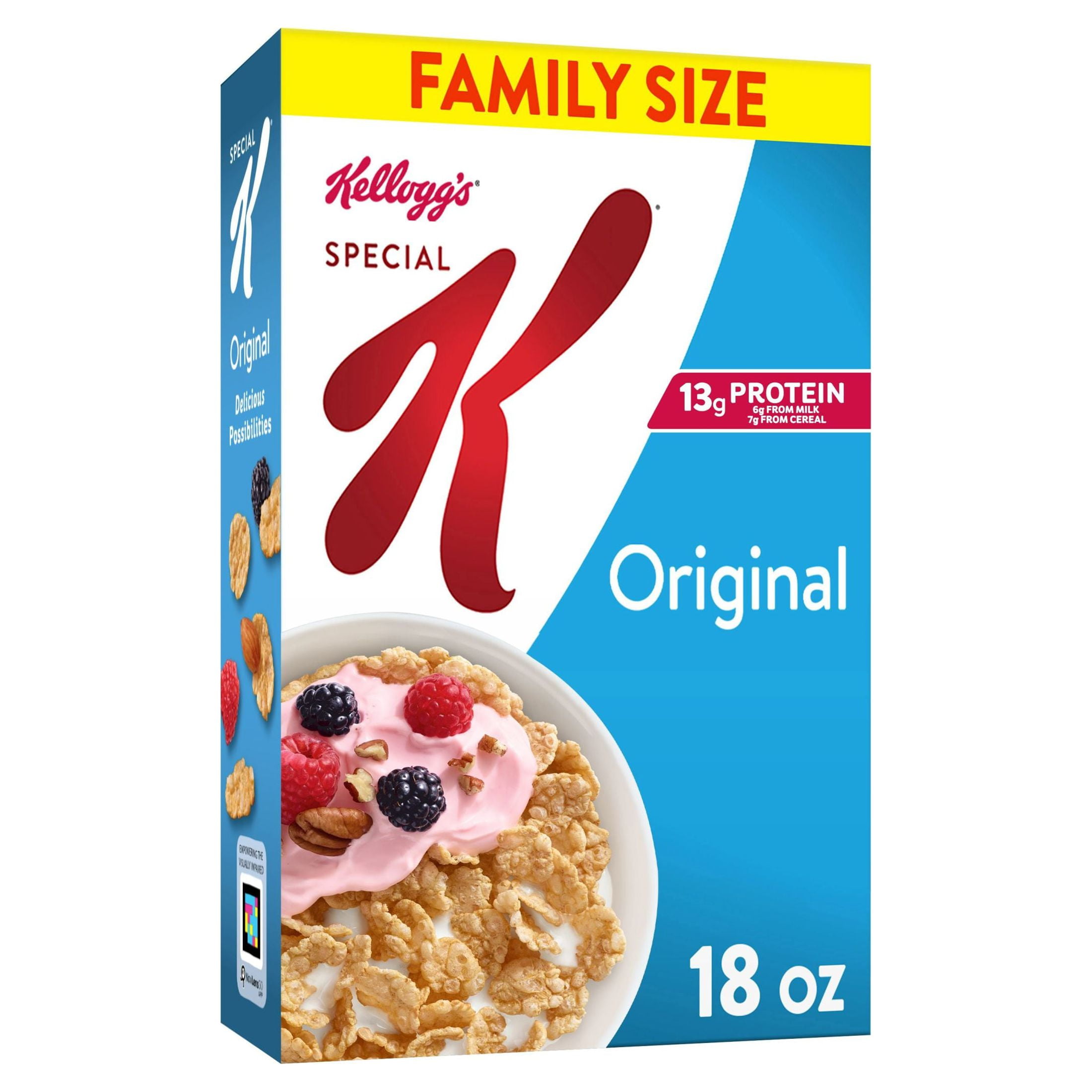
That would be like saying you can judge the quality of a cereal-brand by its box. Special-K? That is really special.
The Book might be full of lies or incorrect information no matter how beautiful its cover is.
You can judge the quality of the cover of the book by looking at the cover. :-)
> The Book might be full of lies or incorrect information no matter how beautiful its cover is.
Cereal "might be", but almost nobody has motivation to do so — this is market differentiation to tell you what you're buying.
Compare and contrast:
https://i5.walmartimages.com/seo/Kellogg-s-Special-K-Origina...
https://duckduckgo.com/?q=budget+cornflakes&t=iphone&iar=ima...
https://www.kaufland.de/product/338169035/?search_value=cere...
None of these will be surprise Weetabix in soy sauce. None is actually a frozen pizza. None is garden fertiliser.
Similar with books and youtube videos. It's not a claim that "beauty is truth and truth beauty", it's a claim the thumbnail/cover tells you what the video/book is about.
For "quality"? Good branding used to be expensive, before GenAI (now I'm not sure). If you could afford it, you could afford good content; if you could only afford good branding or good content but not both… it happens, of course, but it leads to angry refund demands IRL, and no organic viral growth for videos.
Of course, their ideals will most likely differ from your ideals. In addition, even where multiple people might share abstract ideals, their ideas about how to effect these ideals will often differ.
The "kids just lack manners these days" should also be separated from more detailed criticism.
That whole thing about denying that decadence is even possible is so comically a symptom of people being part of said decadence not wanting to admit it.
From my other post:
Overall, when the parents lose control of the child, the culture takes over parenting. When the culture is ridiculous, the child grows to become a ridiculous adult and won't know it and possibly even defend it.
It's absolutely accurate that `kids these days` have grown up in a different environment than `grownups these days` than the same demographics from 50, 100, 200, or 1000 years ago.
Even if it's for the sake of feeding the algorithm, I do my best to skip them.
I also internally prioritize videos which:
- avoid usage of superlatives "TOP X", "BEST OF Y"
- have more than 5k views and less than 250k views.
After a while, my YT recommendations have become mostly solid.
1: https://allscience.substack.com/p/on-the-grim-reality-of-you...
( ͡ಠ ʖ̯ ͡ಠ)
(fixed it for you)
Entirely conjecture on my part, but I imagine this _was_ true, has now been done to death, and no longer has any juice left in it. It’s how all the marketing stuff goes: discovered, early adopters get great results, everyone starts doing it and it loses any value.
You might still lose out, if you don't do it?
Just like virtually every car these days has great safety features, so it's not a good selling point; but just try selling a car with 1980s levels of safety.
Plenty of good content is forced to play the clickbait thumbnail/title game and it would be a shame to miss some of it because of YouTube's incentive problems.
TOP 10 BEST
When you have "top" and a word ending with "est" in the same headline, you've done it wrong.
I never avoided these. They naturally make me puke and disgust and want to smash their degenerate faces if I ever see one on the street. No need for doing my best. The realization that so many people happily click through that was sickening at the time. It’s “open doors” party in asylum and people rushing in in excitement.
Btw, many channels seem to moved on from that, in self-moderation after a short period of experiments. Those who stuck to it showed the most increase in mental deficiency and turning to stupid comedy/meme show rather than original material. One example of that were these new LTT formats, afair.
You're supposed to smash the like button and remember to comment and subscribe.
Youtube's "the algorithm" will make or break both videos and channels.
But "the algorithm" isn't really a mystery. At a basic level, it just shows a bunch of video recommendations to viewers, and measures if they click it or not (watch time, comments, likes also factor into the algorithm, but none of that matters if they don't click first). The higher the click-through rate, the more the video is pushed in recommendations.
And the only things a viewer sees is the thumbnail, channel name, and video title. They have to decide which video they are going to watch based on just that.
So really, a large chunk of "the algorithm" is just how appealing your thumbnail is to potential views.
More or less, the art of making a successful video requires:
* An attention-grabbing thumbnail
* A curiosity-provoking title & premise
* A strong hook which convinces the viewer to put the screen down and let it run
* Editing which delivers the information at an engaging (yet monetizable) pace
* Packaging said information so that it is intelligibly balanced across the mediums (audio/text/video)
* ^^^ Doing this all in a style which still retains enough uniqueness to establish a repeat viewerbase
"The algorithm" is a system for efficiently delivering novel videos with these qualities to the audiences who will most eagerly consume them, which is an essential function for a platform with 2 billion monthly users. For every video on lowest-common-denominator celebrity junk, there's a dozen niche videos tailored to some ravenous subculture or other. Not all magazines are tabloids... but just about anyone can kill time with a tabloid, so that's what leads.
Unlike magazine stands, however, the platform will eventually learn to only show you the thumbnails for videos you'll want to finish watching. It's almost embarassing to share... but here's an example batch of 12 recommendations, almost all of which I'm likely to (eventually) click on and fully watch: https://i.imgur.com/dygfXXb.png
Only to the degree Youtube defines success for a person.
As a form of creative expression, a Youtube video can be successful independent of the analytics.
Sure defining success on your own terms means you need a day job. But defining success on Youtube’s terms treats Youtube as a day job anyway.
One popular channel who commentates on american police body cam footage, replaces the gunshot sounds with animal noises. It's ridiculous. Also no discussion or use of tobacco. Many times I've heard people refer to Adolf Hitler as "bad mustache man" for fear of getting censored or demonetised. One channel that discusses historical firearms, is censoring the 1933-1945 german reichsflag. And so on and so on. It's all so tiresome.
Note that I haven't done any of this myself except for making a couple thumbnails for personal videos. I was curious and watched a YouTube video about thumbnails and why they're important.
The thumbnail, video name and channel name are the only bits of information potential viewers see - if your thumbnail isn't good, they aren't even going to _start_ your video, let alone keep watching it.
Very few of channels I subscribe and watch, such as Forgotten Weapons, Technology Connections, Scott Manley, USCSB, CuriousMarc, media.ccc.de, etc. uses that open mouth YouTube face for their thumbnails, if they display a human face in a thumbnail at all. I would consider Doug Demuro videos to be embarrassingly deep into "typical YouTube stupidity" realm to admit watching, but even he tend to leave his mouth less than fully open.
Do they not engineer their thumbnails to "appease the algorithm" - they do, by showing accurate and intriguing previews of what is to be presented, that for those channels often happens not to be an adult male human face with all orifices articulated to near or past mechanical limits, which, by the way, is an another one of optima.
The statement "one can(not) judge a book by its cover" is not functionally equal to "books dipped longest in fluorescent yellow dye sell the most", at all. Apples and oranges both have their place.
Tracking what you click on versus what you don’t, you might recognize that certain thumbnails make you more likely to take a pass.
For clarity, my experience is at hobby scale and part of that hobby is learning about youtube. Trying to make the line go up is fun (until it isn’t) and a little attention to thumbnails seems to make the line go up.
You can make this a button in the toolbox in the settings.
End users really don't need to know about it. Its exposure in the UI is likely just because a lot of stuff it can do isn't available yet in the traditional GIMP UI.
"End users really don't need to know about it... a lot of stuff it can do isn't available yet in the traditional GIMP UI"
So why "don't they need to know about it?" And regardless, putting a meaningless label on it is a user-hostile blunder. This blunder is not all that uncommon either. Affinity did it by burying a bunch of stuff under a menu item called "Studio." Not as bad as "GEGL", but still meaningless.
https://www.getpaint.net/download.html
https://www.google.com/search?q=paint.net&tbm=isch
GIMP is almost designed to be passive aggressive and sometimes hostile to its user. Last year I had to regularly process some images in gimp on linux (cropping, composition, other basic ops) and seriously considered installing samba, qemu and windows only to share these pngs with paint.net. I can’t even fathom the pain of having to do something like a thumbnail in it.
If you like Paint.NET, it might not take that much effort to file bugs against Wine for any problems you find until it works correctly. There is one user at least reporting that
If you need something like
https://en.m.wikipedia.org/wiki/Pinta_(software)
use that. If you want something like krita, use that. And if you need something like gimp, paint.net is not even in consideration because it is decidedly something else
I have also worked as a “designer” in a real typography for some time and know a thing or two about the process (not fully, but count me as sort of an insider). And I can tell you that gimp is only “an artist’s impression” of a graphical toolbox, and that artist is heavily drunk. If you need something like gimp and paint.net/etc isn’t enough, you need photoshop. Cause we’re talking about serious pre-print color management, etc. Gimp is two parts: very poor home graphics editor and very poor industrial graphics manager.
Youtube thumbnails are paint.net 100%. I use that all the time for all my graphics, technical and creative, tried all others, and have no reason to switch, apart from OS requirements.
But generally it's really not as nice as Paint.net. I don't like the ui at all (washed and bleak, hamburger menus, checkboxes on layers swallow second clicks, clicks on icons sometimes demaximize window, etc, also slow). It's just bad. Idk if it's gtk3/4 or pinta itself. But it generally works and apart from that I'll give it a 4 out of 5.
Also, is "washed and bleak" really that big of a problem for an image editor? It just doesn't matter what it looks like as long as the UI is intuitive and has the features that you need. It should also be noted that Pinta very much looks just like your overall Desktop appearance on Unix. I'm on XFCE and it's so incredibly theme integrated it looks like it's part of the system.
Personally, I really like Pinta. Biggest problem is the bugs and crashes. Wish I could use actual Paint.net though, but there's no way to use it on Linux.
> a GTK clone of Paint.Net 3.0, with support for Linux, Windows, and macOS
Used to use this way back in the day for quick edits on Linux, happy to see it's still active.
didn't even keybind settings to ⌘,
didn't even keybind save to ⌘s [0]
when quitting there is no option to save
clicking + on brush size increases it from 40 to 40.01 (!)
of cause no wheel support to change size ...
I'm sure with every minute of trying this the list got longer and longer. Feels like an X window to an ancient unix machine.
[0] while ⌘s doesnt work for new images it does work for "overwrite" jpg etc which is a HUGE advancement!
Those images got into an exhibition so I’m pretty happy.
Photoshop literally has whole training companies and conferences on how to use the software. I ended up at a photoshop world conference. When I was on Mac I’d use pixelmator for quick crops and edits (or even the preview). That’s easier, but these programs are very powerful and you need a little bit to learn them.
Example: https://www.insidehighered.com/news/tech-innovation/teaching...
The UI is 95% the same as every image editor since 1985.
There's no problem with the name other than with people looking for cultural issues that don't exist to bang on about and fill their "do good" bank.
There can be some absolutely dreadful, politically incorrect names, but I don't think any of GIMP's significant problems came from it's namesake.
Gimp is a term used to mock people that can't walk. It's not a medical term, it's strictly a pejorative like the n-word.
Gimp is also a term for someone who gets pegged up the ass while wearing a rubber suit.
Not a good brand.
This is just a ginned-up non-controversy that should have stayed in 2019.
I've heard Gnome used as an insult far more than Gimp.
However it's great that they're making gradual progress. I've used Gimp for years.
If "gimp" is an ableist slur, is "lisp" an ableis slur, too? And does that Unix manual-viewing command seem to assume masculine superiority? While at it, that Unik signal-sending command would definitely be banned in Boston for indiscriminate cruelty.
I mean, come on. Humans are able to differentiate between meanings of a word, and even possess a sense of humor, to a degree.
That said, I'm totally not a fan of naming projects in a playfully stupid, disgusting, or, worse, obscene way. Sadly, people get their kicks out of that more often than I would like. But I think that the hooliganish joy of doing so critically depends on the rest of us reacting to such a name in an inflamed way, like above. There's something to be said about feeding trolls as a self-defeating behavior.
I would rather celebrate the major release.
I don't think Eunuchs have ever been considered superiorly masculine.
Better call Google, Yahoo, Mozilla ... and let them know. A lack of humor and humility is destroying SV, the country, and the world.
Now that I’m not, the $10 a month is a harder pill to swallow, even though I use it quite a bit. A subscription pricing model isn’t great for those that need something once a week or month or whatever.
[1] https://www.youtube.com/watch?v=dJBEAZFP0aA [2] https://www.youtube.com/watch?v=lm51xZHZI6g
Nothing Adobe will ever again be installed on my PCs.
I didn't eat avocado toast for 2 days and am buying adobe outright later today.
People hate adobe for their anti-consumer practices, purposefully obsfucating the PSD format, and shoving AI down everyones throat.
That said, can also see the utility in making deals with the devil: if it means getting your own software done faster and better, then it might be worth it, even if it feels gross.
This is a game-changer. I tried to use GIMP to typeset comic translations many years ago, and the workflow was so terrible I had to resort to a few extra tools, complicating my workflow. I'll have to try the new text editing to see for sure, but it sounds like typesetting is now comparable to what's offered in proprietary editors.
GIMP has always been useless for my workflows, professional and personal, for that reason, and Photoshop's just a far higher quality and more useful piece of software. But with that fixed I think at least I could recommend GIMP in something close to good conscience for folks who can't yet afford anything better.
Although really, even there the UI is so bad that Photopea would still be preferable, webapp or no. At least that knowledge transfers. Time spent learning GIMP is just wasted.
But then again, it's a free program and I'm not owed anything by its authors and contributors. It's just a little... sad, maybe, to have all their work UXed into relative obscurity, at least from my point of view, and probably that of a few other people who share my frustration. And even so, if this is the way they want to make the GIMP and they're happy with it, then more power to them - and less to me.
idk what you're referring to but gimp has also supported editing text after it's been placed. what's new is non-destructive filters and non destructive outlining of text (despite what some may claim you were able to draw an outline of a text even before gimp 3, by converting it to a vector path.)
Here's a funny one from my history, 12 years ago: https://www.youtube.com/watch?v=G13TXE9agYM
Unpopular opinion, but I think the UI/UX works just fine? It never got in the way of what I wanted to do, and now I am familiar with where all the options are.
The fact something is a well known free software program ensures a few extra features: it’s more likely to still exist in 5 years, you will still have a license to use it in 5 years, you can have it available on all of your computers and it is likely just one package manager command away from being available.
I just saw the other day a coworker fighting up with an MS Excel that refused to open a .csv file because it could not find a license.
I asked him why not use LibreOffice in the meanwhile. He looked to me like I was crazy and asked if it had better features.
Well, yes, it does have more features than Excel without a license and yes, the .csv importer has more features and will help you select the limiters with a nice preview and organize the column width automatically after importing.
One is for digital painting and the other is, as it name says, an image manipulation program.
True. Usability, accessibility, and basic UI quality are all important focuses for the Krita devs.
Nevertheless, both are wonderful pieces of software! I'm not a graphics pro but do find myself editing images quite regularly, and I usually reach for GIMP as it's more familiar to me. Krita on the other hand has a great brush engine, so if I feel like drawing something, I go for that.
Also, of course, whichever one has GMIC on that particular day! Some of the stuff in that plugin is absolutely wild. Usually that means Krita again, though iirc at some point it was broken there for some time, but I found it for GIMP...
Btw, anyone know if there's a Rebelle Mixbox-style color mixing feature for either of the two?
I doubt there is anything that couldn't be done in either and it is simply a matter of time spent in the UI and personal preference.
GIMP is the one that's still missing proper colorspace handling, especially regarding CMYK.
And Krita has had vector layers with text support for quite a while as well.
But not proper native support for CMYK and spot colors as you might know from Adobe or Krita, where everything internally tracks CMYK data throughout.
It is much easier to make a photo collage in Inkscape than Gimp.
The relevant docs for the temporary floating layer that's created on paste are here: https://docs.gimp.org/en/gimp-selection-float.html
Barring that, I'd also prefer it to surface anything to tell the user what's going on. Pasting subtly switches modes into a context where a lot of the UI isn't working right until you make a decision on what to do with the floating layer. That kind of mode-switch should be signalled loudly to a user. The signal Gimp chose? Two small buttons in the layer panel highlight green.
> Copying and pasting now creates a new layer by default rather than a “floating selection”, which many users found confusing. Floating layers can still be created with the “Paste as Floating Data” option for those who prefer that workflow.
so it's solved now.
You used to be able to learn a program by simply running the mouse across the menus to see the hotkeys and icons too.
(Not sarcastic.)
You know how pasting creates this special "floating" layer? While in this mode, the "Layer->Merge Down" menu command is replaced by "Layer->Anchor Layer" - which has the keybind. "New Layer" also becomes "To New Layer".
While I can see how it makes sense on some level, it's also a whole new kind of counterintuitive.
The problem with it is that we've had a good UX understanding of how modal behavior works for ages, and if you're going to do something modal, you need to make clear to the user that the mode has changed (especially to the naive user, who has no reason to anticipate paste enters a novel mode). The indicators that mode has shifted are too subtle: one is the buttons going green on the layer panel (which I think can be hidden at that point? I'd have to check), and the other, I have now learned, is some menu options changed. No dialog box, color switch, or text indicator to say "PASTE MODE: choose how this pasted data should be added to the image."
And when it's so high on the critical path of using the software (how long does the average user use an image editor before they try to paste something?), it's a huge hit to the overall experience and makes the user feel like this tool is too complicated.
Just don't mention the name.
[1] I think they knew Beastie was a harmless computer thing, but they also thought the moon was the size of a basketball.
I didn't want my christian conservative parents to keep berating at me as if I turned in to the devil for choosing a OS that has a mascot that resembles one.
But of course that won't happen
I'm scared, they already started messing with the toolbox stuff (putting multiple icons under the same button and then changing the icons too to make it entirely impossible to find anything).. "modern desktop" has taken on a different meaning for me, it's all about making it look neat at first glance, then entirely undiscoverable, removing any affordance in sight, burger menus, ribbon menus.. f...
having used all the 3.0 RCs up till now, i can assure you all gtk3 has done is made life nicer on all major platforms. for gimp's faults (now markedly fewer) it's an image editor, a thing with a distinct purpose and pretty immediate feedback on indulgent changes nuking productivity. the cancerous low-information-density, look-over-feel trends that we associate with new gtk versions by way of gnome's visionless bikeshedding blessedly does not translate to this new gimp. pinky promise. go use it. you'll like it.
It means "this gonna get dead" and the argument will be "oh, nobody uses it" yeah, because, you can only want a nice thing back if you knew it existed to begin with, eventually, most users either never knew it was there, or assumed it went away, and eventually, forget it entirely, and then it's gone.
I don't think you have to worry about settings disappearing in newer releases.
Which, major releases of Gimp are so slow anyways, if it was a realistic worry for this software specifically (it's not), it would probably be 10+ years before such a change hit stable.
It’s a race to the bottom to simplify the most common use case for the most incompetent computer user.
To compound things, because everything is “engagement” driven, it means you have product managers place entirely unwanted features in prime real estate locations, often in jarring ways like with full colour animations, just to get people to use it. (Eg pretty much every AI feature in productivity tools).
This also annoys me to no end. Here is how to fix the icons:
Ungroup GIMP tool icons:
Edit -> Preferences -> Interface -> Toolbox -> Untoggle "Use tool groups"
Edit -> Preferences -> Interface -> Icon Theme -> Select "Legacy"
- Pressing '/' opens a search dialog for all tools.
- By default, the brush size selector precision is garbage. You can get fine precision by using '[' or ']' keys, mouse wheel or right click + drag instead of left click + drag.
GIMP can do most things, but it is unfortunately a good example of how sane defaults are important.
That being said, I've tried version 3 and did not notice a large difference in UI except that everything is a darker shade of gray: https://i.imgur.com/Lj5BIA2.png
    sudo snap install gimp --channel=preview/stable
/snap/bin/gimpMonochrome icons is from GNOME, it's a shame Sun has gone, they used to do usability testing on GNOME and publish the results .
We'll see how it goes from here, while it should be easier under Gtk3, there's still a bunch of UI to make sane around d GEGL ops etc.
I wonder if we will see a push to Gt4, that should be less painful than 2 to 3.
We should see improvements gradually accelerate now this is out.
You can also access that dialogue under Help.
GIMP's toolbox was like that, since forever IIRC, no?
Edit: Just checked, everything is where it's since 1998. New tools added under correct toolbox categories (heal under stamp/clone, etc.).
Office 2003 were amazing in this regard, you could customize the toolbars as you needed to optimize your workflow.
There are some. At first glance it doesn't seem to be that much different from 2.10 that I have installed in Manjaro
I remember, for years and years, trying Blender and quitting it due to the terrible UX choices. Likewise, I also remember the devs and some older users on the internet trying, at every turn, to tell us how much superior Blender UI/UX was, that all the people were wrong and they were right. They weren't right, of course. Then the team at Blender finally accepted it, they did a complete redo of the UX/UI and now Blender is winning prizes at the Oscars.
The same could happen to GIMP if they just accepted the UX is terrible.
I'm saying this, totally agreeing that these devs did a fantastic job and that they don't owe us anything. This is open source, of course. But, this level of stubbornness, is preventing GIMP from being used by a lot more people that want to finally ditch Photoshop.
I'm an occasional/light user of image editing software and Gimp has been my go-to for years now.
I really appreciate all the work you've put into small UX details and performance over the past 3-5 years. It shows.
Those... are not "pro-quality" things but cheap gimmicks.
Good that they're introducing non-destructive editing! I've long moved to DarkTable for photo editing. Photo editing never seemed like GIMP's goal.
For me, the swiss-army knife approach they support is good enough. And it saves me from having to wrangle two or three other tools.
Besides, Adobe is an ugly company with shady billing/retention tactics…
GIMP is still trying to reach parity with CS6 days from 20 years ago, all for the gold star of saying “we did it guys”
> This is the end result of seven years of hard work by volunteer developers, designers, artists, and community members
Gratitude!
Amazing to see this release.
Oh thank god
I remember wanting this 2015 .. finally.
Hopefully they'll adopt a more sane release strategy going forward.
Or maybe there was another model you were suggesting? What do you find non-sane about the current one?
Hopefully the now-impending port to GTK 4 will be a lot smoother and won't be such a disruption to their ability to ship the features they've been working on.
> GIMP was very tied to GTK+ 2
People seem to forget that GTK was originally created for GIMP, Gnome came around and co-opted it since it was more free (libre) than QT.
GTK3 was a full rewrite divorced from the GIMP development cycle so broke a huge chunk of things GIMP put in place specifically for their code styling. Thus the long development cycle.
Are distros going to drop GTK2 now?
https://wiki.archlinux.org/title/Uniform_look_for_Qt_and_GTK...
Plus you can search for "GTK 2" dependencies. Some sites seem hopeful to move to GTK 4, while others wish they could move to 3, and some talk about upcoming 5.
A reverse dependency search shows 340 packages relying on it (200 direct dependencies).
https://arstechnica.com/information-technology/2009/01/gimp-...
I hope the GTK team figures out how to consistently load the right font here. A lot of great work seems to have gone into GIMP 3, so it's a shame that a bug like this makes it look unpolished.
Porting of plugins from GIMP 2 to 3 is not complete. Testing is not complete. An MS Windows build is not tested and not in the repo."
Life changing. Worth relearning a workflow just for this, no contest.
would be even nicer if there is one click passport mode, picture improvement mode, etc, something like what mobile phone photo apps provide.
Can anybody tell or guess how those clouds were created? I've been looking for such an effect for some time now, basically emphasizing edges and contours.
The new widgets are kinda nice too. They've had the RCs in Fedora for a while.
(If you're here to shit on gimp because it doesn't work like adobe, please take it outside, or slashdot.)
I use both and neither are user friendly. If you rely on Photoshop for casual edits then I truly pity you. Your money has been better spent funding Affinity Photo for years now, Creative Cloud is a lost cause. CS6 is much better, but practically antique at this point.
Basically in order to have a meaningful conversation you need to figure out how to enumerate your grievances before you say them.
in 4.3.2. Options:
> Move the active layer
> Only the current layer will be moved. This may be useful if you want to move a layer with transparent areas, where you can easily pick the wrong layer.
note that version 2.6 was relesed in 2008.
i fail to see how an option for moving (visible by default), in a move tool, is "a half-baked solution (..) in a random menu." you don't move around text with a text tool, so where else should it be?
> Seriously though, the text clickable area should be a bounding box of each line.
gimp allows an arbitrary bounding box size for text layers. this enables, among other things, to conform text into a specific bounding box (i.e., no need to manually press enter to keep text inside a specific area). calculating the hit point with a bounding box instead of the content will invite even more confusion as people complain that text layer keeps moving when "i pressed the other thing."
also because people often praise krita for being the sane one, without apparently having used either of them for more than 5 minutes, krita has 3 different "move" tools and 2 different resize tools for text, each doing different things. probably the most confusing decision on krita is to make "mouse pointer tool" vector only. the program does tell you to use the move tool when you try it, but they could have just... make bitmaps movable with the "mouse pointer." nothing i can think of prohibits them from doing this.
also krita's move tool defaults to moving the selected layer without a visible option to change this behaviour, unlike gimp. so gimp is actually better even by your standard.
Where it already is. But it's a bad solution for moving text. You should just be able to click on the text and move it.
> gimp allows an arbitrary bounding box size for text layers
That's why you would probably use the x-height of the text path for one long bounding box and then add a bounding box for each letter also. There is no need for the "on click" bounding box to be the same as the in-editor bounding box. You just need to allot a small area around the text that can be clicked to move it. It's not hard, or at least it shouldn't be.
> also because people often praise krita for being the sane one
I don't know what Krita is, but you seem overly invested in this argument if you are having it so frequently that you have to preëmptively admonish it.
i dont engage in this discussion frequently myself, but have a look at the comments and you will see around half mentioning or comparing it to krita despite the news having nothing to do with it. this has been the norm of discussion regarding gimp, for better or worse.
Reasonable.
> this other piece of software fails here so it's fine for GIMP to fail here
Not reasonable.
Do you get it?
Line: Rectangle select -> Bucket fill -> Transform
There should be some basic arrows but there doesn't seem to be.
Haven't used Gimp in a long time, but try holding down ctrl, shift or alt while doing the circle (or rectangular for that matter) select.
One is for aspect ratio, one is for center from starting point and the last I cannot remember.
IIRC the same goes for combining selections: modifier keys can be used to add, subtract or make intersections.
Contrast Blender, which does its own thing too but has an infobar at the bottom continuously trying to give context-appropriate hints for the current keybindings.
Meanwhile, there's a keyboard shortcut for "anchor floating layer." Where will you find it? Not by hovering the button that anchors floating layers, that's for sure.
Second tip: if you get stuck, there is SO much content on youtube these days, you’re bound to find a guide or some help just by searching.
Good luck and enjoy free software!
In practice, it meant taking some tutorials and searching up how to do the simplest things. Annoying but you get the hang of it after suffering several days.
Still, I'd wait for 3.0.5+ or so.
But, the friction for trying it yourself has never been lower.
Writing more internet comments is comfy but won't bring you closer to answering your question.
A full CMYK mode is on my TODO list now that 3.0 is out. :)
Yes, sort of since 2022... =3
That's been at least my experience. But I haven't used Photoshop in years now and got pretty much used to GIMP by now, for the once in a while that I use it.
And now I don't really have the annoyances anymore. I actually know pretty well how to do most basic stuff, and some handy keyboard shortcuts. And now GIMP doesn't feel that clunky anymore.
I have tried to use GIMP on dozens of occasions, and it always surprises me in the worst ways, or bounces me off to search the web for a howto. Simple things like: I want to select a rectangle, move/resize the selection, then crop the image to that selection. Or I want to arrange two images side-by-side for comparison, crop to the smaller one, to export a side-by-side. Pretty much every attempt at doing something other than colour curve adjustment has resulted in a faceplant. Eventually I gave up switched to Krita.
Overall, it works similarly to MacPaint from '84 and even has the same CUA keybindings.
GTK 4 was released in 2020.
I hearby declare the GIMP / GTK 4 challenge: use AI to migrate GIMP from GTK 3 to GTK 4. The prize: a drawing of a seven legged spider.
Though if you really, really wanna, well I just looked and the top 2 search results were plugins for that sort of thing. The things people'll do for GitHub stars these days...
Guess you could try putting those on? In which case we wish you good hunting!
My wishlist for GIMP 4 is to see AI tooling integrated by default:
- Image generation that will do completions based on prompts on arbitrary areas. Something like this: https://www.adobe.com/ca/products/photoshop/generative-fill....
- AI super-resolution. There are a lot of options now that can dramatically improve sharpness, akin to Topaz Gigapixel: https://www.topazlabs.com/gigapixel
- Meta's segment anything integrated so that there is no need to painstakenly select objects. https://segment-anything.com (Does it support sub-pixel fuzzy selections?). It would also label everything in the model, which leads to...
- Built-in model context protocol (MCP) support to allow for automated control by agentic AI. (See what is possible with Blender: https://www.youtube.com/watch?v=DqgKuLYUv00)
Of course it should only download the models the first time someone needs them.
https://www.gimp.org/registry/
If you want to maintain a new one, i'm sure it'd be very appreciated.
Realistically the easiest pull would be to just take some existing repo system like npm/pypi/dockerhub and then fork the tools a bit and spin up an instance on some cheap cloud vps.
Enough of these things already exist, just take an existing one and modify it. The scripts really aren't that big
I did some LLM chatting and couldn't find this so excuse me if it's well known and I'm out of the loop
If GIMP were to implement it, they'd probably have to go the same route as Krita and either spin up or call out to a running instance of Automatic1111 or ComfyUI.
https://github.com/Acly/krita-ai-diffusion
MCP would be cool, but it would be significantly harder than Blender which can represent the "world" as a formal set of expressions. MCP for GIMP would be dealing with layers of rasterized data which would mean integrating with YOLO/LLava/etc in order to make sense of it. It would be neat, but it'd be a daunting integration and potentially VERY VERY slow.
But you can say the same thing about any feature of GIMP. Your comment makes me wonder why we can use the pencil tool since we didn't pay for it.
They definitely should run it locally. But there are many ways of running image generation model locally.
No, it just means executives want to add AI to things. So many of these "But with AI" are not lead by customers but by executives wanting to make sure their product isn't seen as behind the times.
So your stuff will probably happen after you retire.
Also, AI stuff needs to bake a bit more until it's worth adding as an extra maintenance burden, so maybe waiting 10+ years for it isn't such a bad idea.