The reason is simple: genes coding the long wave opsins (light-sensitive proteins) in these cones have diverged from copies of the same original gene. The evolution of this is very interesting.
Mammals in general have only two types of cones: presumably they lost full color vision in the age of dinosaurs since they were primarily small nocturnal animals or lived in habitats with very limited light (subterranean, piles of leaves, etc.) Primates are the notable exception, and have evolved the third type of cone, enabling trichromatic color vision, as a result of their fruitarian specialization and co-evolution with the tropical fruit trees (same as birds, actually).
So, what's interesting is that New World and Old World primates evolved this cone independently. In Old World primates the third cone resulted from a gene duplication event on the X chromosome, giving rise to two distinct (but pretty similar) opsin genes, with sensitivity peaks at very close wavelengths. As a note, because these genes sit on the X chromosome, colorblindness (defects in one or both of these genes) is much more likely to happen in males.
New World primates have a single polymorphic opsin gene on the X chromosome, with different alleles coding for different sensitivities. So, only some (heterozygous) females in these species typically have full trichromatic vision, while males and the unlucky homozygous females remain dichromatic.
Decent wikipedia article on the subject: https://en.wikipedia.org/wiki/Evolution_of_color_vision_in_p...
Types of opsins in vertebrates: https://en.wikipedia.org/wiki/Vertebrate_visual_opsin
It's almost as if there was some evolutionary pressure towards being very visible in sunlight which is more important than evolving ways to collect as much sun energy as possible. When I guess at this I end up with something along the lines of reflected green being used as a signal to a neighboring plant: "I'm already here, grow in some other direction instead." There is some evidence that plants do this (https://en.wikipedia.org/wiki/Crown_shyness, https://onlinelibrary.wiley.com/doi/10.1111/1365-3040.ep1160...) but it's not clear that the need to do so is so strong that it would overshadow the drive to collect as much energy as possible.
Or perhaps there's something to do with the physics of absorbing light to drive a chemical reaction that makes it better to absorb at red and blue while passing on green (450nm and 680nm are not harmonics--so if this is the case it's more complex than which sorts of standing waves would fit in some chemical gap or other).
This is most likely a historical accident, with no special meaning.
Most algae and plants have auxiliary pigments, which absorb other parts of the solar spectrum and then transfer the energy to chlorophyll a.
The land plants and the green algae use mostly chlorophyll b as auxiliary pigment, which absorbs light in a blue band adjacent to the violet band of chlorophyll a, and in a red band that is distinct and adjacent to the red band of chlorophyll a.
Thus the addition of chlorophyll b increases considerably the amount of captured energy.
The algae that are dominant in oceans, e.g. diatoms and brown algae, have more auxiliary pigments, so that many are dark brown, even close to black.
Unlike for marine algae, for land plants, capturing more solar energy is not desirable, because they already have difficulties in avoiding overheating and excessive loss of water. So the pigments used by them are good enough for their needs.
The the lack of photosynthetic activity between 550 and 650 is still suspicious. I've learned from other commenters here that my assumptions about the gap corresponding with peak solar energy weren't on solid ground, but there is a gap.
Perhaps a different way to frame the question is: why do the chlorophyll pigments have two peaks, while the others appear to have only one? Perhaps they have an evolutionary past which involves absorbtion from a star besides sol?
Like I have said, in marine algae you can find a variety of colors, as already seen in their names, e.g. red algae, yellow algae, brown algae. Most of them have strong absorption for green light, due to the auxiliary pigments that they happen to use.
Only the green algae and their descendants, the land plants, do not absorb green light and as a consequence they are competitive with the other algae only in places with abundant light, i.e. in very shallow waters or on dry land, where they can get all the energy that they can use without damage, so they do not need better coverage of the solar spectrum.
The energy of the captured photons does not matter much, because even the red photons have enough energy.
The captured photons are not used for "photosynthesis", which is a misnomer whose origin lies in a time when the mechanism of "photosynthesis" was not known.
In oxygenic phototrophs, a part of the captured energy is used to oxidize some manganese atoms so strongly that they can oxidize the oxygen from water, converting it into free dioxygen. The hydrogen from water is bound into a reduced organic substance (NADPH), which will be used later as a reducing agent (without needing light) to make carbohydrates from carbon dioxide.
The rest of the energy of the captured photons is used to pump ions through the membrane of the chloroplasts. The energy stored in an ion gradient will be used later to power all organic syntheses.
The ionic pumps could work even with infrared photons, as they do in phototrophic bacteria that live under algae, so they have modified chlorophylls whose red absorption band is shifted into infrared, away from the red band that is removed from solar light by the algae sitting above. However, those bacteria cannot split water, the energy of infrared photons is too low for that (splitting water needs around 1.25 eV, while red photons have over 1.5 eV).
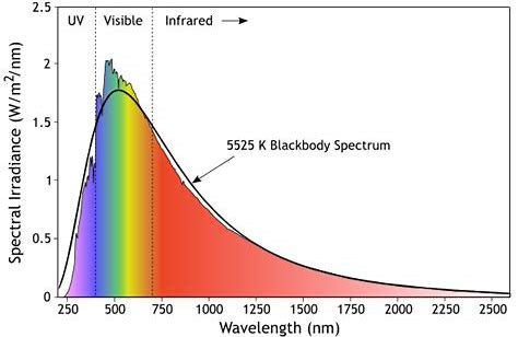
It actually peaks between magenta and blue: https://sunwindsolar.com/blog/solar-radiation-spectrum/
Green is only bright to us because of our cone sensitivities overlapping.
No, it actually peaks wherever you want it to peak, depending on how you plot it: https://www.oceanopticsbook.info/view/light-and-radiometry/l...
> Figure 1 shows plots of [solar] energy irradiance as functions of both wavelength and frequency. The red line is the solar irradiance at the top of the atmosphere. The green curve in the left panel is the corresponding blackbody irradiance for a temperature of 5782 K, reduced by the distance of the Earth from the Sun
> The peak of the blackbody irradiance spectrum is at 501 nm for a temperature of 5782 K. This corresponds to a frequency of ν = c/λ = 5.98 ⋅ 10¹⁴ Hz.
> The right panel of the plot shows the same solar data plotted as a function of frequency, along with the corresponding blackbody spectrum
> Note that when plotted as a function of frequency, the solar and blackbody spectra have their maxima near 3.40 ⋅ 10¹⁴ Hz, which is not the frequency corresponding to the maximum when plotted as a function of wavelength in the left panel. Indeed, 3.40 ⋅ 10¹⁴ Hz corresponds to a wavelength of λ = c/ν = 880 nm.
> In other words, when plotted as a function of wavelength, the solar irradiance is a maximum near 500 nm, in the visible, whereas the maximum is at 880 nm, in the near infrared, when the spectrum is plotted as a function of frequency.
[emphasis original]
> This occurs because the relationship between wavelength and frequency is not linear, so that a unit wavelength interval corresponds to a different size of frequency interval for each wavelength: ∣dν∣ = ∣c / λ² dλ∣.
However, it continues:
> Figure 2 shows the solar photon irradiance [number of photons per second, as opposed to number of joules delivered per second] and the corresponding blackbody spectra
> Now the maximum is at 635 nm when plotted as a function of wavelength and at 1563 nm, in the short-wave infrared, when plotted as a function of frequency. The maxima are at still different locations if the spectra are plotted as a function of wavenumber.
This time the emphasis is mine. This contradicts the explanation given above, that the curve peaks in different places along different scales because those scales are nonlinearly related. The relationship between wavenumber and frequency is linear. Why does that lead to a different plotted peak?
Are we measuring wavenumber somewhere within the atmosphere (where?), rather than in a vacuum? That would mean that different frequencies of light had different velocities, complicating the relationship between frequency and wavenumber. But it would also be a strangely artifactual way to represent solar irradiance. What's so special about wherever it is that we standardized wavenumber measurements?
This means that changes of variable come with an additional factor - the Jacobian. You cannot simply substitute the relationship directly into the formula for the one spectral variable, like you would for a "point function" (you need to account for the change of unit in the y-axis too, if you like, not just the x-axis).
It's not explained well but this is fundamentally what causes the moving peaks.
Well, I can see that in the labels on the y-axis, but I assumed it was a mistake.
So you have a graph that tells you that, for light of wavelength 1000 nm, measured irradiance is 3.5e+18 photons per square meter per second per nanometer.
And since there "are" 1000 nanometers (?!?), this means that the actual irradiance is 3.5e+21 photons per square meter per second.
Or does the "per nanometer" really mean something less stupid than that? What's being measured? What kind of nanometers are those on the y-axis?
For example, pick some small value "k" close to 0 in units of nm. Then in your example, the amount of irradiation contributed by the small window [1000-k, 1000+k] nm of wavelengths is roughly equal to k*3.5e18 photons per square metre per second (you can check that the units work out). The smaller k is, the more accurate the approximation. If you want to get an answer for a larger interval you can break it up into lots of k-sized pieces and sum the results up. Recall from calculus that this is exactly what integration is (yes, I know the truth is a little more complicated in general measure theory).
Does that help? It's a bit like a continuous probability distribution, in the sense that to get an actual probability out of it you have to integrate. Formally a mathematician would say that a density corresponds to a "measure" over the space of all possible values of your spectral values.
But the question remains... Why do plants reflect light so well at the frequency where my cone sensitivities overlap? Mere coincidence would be believable, but it seems to also hint at something about the relationship between myself and those plants.
You have another kind of cone with maximum sensitivity in blue, because that is what the clear sky provides.
So a mammal looking upwards (or forward for a tree-dwelling animal) can distinguish easily leaves from sky.
Monkeys and us have another kind of cone with maximum sensitivity in red for 2 reasons, blood is red and many mature fruits have reddish colors (including orange and purple).
The redness of blood matters not only for noticing wounds, but also for detecting emotions on the faces of mates or adversaries (due to increased blood flow; for some monkeys the emotions may be seen not only on faces, but also on other hairless areas, e.g. buttocks).
https://en.wikipedia.org/wiki/Sunlight#/media/File:Solar_spe...
I think this is also why the sky appears to be a deeper, darker blue at higher altitudes.
Doing more research, looking at [1] (the data source for that Wikipedia image), it looks like the peak is between 480 nm (cyan) and 540 nm (lime green) for "global tilt" and 480 nm to 580 nm (yellow) for "direct + circumsolar" (I have no idea what the difference is between "global tilt" and "direct + circumsolar").
Interesting. It seems like the chart in my original comment isn't as precise as I believed.
Exactly that. Blue does two steps of the process, while red does only one. There's a cost for synthesizing all that machinery, so absorbing green would just be not worth it.
> 450nm and 680nm are not harmonics
In fact they're in 3:2 ratio with 1% margin. But they don't have to be. Take a look at fluorescence: it converts one wavelength to another, and they don't have to be multiples of each other. Once photon gets absorbed onto a chemical, the electronic structure of the molecule decides what will happen to it.
> Photoexcitation energy is rapidly transferred through an antenna network before reaching the reaction center
I didn't know that. With this in mind, perhaps a better formulation of my question is not:
> Why are plants green?
But instead:
> Why are green photosynthetic pigments more common than others?
Based on my read of this paper, the answer to that would be that a pigment which absorbed only a single narrow band of light would be prone to being either over or under powered most of the time. Absorbing red and blue, but not green, provides more opportunities to deliver constant power at the reaction center despite varying light conditions.
Also remember that these are random processes with selection pressure keeping those who survive to reproduce. Assigning a will to such processes makes them and the results harder to understand- imho.
Theres probably something more efficient at converting light into simple sugars.
It's not reflected- it's just not used (and thus absorbed). If the plant has more energy that it needs already to produce offspring... what pressures exist to produce more?
You seem to have missed the context of my reply:
> an extinction level event that filtered sunlight for a long time, removing green
The lack of green sunlight would not necessarily result in a mutation that reflects green. There is no evolutionary pressure for reflecting/not using something that doesn't exist. In fact, it would be adding intent to a process that has no intent.
TLDR: Plants are running an energy-harvesting system that can only respond so quickly to changes in light input. Making use of green would cause variance to be large enough that the gains would not offset the losses. So, avoid green and have lower variance --> higher energy capture on average.
That would be easy to test, I suppose.
In fact, perhaps we're already doing so by letting plants live in our offices with 60Hz flicker, and perhaps higher frequency flicker caused by LEDs and PWMs.
In short, I'm not buying this theory just yet.
Wow that's wild how heterozygousity can be that helpful. Makes you wonder if there are other genes like that.
When the circle was around the halfway point of shrinking the color looked the most vivid for me, so be sure to wait the whole duration.
I looked away, and then back to the screen, and the effect was gone. It was only in my head. Wow.
A super fun, delightful experience indeed.
Edit : Apologies, I just now see the other ones.
Sober, I later realised that they were normal green shoes, but in my no-brain-filter state, I was able to appreciate that we have many more green cones in our retina than red or blue, and normally the mix dial for green in our brain is kept pretty low not to overpower the other colours. The animation once again raised this dial to show how powerful is our raw perception of that colour.
(The evolutionary reason is that we spent a lot of time in vegetation or on trees, and it's very useful to be able to distinguish things and perceive small movements in a sea of green.)
http://hyperphysics.phy-astr.gsu.edu/hbase/Chemical/imgche/w...
This location-dependent tradeoff is something to think about when it comes to "false color" images in astronomy. If some aliens described Earth as "a boring uniform nitrogen-colored ball", we'd probably be a little offended at their ophthalmo-centrism, and tell them that the fault lies in their eyes, not in our planet.
Even if you have a mathematical "photo of a planet of nitrogen gas clouds", that leaves the problem of how to present it to humans, since we have no concept of what "nitrogen gas color" is supposed to be.
It’s interesting (kinda optimal) that different cones explore near both edges.
But I guess it could be both.
It is actually quite strange that plants are green -- that's the wavelength the atmosphere lets through particularly well, so would be particular good to be absorbed instead of reflected, for energy production. It seems nature hasn't come up with a good, cheap way to move the absorption into that wavelength.
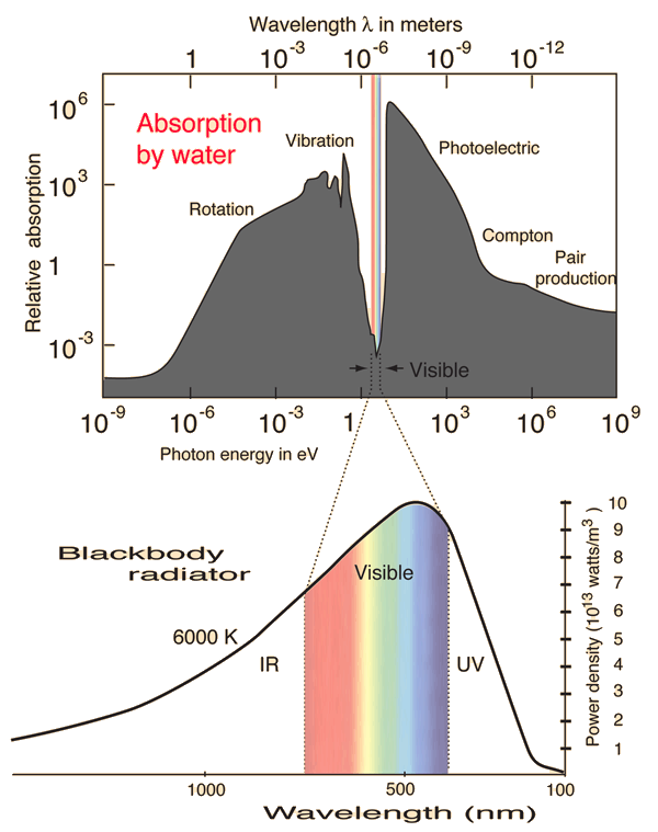
Light visible to humans is at the peakiest bit of the sun's black body spectrum, see here image here: https://i.sstatic.net/kRUju.png
Green isn't just the wavelength the atmosphere lets through the best, or the wavelength humans are most sensitive to, it's also the peak of the sun's black body spectrum.
I think I can see psychedelic aquamarine and the other cone primaries by closing my eyes and rubbing my eyelids while pressing in gently but firmly.
[1] https://news.ycombinator.com/item?id=813656
[2] https://web.archive.org/web/20160306132951/https://casa.colo...
I do not believe I have any kind or amount of colorblindness, so imagine my surprise when extremely confused I pulled the image into MS Paint, used the Color Picker tool, and found that indeed, the background has quite a bit of blue in it.
Anyhow, I cannot reproduce the illusion cited. For me the circle just blurs out and I start seeing orange.
I have a slight deuteranomaly. I did see the illusion. Pretty!
The RGB values used are also indicated in the filename.
What you are seeing (in the static image) is normal. Have you noticed that (0, 255, 0) looks way brighter than (0, 0, 255) regardless of your monitor calibration? For the same reason, non-red images can have quite a bit of blue in them while still subjectively registering as "green".
You mean this, right? https://dynomight.net/img/colors/generate.html?inside=ff0000...
The background turns green (???) eventually, kind of like as if ink started to spread across it.
Or you meant full yellow (255r, 255g, 0b) and full red (255r, 0g, 0b)?
> Or if you make the outer circle yellow and the inner circle green, do you see a red halo?
I used the controls this time and made the background full yellow (255r, 255g, 0b) and the inner circle full green (0r, 255g, 0b). Also adjusted the countdown speed, I realized I wasn't patient enough to wait out the 60s before ever (but that also it didn't need to be so long).
During countdown the entire image turned green. Whenever my eyes would move a bit, I'd see either a 3D shadow depth effect or a yellow aura around the circle. When the circle started getting smaller I just saw the yellow aura. Whenever I'd drastically move my eyes, the entire background would revert to yellow, but would quickly go back to seeing green.
I don't really see them being unusually saturated though, but maybe I just don't have a good grasp on what to expect. Maxed out R/G/B or C/M/Y all strike me as super saturated from the get-go.
For the first question, I see a green halo.
For the second question, I see something in between what you and blincoln see. The halo I see is definitely orange, not red. During countdown, the outside of the circle became greenish-yellow, but I could distinguish between the circle and outside the circle.
Did you wait for the black bar to finish, and the circle to start shrinking? Takes a very long time. The effect happens at the edges and disappears if you remove your focus from the center dot.
I have mild achromatopsia and can see the effect in all color variants I tried.
I also did the Farnsworth-Munsell 100 hue discrimination test, got a score of 28 on that - ideal being 0, and above 4 meaning something is amiss. So I don't really know what to make of this lol
Now either we both fluked it the first few times or these tests are genuinely not trustworthy. I find that pretty unlikely, but what I do think I know is that I do not have CVD after all.
This one seems to have worked for me: https://www.xrite.com/hue-test
Enjoy your forbidden color, you earned it!
> The idea for that animation is not new. It’s ~~plagiarized~~ based on Skytopia’s Eclipse of Titan optical illusion (h/t Steve Alexander), which dates back to at least 2010.
I didn't expect a strong effect, because the overlap between blue and red/green is so much less than the overlap between red and green, but bright purple is close to the opposite of what I expected. I'm genuinely puzzled.
It was also very intense, like staring into the sun. I observed this for both of the two default yellow tints that I could choose via the (Windows?) color picker
I have no idea why this would differ between individuals
Edit: link below with FFFF00 for yellow
https://dynomight.net/img/colors/generate.html?inside=0000ff...
I retried it first thing in the morning, in the dark, with my phone screen at minimum brightness, and no contact lenses in, and I got the expected result - vivid gold for my original setting, vivid yellow for yours.
After putting my contacts in, under medium ambient light, with my phone screen at medium or full brightness, I get the purple ring, but now that I'm looking for it, I can see an outer ring of gold or yellow as well.
The effects is much less pronounced if I put on my reading glasses (while still wearing contacts), so I think it must be an artifact of the contact lenses, probably in combination with the conditions they're supposed to correct (nearsightedness + astigmatism), as well as age-related inability to focus on tiny details with my contacts in.
https://dynomight.net/img/colors/generate.html?inside=0000ff... was suggested by another commenter.
But as I mentioned in a parallel thread, I think the effect is caused by an imperfect optical path. Without my contacts in, there's no purple ring.
Would it be possible to generate ones that _would_ work for specific kinds of colorblindness? Or is the entire concept doomed due to the specific way(s) that colorblind eyes are messed up?
I suspect, however, that those of us with deuteranomaly probably see a different blue-green than normal-sighted folks due to the bent color cones.
The real question is, what about the folks with Deuteranopia (no working green cones at all)?
Deuteranomaly, though, is still probably the best place to start since that's the big one that affects (some say) up to 10% of all males. Every other form of colorblindness affects a much slimmer percentage of the population.
I fail on the first page of the Ishihara (?) test. When using those colorblindness filters in photoshop/-like apps, the protanopia and deuteranopia filters do very little for me. No 'real' diagnosis. I can see red and green though, but the shape needs to be big, and the color should be quite saturated. Reading resistors is really hard.
Should work for anomalous trichromats (by far the majority of people with color deficiencies) but probably with less intensity.
"Folks with deuteranomaly have M cones, but they’re shifted to respond more like L cones."
I don't think this is true. What would the difference between deutan and protan then be?
"Why do you hallucinate that crazy color? I think the red circle saturates the hell out of your red-sensitive L cones. Ordinarily, the green frequencies in the background would stimulate both your green-sensitive M cones and your red-sensitive L cones, due to their overlapping spectra. But the red circle has desensitized your red cones, so you get to experience your M cones firing without your L cones firing as much, and voilà—insane color."
I think only people with missing L cone (Protanopia) or M cone (Deiteranopia) would not experience the phenomenon at all.
Maybe this could be used as a new type of color deficiency test?
Not to say the laser is a waste, despite the above I'd argue it's very useful. It lets us test how effectively the above actually works, and has other applications.
The laser system results in a stronger perceptual effect than you get from the illusion alone. We didn't have the technology to build it until recently. I'm certain the people who built it knew about the illusion, and it's probably what inspired the experiment in the first place.
How do you describe the experience scientifically? Do you get a whole bunch of extra colors you'd want to give a distinct name since they're so clearly different from the standard trichromatic colors?
Is a computer screen annoying because it can only produce a subset of the colors you can see?
Do you notice that you have a fourth parameter or dimension in the colors you see, so would want a 4th component in RGB, HSV, etc... color sliders? E.g. for our HSL, would the fourth parameter be hue-like, saturation-like, lightness like or some completely novel other thing? If hue like, do the hues also form a 2D sphere or torus like topology similar to how our trichromatic hue forms a circle?
I'd expect at least twice or 3x as many named colors, since for every regular color (red, green, blue, yellow, orange, purple, pink, grey, brown, black, white, ...) , you'd have a fourth dimension altering it that can be low, medium or high in value ...
E.g. for our yellow, you'd have yellow with not the extra signal, a bit of the extra signal or lots of the extra signal. Is this the case or not? Perhaps the overlapping reduces it, but as said in the article trichromats also have overlap yet we definitely see a lot more distinct colors than dichromats.
If you are bored, try to get Gemini/claude to make a color wheel for birds or tetrachromats.
An aside: Recently I learned that birds are reptiles. That hurt my brain and I’m still recovering. Especially since the modern dinosaur exhibit claiming this fact contradicted the 1980s era reptiles exhibit down the hall (both at the British museum).
For the site operator: the domain is present in the Spamhaus DBL (Domain Block List), which is presumably why these lovely gents are having issues, might wanna check that out.
But try to maintain laser focus on the central dot, not letting your eyes move or blink if you can help it. Once the black bar depletes, the circle should start shrinking, and around its periphery (like an eclipse) should be some incredibly vivid, super saturated colors.
We see with good resolution only a small part of our visual field. Perhaps the brain starts to "invent" what's there it we don't give it information by constantly moving eyes.
As a more advanced version, they say that fire kasina practice may produce very interesting visual effects.
https://en.wikipedia.org/wiki/Spring_green
I wonder whether there is a physiological explanation for this.
Yeah… it’s gonna be hard to distinguish those in the best of circumstances.