For many years now KDE has focused on polish, bug fixing and "nice-to-have" improvements rather than major redesigns, and it paid off.
I often wondered why desktop UIs became so terrible somewhere in the 2010s and I don't want to attribute it to laziness, greed, etc... People have been lazy and greedy since people existed, there must have been something else. And I think that mobile is the answer.
UI designers are facing a really hard problem, if not impossible. Most apps nowadays have desktop and mobile variants, and you want some consistency, as you don't want users to relearn everything when switching variants. But mobile platforms, with their small touchscreens are completely different from desktop platforms with their large screens, keyboards and mice. So what do you do?
In addition to mobile, you often need to target the browser too, so: native desktop, native mobile, browser desktop, browser mobile. And then you add commercial consideration like cost, brand identity, and the idea that if you didn't change the UI, you didn't change anything. Commercial considerations have always been a thing, but the multiplication of platforms made it worse, prompting for the idea of running everything in a browser, and having the desktop inferface just being the mobile interface with extra stuff.
You keep the UIs separate. Dumbing down desktop UIs to mobile capabilities is just as bad of a design as it was when people tried to jam a desktop UI into mobile. You have to play to the strengths of the platform you are on, not limit each one based on the other. Yes, it's more work, but it's well worth it to have a product which is actually good.
Who do you think has been "infected" by the "mobile" virus? KDE's only real competitor is way more keyboard focused than KDE...
[1] Hamburger menus are designed to make efficient use of a small vertical display where horizontal screen space is a limited commodity, which just is not the case at all for a large horizontal computer monitor. On a large horizontal display, they're a straight downgrade since you need to click the menu to see what's inside it, which makes action discovery harder. This click is also added to a lot of actions so they add more friction to almost all interactions.
Supposing I did, the only hamburger menus I can think of contain lesser-important functions of each app, like seeing the version/build number, or certain settings. I'm not sure I want something like a "See hidden files" ticker occupying screen real estate forever when I could just set it once in an accessory menu.
I question whether these critiques would evaporate if, instead of the three horizontal bars, Gnome instead used a gear icon or something, and turned their contents into a pop-up window rather than a popover element.
Perhaps the biggest problem with the hamburger menu is that there is absolutely zero convention for what you put in there, or in which order. You don't know what you'll find in the menu unless you click it. With the old top menu, there were a set of conventions for this; roughly where specific options went, and in which order, and even which hotkeys you'd press to activate the menus. This means that even in an application you were completely unfamiliar with (even hideously complex ones such as an IDE or 3d modelling software), you could fairly easily navigate the application.
It very much feels like we've fallen into the same trap medieval handwriting did https://en.wikipedia.org/wiki/Minim_(palaeography)#/media/Fi... -- building designs around what looks aesthetically uniform and cool rather than what is easy to parse and use.
And this is true despite the fact that a vanishingly small number of users actually use a touchscreen with gnome.
https://blog.prototypr.io/mobile-first-desktop-worst-f900909...
You asking this means (maybe?) that you're too young to have used the abhorrent default start menu of Windows 8, but yeah, forcing down users' throats the result of tucking what essentially was a mobile design into a 32" desktop monitor was the pure definition of "stupid decisions driven by marketing".
And it was not only OSes, too much of the web got "infected" with these design trends that are only appropriate for small screens:
But I do happen to enjoy having extraneous menus hidden. Why are they cluttering my screen and workspace when I'm using keyboard shortcuts anyway? I want to see my actual work, not some menu I don't need and will never click on...
Using a mouse to click on a bunch of tiny menus littered all over the place is horrible for productivity and screams "boomer"...
VDG tackled (and tackles) not only design for the desktop itself, but also for KDE applications that had never seen a designer's touch before.
I've been long a KDE user, even through the 4.0 troubles, but also the first to admit that it used to look clunky. Looking at old screenshots is a quick reminder of how far this initiative has taken it.
I love open source and have been running Linux since 1999, but my experience of contributing to both KDE and GNOME is your PRs never go anywhere unless you're part of the inner cabal of maintainers, otherwise any small bugfix or feature goes into bikeshedding mode, and it's the reason I don't contribute any more.
That said, I run KDE now after two decades of GNOME. It's pretty good and has been looking good for a while now.
For what it's worth, I'm not part of KDE's inner circle, yet the several PRs that I have submitted to them since I started using it (~2 years ago) have all been accepted. One was difficult to shepherd through the gauntlet of opinions, but was finally merged. So the process is not entirely impenetrable.
What's up with the massive amount of chrome used for nothing except new tab/copy/paste buttons? Is it really necessary to take up what could be used for 2+ extra lines of terminal output for a labeled Copy button? Compare it to gnome console, or any other terminal really, and you will get far more terminal output for the size of the window, as it should be.
And it's not just Konsole. So many KDE apps have this same problem. Giant labeled buttons taking up space from the actual content, for things you will never use or have well established keyboard shortcuts already.
https://mero.ng/i/lWMWazUP.png
The screenshot on the website has all sorts of optional bits enabled, and I would readily agree is not a good showcase.
The reason all those optional bits exist is because you'd be surprised who ends up using a terminal emulator in a general purpose desktop GUI used in many large IT deployments. E.g. a lot of folks who are used to PuTTy on Windows and want a little GUI for SSH connections, and for them this is the game changer.
The "try to show all the goods in your screenshot" mindset is really not a good one though, agree :)
> So many KDE apps have this same problem.
Right click any KDE app toolbar -> Text position -> Icons only
I also believe it's a setting in the System Settings.
Unlabeled buttons are a scourge, accursed and meaningless hieroglyphs
It's not, which is why the context menu gives you an "Icons Only" option, along with "Text Only", "Text Alongside Icons" (default), and "Text Under Icons". You can also adjust the icon size, or remove the toolbar entirely.
What context menu is this about? When I right click into the terminal area, my context menu has a grand total of... 11 items.
https://discuss-cdn.kde.org/uploads/default/original/2X/b/ba...
The root cause is that UX folks almost never use a product as often as their users.
So what's an "oh, left instead of right" minor change for them is anathema to someone with muscle memory.
Ergo, IMHO, all breaking UX changes should be required to clear a high bar, with the default being status quo + tweaks.
  - We now have a plethora of UX logging and can see real time where users struggle.

  - There are dedicated UX teams whose sole focus is to improve UX.

  - More people are using technology than ever, and so we have a more representative sample of data to work with.
  - Mimicking mobile UIs, as eloquently called out here: https://news.ycombinator.com/item?id=45290812

  - I suspect there is something of a race to the bottom WRT To UX teams; they're always designing around any pain point, which has a few knock-on effects:

    - There will _always_ be pain points, and so there will _always_ need to be UI changes.

    - Designing a product so that the bottom of the bell curve can use it well probably does make an objectively worse product.

    - There's nothing wrong with needing to learn a UI, and this "learning" could be mistaken as pain point.

    - UX teams can't exist if there aren't things to constantly change, which increases the UI churn.
I prefer what Windows 11 has done with settings being a simple two panel window with categories on left and scrollable settings on the right, with a search/filter bar at top. As you drill deeper you have a breadcrumb at top allowing you to see the levels you are in and click to go back up. This also allows space for descriptions of what each setting does. It could even be improved by allowing users to pin commonly used settings.
This seems overall more simple and cohesive compared to the old Windows control panel with icons and nested settings being popups within popups within popups. It also allows easier scaling and viewing depending on DPI, screen size, resolution, etc.
Super solid, <3 for the KDE team and product.
I looked at some Asahi Linux videos and it always shows KDE and the interface is Windows like (or what I call Windows like). I never liked that and that is single biggest reason I never tried KDE. I know it's Linux and KDE and GNOME can pretty much made to look like each other (i.e their default look and feel). Is it trivial on Asahi Linux or needs a lot of tweaking?
Something like what ElementaryOS would look like - look/feel/UX wise ElementaryOS has been my gold standard sine it released and the last I checked it still felt that way. But since anything other than what Asahi Linux installs and support by default, i.e. Fedora Remix, is neither recommended nor fares well on Mac so I don't think I can use ElementaryOS (which is essentially Ubuntu LTS) really. Even Asahi Linux team recommends KDE.
Also - can one access certain Mac folders in Asahi (e.g. ~/Pictures)? And is it even recommended, if it's possible (Security wise)?
(I have been exploring/searching on Asahi and I am gearing up to use it on my M1 MacBook Pro - will be using/trying Linux desktop after more than a decade)
> (I have been exploring/searching on Asahi and I am gearing up to use it on my M1 MacBook Pro - will be using/trying Linux desktop after more than a decade)
If you are still hesitating, it's actually really easy to try : just run the command on the Asahi website and follow the instructions. The setup will resize your partition automatically and will not touch anything of your macOS install or your data. It's even easier than on PC where you have to boot the installation media and manage the partitionning yourself. IIRC, there isnt even the option to remove your macOS partition at any moment so you can't even lose your data by mistake.
The only prerequisite is having free space on your disk and everything else is automatic.
Also, uninstalling Asahi is as easy as going to macOS Disk Utility App, right click on the asahi partition, delete, and resize the macOS partition. After those three clicks, your Mac is now in the same state than before installing Asahi.
You cannot access any of your Mac folders in Asahi. Your Mac partitions are invisible until you reboot into MacOS.
Some potential workarounds:
1. Use Syncthing to sync your Pictures folder on both operating systems to an external Mac. This of course duplicates the contents of the folder on your Mac/Asahi SSD, which is wasteful.
[Note: Dropbox does not work on Asahi Linux because it only barely works on x86 Linux and it has never worked on Arm Linux.]
2. Use an external USB or SD drive for files you want to share. Needs to be formatted in something both OSes can read/write (e.g. not APFS).
3. Use Paragon's $40 extFS which lets MacOS read and write to your Linux partition. Supposedly; I haven't tried it. This only solves half your problem: It gives MacOS access to your Linux files but not the reverse.
https://www.paragon-software.com/home/extfs-mac/
What's really needed is a way to mount APFS partitions from Linux, and I plan to DDG that as soon as I finish typing this...
UPDATE: APFS FUSE seems to be recommended, although it only provides read access to your APFS partition.
https://github.com/sgan81/apfs-fuse
4. Make a brand new partition on your drive for shared files, and format it exFAT. MacOS can read/write exFAT natively and Linux can usually be made to do so, although I haven't tried it yet on Asahi. This seems to me like the most promising option if you don't want to depend on an external drive.
KDE generally functions how you expect. For example, a bunch of FOSS hippies somehow managed to create a control panel (system settings in KDE parlance) that's easy to use and navigate, and Microsoft still haven't accomplished that despite trying for over 10 years at this point.
Also, I can dock my task bar to the side, like God intended.
It feels exactly like the KDE website itself: https://kde.org/
That being said, KDE is very usable. I just wouldn't claim that it looks more professional than MacOS. I'd love for that to be the case but it just isn't.
those misleading hype statements are the reason why stuff like "this is the year of the linux desktop!" is a meme because anybody outside of your nerd/tech bubble will just look at you like you're insane.
That's just one detail, but it shows a consistent eye towards the user that feels missing from kde. It feels like they aimed for "floss version of windows usability" and stopped there.
You'll find those people also in these comments :) Can't please everyone, which is totally fair and expected.
I don't say you can't produce things on smart phones, it is just a more restricted environment with things dumbed down, partly for reasons of target demographic, partly for reasons of screen size.
And thus the rise of mobile incentivizes companies ever so slightly to make the desktop more like their mobile counterpart.
In this space open source operating systems (or desktop environments) can be totally uncompromising. They don't need to nudge you into spending money/attention in places that are not in your interest. They don't bolt everything down and pretend to know better than you. In short, they treat you like an adult (producer) and not like a child (consumer).
And that is refreshing.
KDE is nice looking to me. MacOS previously had a huge advantage because of fonts rendering. It's probably still a bit better in this regard, but the difference shouldn't be that noticable today.
It still has weirdly inconsistent margins in places but compared to the disaster that is the jumble of different UIs in Windows that's nothing.
macOS before Tahoe, sure, but now? Have you looked at the screenshots where people layered different fullscreen apps on top of each other and the rounded corners look like a stack of cards because they're all different? It's a complete disaster.
You could power all those fancy new AI datacenters with Steve's spinning skeleton.
All the while they develop and push a product that screenshots what you are doing so that AI can "assist" you. Not to mention pushing ads and news and free to play games.
Maybe the margins or icons aren't what you'd prefer, but you're being intellectually dishonest pretending that there is any uniformity in their product let alone even a single iota of care or interest in the experience the user has with their product.
Reality is... often-times the best things are often unused. And if these things were hypothetically used... there'd be significantly less complaints than the status quo.
It's sad because I really like the aesthetics and user experience of the GNOME desktop and its applications. However, the inconsistent user interface for non-GNOME applications is becoming a deal breaker as more of them transition to Wayland. These applications have no choice but to create their own title bars and other UI elements, resulting in a mishmash of different looks, controls, and fonts. Many of them don't even include shadows around the windows because they aren't sure if they should. As a result of all of this, many third party applications look hideous on GNOME.
As much as I want to continue using GNOME, I'm increasingly drawn to KDE with each passing day due to this issue. I rely on applications like Kitty Terminal, mpv, and WINE. They all suffer from this issue on GNOME, but not on KDE. Ultimately, if I have to choose between a desktop environment and third-party applications, I will prioritize the applications. I think many others would do the same.
IMHO the 'desktop environment' is supposed to get out of your way. I'll admit that sometimes having a widget that makes it "easier" to connect to random wifi, or bluetooth devices is handy; but that depends on your use-case.
My hardware changes once every 5-10 years, and I never use bluetooth so these features are not helpful to me.
https://raw.githubusercontent.com/thiagokokada/blog/main/pos...
After Plasma 6 dropped, I decided to try it, and it quickly became my favorite Linux experience. Coming from GNOME, I was pleasantly surprised that many GNOME extensions I would rely on had equivalent feature functionality built into KDE (things like a Dock, Clipboard Manager, KWin Scripts, Tiling/Fancy Zones, animation configuration). I can pretty much echo everything said by the blog author here. (EDIT: Not to mention that so many of my GNOME extensions would break in between upgrades, or crash regularly, meanwhile KDE has been rock solid for me these past 9 months).
I still think GNOME is slightly prettier, but KDE is infinitely more usable for me.
One minor thing I love is how the old-school wobbly windows, desktop cube etc are still something you can toggle easily.
This is not only plasma, but all the applications are top-notch quality. Just to name a few: Krita, Kate, the office suite.
Apparently, recent KDE versions are actually one of the lightest resource DEs available, which has been great.
I'm not sure what you mean, but if you're referring to the startup splash screen (which I also hate), you can just turn that off in system settings.
Gnome is configurable, but in a way that isn't really well integrated. It seems buggy to me, but I think it's because my preferences aren't standard.
For instance, I like having my dock on the left, and I like top bar stuff to be in the dock, so the dock is the only thing that can take up screen space, and I like the dock to disappear when I'm not using it.
Simple, right? Can't do it in the regular configuration. Can do part of it in tweaks, which is a separate configuration app, but then some of it requires extensions. So, that's 3 places to go to
What's it called when hiding complexity makes it more complex?
So, that gets me there, but then the dock fails to hide half the time on zoom calls. And when I unlock the screen, I can see the empty space where the top bar used to be for a quick flash before the full sized app window goes back to where I left it.
So far, I don't have those issues with KDE. I don't like the annoying and krappy branding with the launcher icon and more than half the apps having a K in the name, but you can change the launcher icon and use whatever apps you want.
Fun fact about Linux "docks". The reason why they can't do the exact effect Apple uses to auto-scale their dock on mouseover is that Apple patented that particular effect.
So I guess you just have to live with it, but consider it a way to honor the original contributors who build all the K(DE)-versions of the common apps
I'm not sure why you think requiring extensions is a bad idea. I have tried out at least 20 GNOME extensions (and kept maybe a third), and I appreciate the flexible underlying architecture to allow extensions to flourish. With extensions, the same GNOME can have Windows XP style taskbars or Mac-style docks or i3-style tiling or anything in between.
Certainly it would be a more refined experience if the core developers took care of every single possible customization users could want under the sun, but at some point it's more effective to outsource that to other developers. Either that or you end up with Apple-style highly uncustomizable experience designed by a UX designer, which is not what I want.
Extensions are a pragmatic choice.
Making one is more work than what I can do from basic configuration settings in KDE. I want to spend my time on other projects. The marketplace suffers from the same problems as most marketplaces. Plenty of unmaintained extensions. No guarantees of quality. Now I need to do research on extensions instead of just changing a configuration setting.
The existence of extensions allows gnome devs to figure they don't have to support basic features because someone will make an extension for it.
Extension configurations don't live in the same place as standard configurations.
The experience is fragmented and has friction.
This makes them incredibly powerful and flexible... but also fragile. Extensions can crash GNOME Shell/mutter. On Wayland that means your entire session goes down with GNOME Shell. Extensions can interfere with each other, and if you are an extension developer, you may need to update (or at least check) your extension every 6 months (GNOMEs release cycle).
AFAIK Gnome extensions still doesn't have a stable API, so this issue is still present today.
After 7 years I was fed up and switched to KDE and never looked back
What's the point of this? People should just use the real Arch Linux.
Apart from that, the DE and configuration options are miles away from windows 11 to be honest, and will probably go the KVM+passthrough route when I upgrade my desktop to keep Windows for CAD work, etc. Even Windows' Explorer is egregiously clunky nowadays and will break features like previews on its own and hang all the time.
These days, I daily drive Niri and love it. I love the workflow of a scrolling WM. I love that I can configure it via a single text file in the standard configuration directory, I love how lightweight it is. It’s just about perfect for me.
It may have, yes!
One of the ways we run the KDE community is that we have an annual process to elect community-wide goals, which then have their own leadership team, infra, budget, etc. The goals themselves are long-running, i.e. it's not one year and done, either.
In about 2020/21 one of the goals that won/was added was titled "Improve Consistency across the Board", which lead to e.g. a comprehensive update of the HIG, renewed efforts on the controls library, and many cleanup passes across the products to get them up to date and in line.
It's an ongoing process and I'm sure plenty of people can still point to a pet peeve or an ugly corner - we're happy to have discerning users with high expectations - but the general state of things should be much better than half a decade ago.
There's also a next-gen styling/theming system project called Union in the works along with a next-gen design system developed in collaboration to take things to the next level in a few years, but we're taking our time to get it really right instead of pulling a Liquid Glass (one lesson we've learned through the years is that clawing your way back from reputational damage is really hard, and compromising on release quality is never the way to go). You can see annual updates on this e.g. in the feeds from our flagship dev conference.
But I don't mean to trash KDE. Some people don't care about that padding or visual layering or whatever but do care about the extra options and features. At the end of the day, I'm just happy that we're on a platform where all these approaches have their space and people can chose and build commnities that grow tools that adapt to their own sensibilities and needs.
KDE is great, Gnome is great, free software is great. Mac and Windows are hell.
KDE tends towards pragmatism, discoverability, and customization over simple and flashy. The developers don't assume their users are simpletons who will get confused and run away if they encounter a checkbox they don't understand. They understand that many of their users are advanced tech-enthusiast "power users" just like themselves.
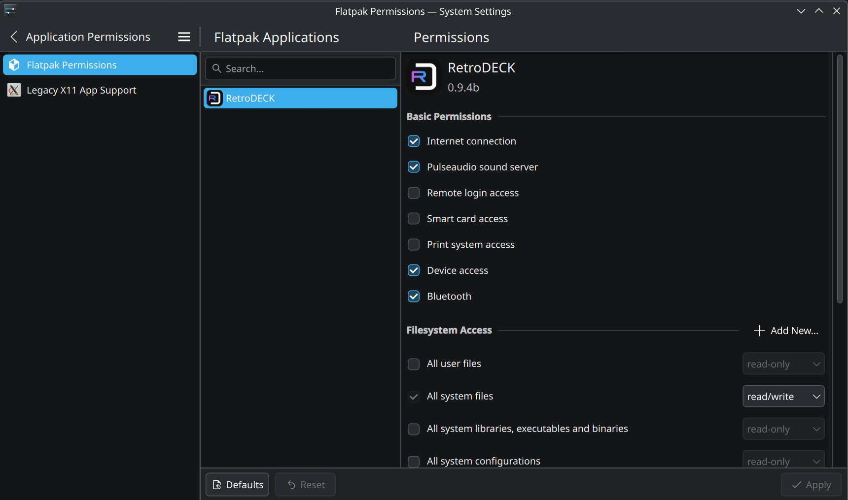
I will say that the permission editing is (as you can also see in the nav bar there) a few levels down digging into menus, and if you go into those kinds of corners of other systems the UIs often tend to start looking a bit more "developer-y". E.g. check the analogous bits of Android, and also MacOS has a few things like plist editor windows and such where you're suddenly well off the consumer track and into unloved form-shaped things. It's a bit like the backrooms.
But that's not meant as a defense or justification!
In fact blogs like this and lists of warts often help us. If you play fly on the wall in some of our channels (e.g. the promo ones), you will also often see people doing the legwork of parsing reviews and ticketizing criticisms. We try to listen quite actively because if someone dislikes a UI they're most often right.
The most important thing is that what's bad today can in fact be good tomorrow, especially if you don't get defensive about it.
What a great way to put it. I wish software developers of every product would feel that way.
And also thank you for all the hard work, to you and the team!
(this wasn't my main reason to switch from Gnome though, I just couldn't stand the random design decisions in each Gnome update anymore, and generally Gnome never really clicked with me the way KDE immediately did - which is also strange since Gnome is supposed to be the 'Mac desktop clone', while KDE is supposed to be the 'Windows desktop clone' heh)
KDE does have a lot more similarities to Windows but saying it's a clone might put the wrong idea on peoples mind when they transition from Microsoft's system.
But enough about Mac OS Tahoe!
Apple should at once hire the people who are responsible for Gnome's UI, because they've got it figured out. Even better, put back together the Nokia N9 GUI team.
macOS is nearly the opposite in this regard. I wouldn’t mind giving it a facelift but doing it GNOME style would mean it losing much of what has kept many users on it.
Often it functions as a “do this for everything” modifier. So for example, option-clicking the minimize traffic light minimizes all windows from the application the window belongs to, and option-clicking a disclosure triangle in a nested list expands or contracts all child nodes.
There’s tons of little things like that which might sound silly but become significant time and sanity savers after making a habit of using them.
I'm a regular Linux user, but I wouldn't know how to get all the data from the Wi-Fi applet using the Command Line. GUI have the advantage of discoverability over CLI: with a GUI I get a bunch of useful info in a single place, with a CLI I first need to know that a data is available and then I need to look-up the right invocation to get this data.
Let them cook!
There's many things to not like with Gnome, but they've got the user interface figured out. Contrast is correct both in light mode and dark mode. Readability is excellent. Margins and paddings are consistent across the board. Buttons, checkboxes and other gizmos look exactly as they should, with subtle shadows and 3D effects. Border radiuses are consistent and not to large.
Icons are not great, but that's the same on all desktop environments now. OS X had great icons, but that age is over.
And since they have all the important basics correct, it is trivial to fix any short comings in the UI. The team deserves praise for what they've achieved.
You're sabotaging hard your own messaging with comments like this.
There are many cruel and pugnacious creatures here.
Indeed, it's best to remain indifferent, lest... behavioral modification ensue, and one become strange.
It looks amazing and feels super snappy, I have never had such a painless Linux desktop experience. It even has a tiling window manager functionality built-in that was enough for me to sway away from i3/sway. But it also just works like a normal desktop that a non-technical user can use with ease.
https://bsky.app/profile/system76.bsky.social/post/3lylz3cfy...
Not sure about Cosmic, but both Gnome and KDE support HDR these days. Hyprland does as well and I think support for it was also merged into Sway recently.
Still a little on the ugly side to me, but KDE is really what you make it. Quite literally everything about its UI and behavior is tweak able in settings (and unlike gnome, KDE provides a GUI for all of these settings...no hunting around in dconf).
I used to prefer macOS, and still do to an extent, but Tahoe does not give me hope and I'm using my Linux laptop more and more. UI inconsistencies bug me, but Tahoe is full of them, so if I'm going to have to deal with it either way, might as well go Linux.
[0]https://raw.githubusercontent.com/thiagokokada/blog/main/pos...
I agree. Something looks off about it, but I can't put my finger on what. It's the empty space? The fonts? I don't know exactly.
Actually, the only situations where I think about it is when I'm driving a mac or a win and the window management gets on my nerves, although I'm generally a pretty chill guy.
desktop: https://s3.whalesalad.com/images/hn/debian12.png
code setup: https://s3.whalesalad.com/images/hn/vscode2025.png
Hahhaha, absolutely classic linux on HN post. Couldn't be better written satire.
Except that I guess you at least acknowledged it. Which non-abandonded OS/DE hasn't significantly changed in 5 years? I can't think of one. Maybe GNOME, but they were early movers and everyone hated them for that.
IDK mate, I care more about the utility than the looks since I spend my time using the DE, not hanging it on my wall to admire its artistic attention to detail.
Like I'm sure those inconsistencies exist, but am I the only one whose brain just filters them out like they just don't exist? Kind of like how your brain filters out your nose from your eyesight and you only become aware of it when you look for it.
And to me and my use case and formed habits, utility wise KDE >>> Gnome by a wide margin, though KDE still has some annoyances I wish they would tackle, but for a free product, I can't complain.
None of that really matters compared to usability and functionality. Most of the time I have one panel showing and everything else I can see is applications. The applications are a mix of things anyway.
Obviously a lot of people don't care as much - KDE is a popular desktop!
I don't think you read my comment properly because that's not what I said.
Where KDE is better than Gnome whose UI looks like its was designed for tablet use or 4K+ displays. So yeah, on that front I do care, which is why I prefer KDE.
Reminder that its built-in browser Konqueror debuted the KHTML rendering engine circa ~1999, which was then forked to become WebKit, and now (including all subsequent forks) powers something approaching 90% of web views globally. Pretty amazing!
It's a very complete package, it has a quick launcher that's good, a good screenshot tool and very very nice window management features.
When combined with libinput gestures, you can get macOS style three finger swipe between desktops. And not just a swap, but a nice swipe animation that pauses when you do on the touchpad.
On a laptop, this is such a big timesaver.
Its bottom bar icon handling is very good, customising is easy, and the settings panel is very clear. Everything is just so polished.
Then there is kde connect as well, it integrates so effertlessly. Kde is truly a software powerhouse, well done.
After half a year I'm still not as fast as with sway, but getting there. Things that were hacky with sway and macos (external monitor, screen share, Bluetooth, vpn) just work out of the box.
But yeah, it's not as pretty as gnome or macos.
What kinds of things are you talking about?
These days I feel like all of the major desktop environments are good enough. 95% of what I do with them is launch applications and move or resize windows and that’s easy enough on all of them.
On my work macbook - I can't install third-party software and the default window management is just not there. It has problems restoring windows to correct size when i switch external monitors... The experience just isn't as nice as KDE on my home laptop.
I had to install inputactions to get mac like touchpad gestures on my home kde set up but after that it just feels nicer and smoother than my office mac
But that doesn't work anymore since a while (I guess due to SIP).
On windows you have to click the icon before you can interact with it. IIRC on Mac too.
Not anymore! This changed in some win11 update I can't remember, but I recall celebrating this improvement.
However, this being windows, of course it's half-assed. This works with the mouse wheel but not by scrolling the touchpad (as of up-to-date 24h2).
I've used a variety of environments extensively (Windows, macOS, KDE, GNOME, Xfce, i3, dwm, you name it) and this is basically the one feature I find myself regularly missing from another environment.
Can you explain more about this?
You can also use links between most apps, documented here: https://github.com/bhagyas/app-urls
And drag and drop files and stuff onto and between apps, etc.
Having said that, it's a marginal difference. KDE is on my kid's computer and I use that from time to time without imploding in a ball of emotional-intellectual panic.
Even during the difficult transition from KDE 3 to KDE 4.
I really like it. Complete customization and control.
A few months ago, I added some basic features to Gwenview; for the first time, I was able to give back to the community.
(I think this bug is still present in X11, but I've moved on to Wayland.)
The other bug I run into constantly is that "exposé" sometimes makes all the windows invisible. The only fix is logging out and logging in again. I've seen this across a number of different distros. Gnome is mostly boring and just works for me.
If it wasn't for Mac laptops insane battery life, performance, quality of build and trackpad, and amazing wake/sleep handling. I'd be on a Linux laptop using KDE.
> However, KDE considered my TV the primary desktop and put the task bar only in that monitor, and even disabling the TV didn't add the task bar to my monitor.
You can order the screens however you want; the first one will be considered primary.
It selects the first screen just as a default.
I always want the taskbar on every screen personally. I think that'd be a friendlier default, but since it's KDE it's at least not too hard to change, and everything is configurable down to fine details
I have a LG TV C1 that behaves like that. While my computer monitors do not have this issue.
The TV even has a dual personality. It doesn't appear to report the same informations via EBID when powered off vs powered on.
I also have a MS Windows 10 connected to this same TV, and if I make the mistake of powering up or wake from sleep Windows before turning on the TV, then the NVIDIA GPU setup some broken resolution. And only a reboot fixes it.
So my guess is it's the TV presenting itself with different EBID when off vs powered on. And also somehow presenting itself as active on the HDMI line no matter if off or on. Changing the TV inputs also doesn't tell KDE that the display was turned off.
I haven't debugged any of it. These are just my observations.
I love that KDE is filling a niche that Gnome has left. I love Gnome too and their direction is valid as well, but I think it's UX philosophy has contributed to KDE's popularity.
The day I discovered KDE is the day I switched to Linux as my main OS on desktop.
It works, it's functional, it's a bit _nerdy_... Exactly what I want in a DE.
Meanwhile, Gnome always felt like a low-cost version of MacOS.
I'm glad we have options so everyone can find what they are looking for!
I'm just mad at myself for not finding out about KDE before. It's 100% on me.
Unfortunately, what I found was once you added plugins and themes and this and that, there was too many breaking changes when considering the whole UI system. This is not really a technical fault of KDE devs themselves, but it turned into something akin to managing a node.js project. Yes I know it you use less plugins it's better, but I want both: plugins as well as pixel perfect consistency.
I found similar issues in gnome, where it's even worse since the DE itself pushes tons of breaking changes. Note that I consider even a settings menu reorg as a breaking change.
I finally settled on XFCE, where for years now, nothing has changed. Not even one pixel. The menus are the same, the search results come in the same order so I have muscle memory like "<text> arrowkey arrowkey enter".
That's my expectation from a DE. I basically have the entire desktop byheart. And this culture seems to extend to the plugins as well, for example the various xfce4-panel plugins I use have all been pixel-perfect equal for years now. My themes and what not have never broken on me either.
Windows up until 10 also had similar properties, I had a crap ton of plugins with rainmeter, 10k+ LOC AHK scripts, etc, and nothing ever broke.
I also like that the shared library disease isn't that high in XFCE-land, in KDE installing something needed too many common k-* packages. I understand KDE gives a whole suite of apps so it might be necessary, but this also meant that I cannot use KDE apps even the ones I liked, on another DE without also getting... kwallet or something iirc.
The thing I miss the most from KDE is wobbly windows. I would kill for that feature, but unfortunately, I don't think I would tolerate breaking changes for that feature.
One killer feature is KDE Connect. Saves me from having to grab my phone when I need to copy an SMS OTP code. It's similar to Phone Link on Windows, minus the privacy violations.
The only desktops I've used since 2007 are XFCE and macOS, so I guess I don't know what I might be missing from KDE or MATE. But XFCE absolutely blows macOS out of the water, so at least I'm not missing anything from that alternative.
My goal was to have my own setup without "bloat" I never used. So my own task manager of choice, my search bar of choice, etc.
My initial impression of xfce was that it was much snappier than kde. My main gripe with xfce was the lack of wayland support.
A big personal issue; while my own custom setup was ok, I still had to maintain it, and I found myself trying to make xfce like kde. So might as well use kde I guess.
Another super specifc thing I missed was that its window manager didn't support defining horizontal gradients in the titlebar, so I couldn't rock a true windows classic theme. It could do vertical gradients, but that's not the same.
Now I'm back to using KDE.
I switched from X11 and LXDE to Sway and had a good experience. But Sway was my slippery slope to labwc.
E.g. the machine we optimized for during at least one or two Plasma dev meetings I remember was the original Pine64 Pinebook, which was a very under-powered device. We had a stack of them to hand to devs. Intentionally as a "if we can get it to fly there, it'll fly anywhere".
So it's not just that we haven't gotten worse, we also did get legitimately better in later releases compared to some of our porkier ones (which also did exist).
XFCE isn’t as polished as KDE, and I do miss some features, like KDE’s excellent network applet that shows detailed statistics. But overall, the experience has been good, and I really appreciate how quickly I can unlock the screen after a pause.
I also enjoy the wide variety of themes. KDE has plenty of impressive dark themes, but very few light ones, and most of those fail to clearly differentiate the active window’s title bar from inactive ones. XFCE does much better here.
(Some people point out that XFCE doesn’t work with Wayland. That’s not an issue for me. My time with Wayland was highly frustrating, primarily due to the unreliability of keyboard layout customization. After months of struggling, I went back to Xorg and good old xmodmap.)
I'm concerned about the XFCE team's approach to Wayland, which is to say they are not making any commitments to make a stable release for it. I've already had to take my new Debian install back to X11 to get XFCE working. I know that Wayland is contentious and not developed with clear communication with many DE teams, but the drift here is concerning, and I am considering trying to find something XFCE-like with full Wayland support.
I actualy liked Ubuntu's Unity, and the move to GNOME did not made me an happy user.
As someone that used Gtkmm during the GNOME 1.0 days, the way current GNOME works and the overuse of JavaScript made me look elsewhere.
XFCE was good enough for me (I am old enough to have used twm), and looks rather nice.
For a daily drive DE though, it may be too minimal?
I get the idea of a desktop environment offering more consistency. But, my system feels very consistent. It is really easy, because there are only ~4 types of windows: Firefox, Evince, a terminal, or some ephemeral matplotlib graph.
I wouldn’t think of it as missing out on anything. You just become familiar with the ecosystem of mostly terminal utilities.
Though, my monitors are also from 2010, so a lot of the visual problems people have with XFCE, I don't.
It lacks tiling, and I use some KDE apps very heavily (Kate, Dolphin) so KDE integrates a bit better.
I have thought of giving XFCE another go and I do not think there is anything critical I would miss if I had a tiling window manager (which would have some advantages over KDE's tiling, I think), but I have KDE configured in a way that works for me so not very motivated to do it.
But I'm worried we're being left behind with the shift to Wayland.
Maybe that is unfounded.
I'm keeping an eye on XFCE and they plan to release Wayland support some time this autumn. Once this is somewhere near stable, I thin I will switch back again to XFCE.
Everything is sooo small on my 16" notebook and when I zoom it gets blurry.
I run KDE Plasma on my laptop. KDE animations are too bloated and heavy for the Rock64, and there's way too many preferences to fiddle with to disable them all. If there was some kind of global "lightweight mode" checkbox in the plasma prefs, I might give it another try.
LxQT is fine. The main gripe I have with it is there's no sort of LxQT-meta package on ArchLinux which installs everything I actually need without a lot of fiddling. I spent a couple weeks just gradually figuring out things were missing that would make the environment a lot better. It would be nice if it just included things like oxygen icons and whatever. I understand lightweight, but they should have an "opinionated" lightweight option since I just want something that runs well on a SBC.
I used to run XFCE on an arm chromebook for a few years as my daily driver. Between the two, XFCE seemed much easier to install/customize. IDK about now, since that was before the latest release which uses latest GTK. I assume it is less lightweight now as a result of that change.
hadn't used linux in a desktop environment since college, but installed KDE Plasma on my old laptop today. It's so good
might be enough to finally make me take the time to at least dual boot my desktop
I have to say I am really impressed with KDE, and the large selection of decent applications. I'm new to linux desktop, but I already hope that nothing changes, because to me it already seems complete.
The best part of the experience is feeling like I own my computer again.
Now it is definitely my preferred Linux desktop environment as well.
I remember the one that finally made me stop using KDE altogether and migrate to Gnome 3 at the time was one crash that I would get frequently with Dolphin while randomly browsing fils (that would stop once I removed all Dolphin configuration files but go back after a few weeks).
So I'm not sure whether it's try that that caused a bad reputation that sticks around to this day. (I have other reasons for not preferring it.)
True, but frankly, KDE team repeatedly said that 4.0 to 4.2 is considered beta, and not production ready. I'm also coming from 3.5.x days, and just waited for KDE to mature a little before jumping 4.x bandwagon, and I'm still on KDE.
Maybe, we, the users shall read the announcements with a keener eye.
It is safe to say that many other projects have not done beta .0 releases like that because they don't want the same to happen to them - even though they really need beta testers. Of course few projects will admit that they learned the lesson from KDE.
Oh, this is so true. Ubuntu adopted Pulse Audio long before anyone (including Poettering) considered it stable. IIRC the readme even said something like "The sound system that breaks your audio"
I probably shouldn't complain though, since as a non-Ubuntu user, I get the benefits of all the Ubuntu users beta testing software for me.
Yeah, I remember that turmoil, and was really sad for all KDE devs.
> It is safe to say that many other projects have not done beta .0 releases...
This was a brave move by KDE back then, and still a brave move, but with proper communication, it can be done, I guess...
KDE developers and volunteers embody a great trove of wisdom about software development. I learnt how to make proper bug reporting from AmaroK project, and still use the same methodology, even with projects which do not enforce any style. It makes things much easier. ...and everyone needs beta testers. That's true.
It states the following:
    Some of the more obvious issues are listed below. If these issues are important to you, you should stay with KDE 3.5 (KDE 3.5.10 was released in August 2008) until KDE 4.2 is released (scheduled for release in January 2009) when most of these issues are scheduled to be resolved.

    It is possible that distributions will work around some of these issues before distributing to users.
[0]: https://community.kde.org/Schedules/Is_KDE_4.1_for_you%3F
I'm glad the wobbly windows desktop effect has stuck around too: absolutely unnecessary, but it's silly and fun.
My biggest complaint has nothing to do with KDE itself, but the fact that GTK apps are so ugly by default. QT apps look fine in GTK desktop environments though. (At least KDE has easy built-in settings for handling GTK theming these days...I remember it being more of an issue a while back)
Gnome looks nicer, is more coherent, and in my experience, absolutely rock solid. Everything works out of the box. Trackpad gestures, touch, touch gestures, multi monitor support, HDR now; everything you could think of.
Gnome also is opinionated, whereas KDE still feels like the ghost of Windows XP combined with random things Linux nerds claim to want...
Qt is LGPL and has been for literally decades. LGPL is fine.
> and drama with the commercial entity that does a lot of KDE development.
Kdab? I have no idea what you're talking about here.
> Everything works out of the box. Trackpad gestures, touch, touch gestures, multi monitor support, HDR now; everything you could think of.
Hasn't been my experience, and also "everything" is simply a lot less than KDE. For example most of the network settings are not available - you have to use some third party app that isn't installed by default (`nm-connection-edit` or something).
Notifications are also awful in Gnome. They are the same colour as the background so difficult to notice (I had to end up editing some random CSS to fix this), and they disappear if you just mouse-over them. No history. I missed so many meetings.
I'll give you that Gnome looks nicer. KDE has improved a lot but it still has some amateur looking parts. But it's just so incomplete!
There's only one fly in the ointment: Gnome's onscreen keyboard is both terrible and difficult to replace.
I still prefer it over KDE on my 2-in-1/convertible laptop, though. Despite the jank it also irons out a lot of the pain points that more traditional desktops have with touch, and is clearly made with it in mind, even when the execution is iffy.
Using phosh on a starlite btw. Web players work well however! No thanks to gnome.
I'd like it to have more punctuation and special characters available as long presses on letters, and for it to have a terminal mode with arrows, tab, ctrl, etc....
This comment was typed on plasma-keyboard.
We have an experiment for the "extended layout for tablet mode" bit parked somewhere, stay tuned.
I'm sad because I am stuck with the requirement that all my computers can be accessed via remote desktop (e.g. RDP) in addition to SSH. And I also have to have 3-4 monitors per machine, so I can only use Wayland.
Thus, I am stuck with GNOME on Linux, because no other desktop environment (including KDE) yet has functional remote desktop on Wayland. (Where by functional, I mean equivalent to Windows/macOS where you can log into the same session that may or may not be already running locally.)
I know only 1-2% of users have my problems (^_^) but I just mention them in the hopes that KDE will keep developing krdp and make it work well enough to compete with GNOME and Windows on that axis...
The laptop isn't running Linux yet, I'm not confident the battery lifetime story is great.
But, I settled on KDE as well. Gnome just wasn't configurable enough. There were a number of rough edges that I couldn't find a setting in Gnome to fix, so I switched over.
I'm running zfs on root, so I can have snapshots (every 5 minutes) and incremental backups to my NAS, also running zfs. Using zfsbootmenu. Which was interesting to set up, I learned a lot more about UEFI, framebuffer drivers, kexec kernel handoffs etc. than I ever expected to.
Depending on the laptop, you may be surprised. My HP EliteBooks (800 g8 series, AMD and Intel) are an absolutely better experience on Linux than Windows, it's not even close. I'm thinking specifically about sleep, of all things.
The other day, my 2020 845g8 (amd) laptop crapped out during sleep while on windows, but was not actually dead, since it was hot to the point that it heated a different laptop which was lying underneath (a 14" mbp, so a pretty chunky piece of metal). I had to forcefully power it off. I was under the impression that some windows or driver update had fixed this, but apparently not. This never happened on linux, ever, which is my main os for this particular machine since day one and I never turn off the laptop, only reboot it for a kernel update. The Intel one is fairly reliable on Windows, but it did crash a few times (garbled screen).
Battery life on the Intel model is better under linux (around +25%). On the Amd I can't comment, since I rarely use it on windows, and basically never on battery.
At the office I have a 27" 5k screen which I have to use at 200%. Windows is basically always a blurry mess for some reason, although it recognizes the correct resolution. The only way to be sure to have sharp output is by booting it up with the screen attached. Which then goes to hell when the screen shuts off (think going to the toilet). Wayland on Linux (sway / arch) just works and is always sharp.
I also can basically not connect my sony bluetooth headphones when running Windows. They connect instantly with LDAC under linux.
After some tweaking of the key bindings, I managed to make it behave very similarly to COSMIC.
How does the auto-tiling compare to COSMIC? Does it support stacked tiling (ie tabs)?
Something I use a lot on xfce4 is the Alt-F11 shortcut (it toggles) that maximises a window over the bottom bar and removes the title bar.
In this way, with LibreOffice or say Inkscape I get the application menus at the top and the applications controls at the bottom of the screen. No hotspots - nothing pops up.
On Fedora's live KDE iso I can use the window control menu to supress the title bar on a maximised window and I can hide the bottom bar but its a faff requiring multiple steps.
Myself and my family are running Fedora's KDE edition. The Fedora team has a long history of working very closely with the Plasma dev team, quite actively contributes upstream, and I haven't been disappointed. I'd vouch for this one from first-hand experience!
We also have a new project to produce a distro of our own in the works, called KDE Linux. That has recently had its first alpha release. It still has some real feature gaps and may not serve you well if one of the missing bits is something you require, but it's definitely worth looking into. It has a lot of next-gen ideas baked and some things we got to learn during the SteamOS effort, and think it has a place in the ecosystem.
In the dev community I generally see a lot of people running KDE on Arch, Debian and openSUSE as well.
Personally I've had an issue with KDE on Fedora several years ago, possibly due unstable Wayland, but I don't know real reason. Something in the graphic stack failed. So that was a reason for me asking about it.
The company stuff in the background doesn't really matter.
The team working on KDE Linux are motivated by addressing some structural challenges that always plagued KDE Neon from the concept of trying to graft more recent SW on top of the Ubuntu LTS base, plus some lessons learned from the SteamOS project's way of handling updates, and fully utilizing more recent Linux/systemd features.
It's sufficiently different that sticking with the Neon brand and swapping it out for that userbase would have been pretty disruptive, so they felt it was better to go with a distinct identity.
edit: According to AI, LTS is not provided. Was my AI answer accurate, and if so is there consideration of an initiative to implement an LTS channel?
We did in fact have versions marked as LTS in the Plasma 5.x generation, but the concept never quite worked that well practice (e.g. because distros generally shipped newer versions based on user demand and didn't really adopt the LTS releases, even for their own LTS distro releases, so the benefit calculation for them was different from your expectation) and we haven't kept them for the Plasma 6.x series. You can read some background here:
https://pointieststick.com/2025/05/01/notes-from-the-graz-pl...
It might come back some day in some form, but the discussion is ongoing.
I'm sure if you're missing anything useful diagnostics-wise it's worth a FREQ though. A lot of us also do travel with our laptop to numerous FOSS events all over the place and encounter sub-par networks left and right, after all.
Edit: Why someone downvotes the most innovative CD ripping solution on the planet is beyond me. =)
I admit I previously had only a vague idea about KDE's existence - mostly through my know-it-all friend claiming that the Windows Vista/7 look was inspired by it.
Anyway, I installed it as GNOME is not to my taste and indeed it was the Windows experience without the Windows issues, save for some weirdness like e.g. Open In Terminal taking its sweet time to actually open.
Initially I was missing HDR, but Plasma 6 supports it and both Chromium and Firefox (though the latter in developer edition only and behind a flag at that) appear to have shipped their implementations, though I haven't managed to get it to work yet - the important part is that there's no indefinite delivery timeline any more.
Also, while ScreenTime on MacOS is very unpolished, at least it exists. I do not think something similar exists for Linux or KDE.
I think the best thing is that I don't have to install anything to make it work like I want, and as such there are no incompatible plugins that leaves me with a broken desktop functionality for a week or two every time there is a new release.
That is an annoyance, but the most annoying things are all the small things that just don't work. Focus issues. Multiple screen issues. Date format issues.
While I had some reservations about acceptance when I made the switch from Windows 7, it turned out that it was one of my better choices of my life, and resulted in much less work for me compared to what Windows caused for me previously. And GNOME just did not work out well for most of these people and the workflows they are used to.
This whole system is setup as a SteamOS-like experience using Jovian-NixOS (I wrote about it here: https://kokada.dev/blog/from-gaming-rig-to-personal-computer...).
Still, as far I remember SteamOS is still on KDE5 and uses X11, while I am using KDE6 on Wayland. So not exactly the same.
This makes me want to try it for the 8th time or so.
Missed opportunity for "comparing apples and penguins!"
https://arcan-fe.com/2017/12/24/crash-resilient-wayland-comp...
Author here: this definitely works fine for me (I am assuming you want Alt+F4 to close the current focused window).
After Windows 7 I jumped to various Linux distros but the desktop UX/stability always felt like a downgrade until I ended up with Manjaro+KDE. It just works and gives me peace of mind.
Once I was on a long-distance train and worked on my laptop when some businesswoman sat next to me. She also had a laptop but became visibly enraged over time. Turns out she was fighting with Windows 11 network settings, constant virus scanner popups, cloud sync problems in her office suite and whatnot. This was when I realized how much superior the Linux desktop experience already is.
In all that time, I was quite disappointed to see major distro after major distro (and even Sun Microsystems back in the day) choose GNOME over KDE/Plasma as their default desktops. How could they choose GNOME when KDE/Plasma is/was (in my very subjective opinion) way better? Go figure. Still until today, and with the exception of Steam Desktop, it's disappointing to see that Plasma is not the default/preferred desktop environment in (almost?) all major distros.
So, it's really refreshing to see posts like these. I like when someone finally "gets it" and realizes the advantages and potential Plasma offers.
In case you can't use Plasma, I'd recommend (in no particular order) LXQt, Cinnamon, MATE or XFCe as adequate options. But if you haven't, try Plasma, and customize it to your heart's content. More often than not, you'll end up liking it quite a bit.
It would be hilariously fast nowadays and totally usable, all under like 64mb of RAM :)
I've been on Ubuntu and PopOS for the last 15 years.
So, I gave up and just use Windows for gaming. Sigh.
I'm pretty happy with budgie though. But I think I will have to give KDE a try some day.
But I am sure I could move her over to Linux once Windows does something real bad to her. She is no the fence now, but I do nor what to end up as permanent tech-support :)
FWKW, if I am ever forced into Wayland, right now I would use KDE.
Is there an easy way to get the Windows XP/Gnome 2 experience out of KDE?
It would be magic if there were a Debian package called "I don't care about my desktop, it takes me months to change the wallpaper from the default."
I do not care about beauty, I only care about stability (i.e. my desktop from 30 years ago.) If I could get WinXP out of XFCE, I would switch to that, but my attempts have been disappointing ergonomically. All of the webcruft and sparkle in Cinnamon is also very offputting, although I've been happy to recommend it to others who don't have the same irritation triggers as me.
On macOS use option-click on the Wifi indicator in the top bar to get a "debug" version of the menu, with all the same data.
I just want to mention that blurring secret information is not secure. Use black bars instead.
Every time I give it another chance, usually on a new install, I find the same, that a bunch of applications, sometimes conflicting, cannot be removed.
Mate was my favorite for many years, but it seems neglected now. Therefore I stick with xfce, which my primary complaint for is having an arbitrary, unmodifiable grid arrangement for desktop icons, which I find very irritating.
I think, but can't recall with certainty, network-manager (or network-dictator) is one example of an application that can't be uninstalled without taking the whole KDE with it.
Edit: at the predictable risk of being silently stoned to death as happens every time I criticize Network-Manager, which I will always despise from here to Elysium, I love wicd. Please bring it back.
One of the tricks Debian team does is they first compile the old KDE with newer libraries, then migrate KDE itself, like Intel's Tick Tock. This gives both a performant and issue-free experience as far as I can tell.
Note: I run Debian Testing on my Desktop systems. Servers always run stable.
Don’t get me wrong, KDE is a nice desktop in many ways, but it would benefit considerably from attention of a professional UI designer.
I currently use niri but Plasma has always been my go-to/backup DE. I always have it installed in case someone else has to use my PC.
I know, of course, that it's an extremely minor thing, but it felt quite representative. It also reminded me that Linux is stuck in this bygone age where it's expected for a computer to be a multi-user system, so of course they can't have a "privileged" user account other than root (and god forbid you'd think of using root as your normal every day user).
Wow! (about) A whole week!
I am using it in my main machine now for almost 2 weeks, and this is the period of time that this blog post refers too.
#/media/File:Minims_(palaeography).jpg)