> Looking inside of the display, I found labels identifying the make and model. The signs were designed and manufactured by Trans-Lite, Inc., a company based in Milford, Connecticut that specialised in transport signage from 1959 until its acquisition by the Nordic firm Teknoware in 2012. After lots of amateur detective work, and with the help from an anonymous Reddit user in a Connecticut community group, I was connected with Gary Wallberg, Senior Engineer at Trans-Lite and the person responsible for the design of these very signs back in 1999.
Few years back, we had a work thread about this exact Muni Metro font and the designers brought up segmented types. We never got as far as the author in finding the source, but did bring up other systems with similar typefaces.
NYC has their own called R142A: https://www.nyctransitforums.com/topic/55346-r142a-mosaic-lc...
And here's one inspired by Spain's transit system: https://aresluna.org/segmented-type/
Font specimen pages are so often screaming with design language and intention, they push and prod to evoke and present.
Maybe the secret has something to do with the lack of priority to the actual content; just present the font gosh-darn!
Looks nicely executed within the confines of the inspiration. very cool
Chapter 6 in the book ( https://archive.org/details/andrewglassnersn0000glas/page/98... ) Signs of Significance starts with 7 segment displays to the 14 segment and 5x7...
He then goes on to the 66 segment Vienna underground font and an 83 segment font he saw in an elevator at a Siggraph conference in Orlando ... and then concludes with his own 55 element mosaic.
--
Also, Adam Savage's Tested - https://youtu.be/eKCcqlJnZcA (3 days ago) looking at https://www.kellianderson.com/books/alphabetinmotion.html
At 7:00 into the video is C & D pages looking at the modularity of a font.
(the section "U & V" about 3/4 down the page has the modular components for Kombinations-Schrift https://www.moma.org/collection/works/2724 which was also looked at at 22:00 into the video.
I also have a soft spot for typography weenies, and appreciation for well thought out typography in an age when it seems like it’s becoming rarer and rarer. Great to see this on HN.
+1 on the awesome name though.
But shortening San Francisco to San Fran is both very obvious, and betrays a cheap attempt at sophistication that the soul of SF rejects.
SF feels like a transitory city as multiple successive waves of people drift in and out. That also contribute to why a shibboleth like this gets a lot of airtime. The episode probably recurs weekly in bars all over the city as someone who's just moved here calls it "San Fran", only to be corrected by someone who's been here for just a little longer.
Funny enough, though, it wasn't until I moved here 15+ years ago that it struck me how odd it is to call it "the Bay Area" and expect people to know what that means. Nonetheless, sportscasters do it. Musicians do it. All other bay areas are just areas around bays...
excuuuuuuse you? It's "drive on 101" in NorCal :P
I'm not sure why it's a strange shibboleth? Not every name has to be shortened, and if you are going to shorten names, not every short form is acceptable. I don't know where "San Fran" came from, any more than "Cali", neither of which are used by locals, but it just doesn't feel respectable. It's not the name of the city.
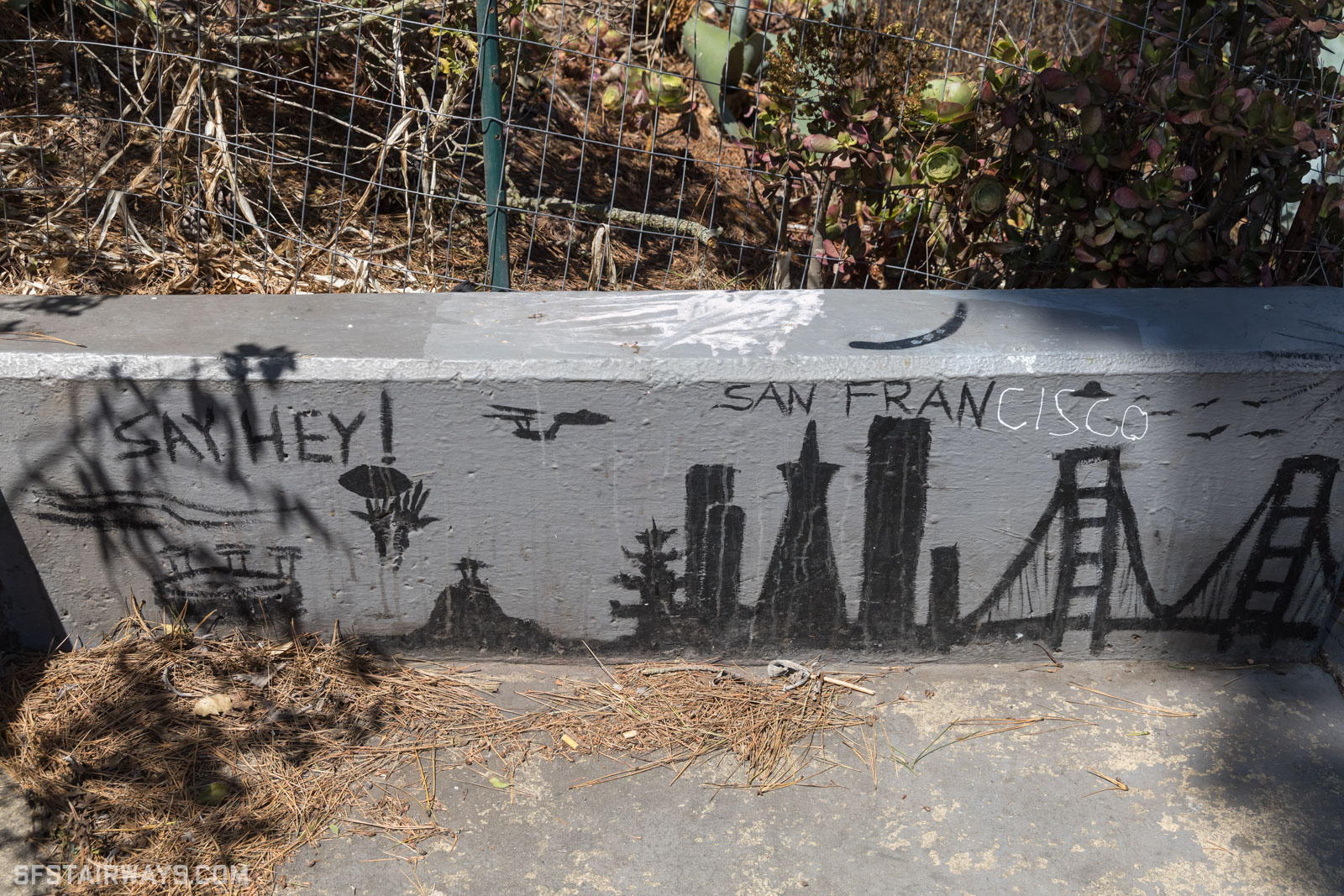
https://www.sfstairways.com/stairways/eugenia-avenue-prospec...
Your words ... 8)
My first name is Jonathan, I generally get referred to as (int al) Jon, Jonny, Jo, or John (bloody silent letters).
As it turns out, until I was 20 I thought my name was spelt Jonathon. I got a copy of my birth cert to get a student loan and discovered the "truth" - even my passport was wrong and my parents had to sort out the first few of those and they should have known better! I was born in 1970 and no one noticed that I misspelt my own first name for 20 years.
I’ve taken to calling the city San Fran as a result. Sometimes I enjoy a good EssEffOh or Frisco too. Really gets the audience going.
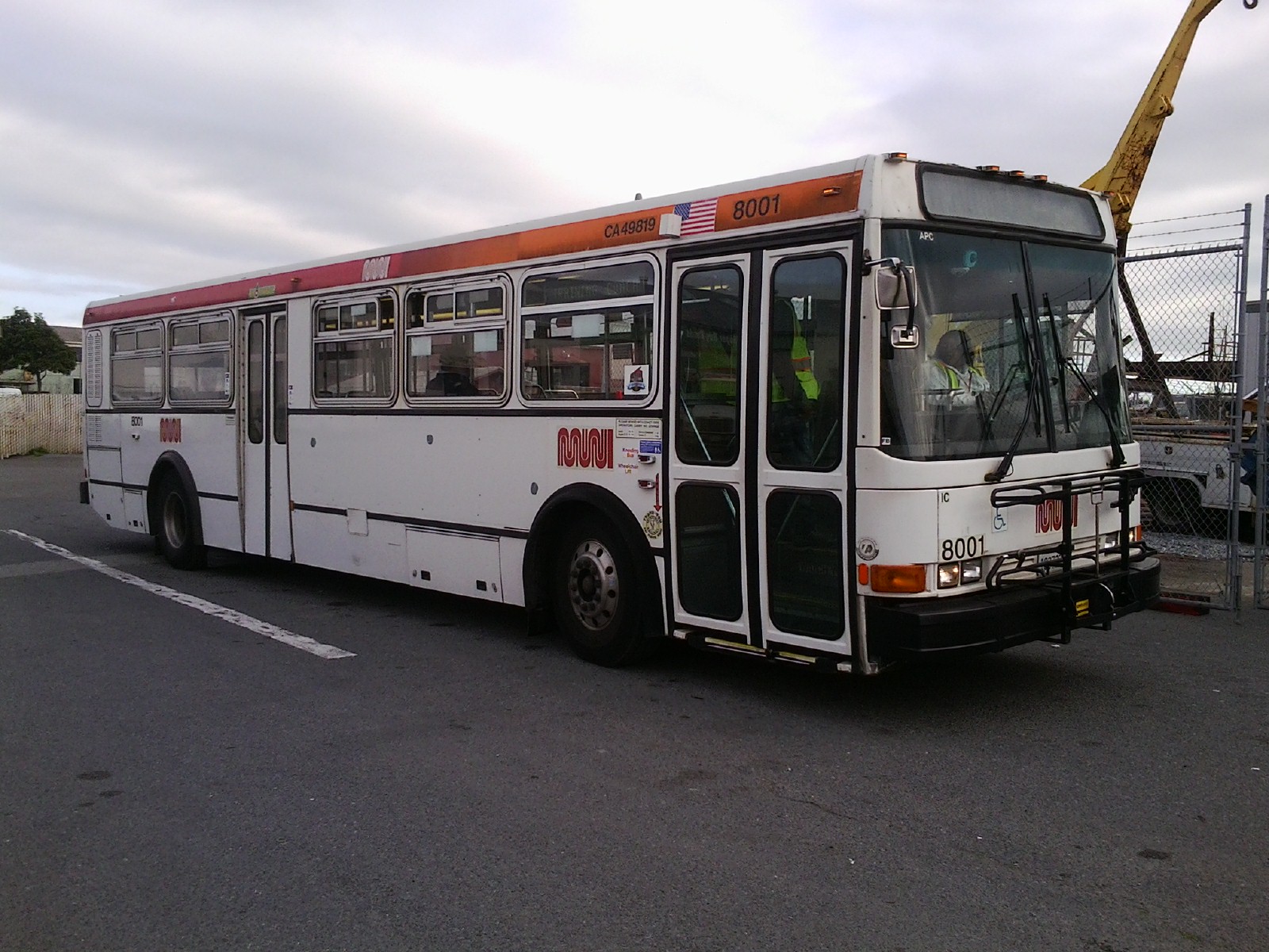
The older Breda trains and I think buses also used to use backlit paper rolls for signs: https://upload.wikimedia.org/wikipedia/commons/4/4c/T_Third_... Those were significantly more readable
https://cptdb.ca/wiki/images/6/60/San_Francisco_MUNI_8001-a....
https://cptdb.ca/wiki/index.php/File:San_Francisco_MUNI_8110...
The signs made quite a racket, but so did the buses (well, the first model I linked to).
Fun fact: When Muni first rolled out the digital signs on their newer Bredas the set the signs to rotate through three different pieces of information. So for 2/3 of the time you had no indication of where the train was headed.
Bonus fun fact: the cloth rolls have a variety of routes and destinations that never came to be.
OUTSIDE MY LIFE, INSIDE THE DREAM.
FALLING UP THE STAIRS, INTO THE STREET.
LET THE CABLE CAR CARRY ME.
STRAIGHT OUT OF TOWN, INTO THE SEA.
PAST THE DAHLIAS AND THE SELF-DRIVING CARS.
THE CHURCH OF 8 WHEELS. THE LOWER HAIGHT BARS.
THE PEAK HOUR SPRAWL. THE KIDS IN THE PARK.
THE SLANTING HOUSES. THE BAY AFTER DARK.
MY WINDOW, MY OWN SILVER SCREEN.
I FOLLOW WHERE THE FOG TAKES ME.
By MADDY CARRUCAN
Q: is the church of 8 wheels really a popular destination? Or is this the poet's bias towards the haight and hayes areas?
For me, Mission Dolores represents "classic SF" and is the area I'm fondest of -- and contrarily, the Salesforce Park and the surrounding area is the pinnacle of tech & capitalism (and b2b saas.)
prev hn discussion: https://news.ycombinator.com/item?id=43053419
:-(
As soon as I saw the first photo, though, I was a little sad to realize that it was of the old-style trains that are being phased out. The author notes this near the end, but I think that the trains are actually completely phased out as of a few weeks ago, maybe even before this article was posted.
https://commons.wikimedia.org/wiki/File:166207_DMCO_Interior...
https://commons.wikimedia.org/wiki/Category:British_Rail_Cla...
I'm so confused -- I use Chrome on a Mac and my back button works entirely normally. No naked photos, sorry to report.
Is this a real thing that Chrome isn't susceptible to? Or are people just making jokes?
NSFW, obviously, but also not all that titillating. (It's artsy B&W photography of women in their bathrooms.)
Love this article!
Signed, someone who has an obsession with segmented displays
https://upload.wikimedia.org/wikipedia/commons/b/bd/Penn_Sta...
I do miss the split flap displays at the Boston and Providence Amtrak stations though…
https://www.reitberger.de/English/Large%20displays/Alphanume...
https://www.reitberger.de/English/Broadsheet/Prospekt_GA_AFA...
These are very common here.
It had 43 segments (each character had a 13 segment column, 17 segments column, then another 13 segment column that was a mirror of the first). You can see the segment shape on the original sign:
https://media.wired.com/photos/59327db4aef9a462de983397/3:2/...
The same segment design was used on in Spain along with a more angular version:
https://web.archive.org/web/20210602143217im_/https://pbs.tw...
An array of those would spell out most of the symbols. Some of her characters violate this pattern though so it only approximates most of the symbols.
If lilsneddz responds with yes, I'd love to publish the code so people can make public interactive displays with her font design.
I think a system like this would make it easier to prototype lowercase and other international symbols though!
This is what I'll do instead of spending time with family over thanksgiving :P
Should be possible to get a passable @ on those.
Whaaa...? Los Angeles has a whole rat's nest of overlapping agencies, (mostly different cities and like 4 kinds of train for some reason)
https://glyphsapp.com/learn/recommendation:get-started
It's a great article!
I always thought those were mechanical displays with little mechanical shutters that moved to display the segments... like these:
Never knew they were LCD.
I second the sentiments here about typography nerds. This is very very cool.
For all the modern handwringing about SF, it really is a hell of a city with a fascinating history.
I'm sitting here with a 4k screen, browser maximized, and all text is, like, huuuuge!
And the worst part? You can't zoom! Seems kind of user-hostile to me …
Cool article, pretty lame that the person creating a recreation of a public-funded font is gatekeeping it behind their email, though.
I made Fran Sans for fun in my own spare time which was a lot of work. I do want to add that all fonts are inspired by work that came before it... yet at some point, the font becomes your own. Yes, Fran Sans is based on the Trans-Lite signage, however when I digitised it, I had to make a number of my own personal design decisions along the way which makes this work my own. Particularly the addition of different styles and characters that were never made for the original signage.
I hoped my intent came through in my commitment to researching and sharing this piece of local history that would have otherwise been lost as there was nothing to be found online when I started this journey.
Hope this clears up my intention, I'd love to send you a copy if you're interested, and I'm open to hearing your distribution ideas.
> I've shared it for free with every single person who has emailed me.
Excited and waiting :) I think it's going to make really cool pen plotter art