Sometimes I think the most hate for light mode is from people without autobrightness in their displays. Or from those who don’t know how to change it easily.
Sure, if I were to constantly blind myself with 10k lux, I would hate white background too.
But it isn’t supposed to be like that: make it the same brightness as the surroundings and voila.
I’ve never met a person saying they hate books and wish they were white on black.
Also with glossy display (like 6k xdr) the only way I can deal with reflections is by always using light mode. Alabaster code theme is my favorite.
If you don’t have auto brightness, there are many apps to change it easily via UI or keyboard instead of manual knobs of your monitor — most of them for the past 10 years support control via hdmi/displayport
—
I don’t see people complaining “I hate listening to most music because my headphones are always at 90% volume — every soundtrack should be lounge cafe del mar.” Or “I use this browser extension to make everything 5% loud.”
Well, just turn down the volume knob, dummy.
Regardless though, due to the design inconsistencies of the system, one screen is too bright that causes to reduce the brightness and another one uses literally 1/1,000,000 contrast difference between tabs to distinguish the active one, so it’s impossible to get a base brightness correct.
I’m using a MacBook Pro M4 and as I move around the house, automatic brightness either tries to blind me despite I’ve been in a dark room for a minute, or simply refuses to turn the brightness up when the sun is shining down into the room. It’s certainly designed for a certain environment, but not definitely a home.
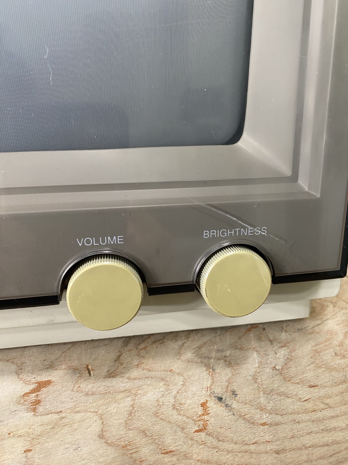
You could probably program keypad knobs like these to do the same: https://m.media-amazon.com/images/I/71s7PGYBkkL._AC_SL1500_....
I was pleasantly surprised that HDR also means you can control brightness - it is all software I that case!
And the brightness keys on an external Apple keyboard work.
I prefer buttons on the monitor.
Using a game comtroller to change brightness is like driving a car from the back seat.
The problem persists, however, because as the linked posts notes light mode is far brighter than it used to be, and now if I crank brightness down low enough to feel comfortable I'm sacrificing contrast and color vividness to such a degree that (for me) it's actively distracting. So, dark mode on high brightness it is.
For code editing, I've always tended towards dark themes ever since they became readily available in IDEs in the late 2000s simply because syntax coloration "pops" so much more strongly than is possible with a light theme. When I use a light theme for code editing it feels almost like staring at a sheet of undifferentiated text in comparison.
That’s why I mentioned alabaster: the only thing it highlights is comments and constants.
Nowadays I can’t stand “normal” themes even for a minute: they are like blinking Christmas lights for me, too much distraction.
Imaging reading the book where each word has different colors for nouns, verbs, what have you — nuts! :-)
Also check this: https://tonsky.me/blog/syntax-highlighting/
In a competent highlighting scheme, you have enough differentiation that every distinct type of thing indeed has a different way it pops.
You don’t see a for loop? Or don’t know where is the variable and where is the method? The list goes on. Never in my life I need a color to differentiate between a class name and a variable (they already differ in first-letter case). Or between language keyword and a variable (I’m not 5, I know those keywords by heart).
There is a reason we use nouns for variables, verbs for methods, stuff like isReady or hasAccess for booleans and what have you.
Color is overrated (or rather very nice for stuff that matters: like comments).
I like cursive though to highlight variables that are assigned more than once (bold cursive if it is a parameter, god forbid): instant attention to what is usually a code-smell.
As you said, it is especially useful for making certain code smells instantly visible at a glance.
I also find that different kinds of code will get different "color rhythms" (e.g. low-level algorithmic code vs. high-level code that calls a lot of functions vs. code that does a lot of operations / mutation of object or class properties) when syntax highlighting is properly semantic. This makes scanning for certain types of things (where objects are being mutated, where variables are introduced, etc) extremely fast, since you don't even need to read the characters.
I also find that rich syntax highlighting makes the codebase easier to remember, since the color (along with things like the line-lengths) gives each function a sort of unique visual texture.
Of course, all of this is personal preference. I am a very visual thinker so this kind of stuff helps a lot for me. Some people are far more verbal in their mental imagery or may remember code chunks solely based on semantics. Then, obviously, a bunch of color and/or text decorations might not matter much, or even just be a distraction.
Functionally it seems similar to spatial memory where landmarks are used as navigation shorthand and is impaired in circumstances where everything looks the same (e.g. in one of those sprawling suburbs with 100 of the same house).
> I like cursive though to highlight variables that are assigned more than once
Exactly, everyone is different, as personally I'd hate cursive and ligatures. Think of it as, what works for you doesn't work for everyone, and what works for them (color) doesn't work for you. But let people have their preferences.
Exactly the reason to fix the code so that there is only a single assignment and therefore no cursive :-)
> IMO, the best themes do typically have minimal/functional highlights, which results in more text that is the base color
And IMO, those are the worst themes.
These things are just preferences, but it is an objective fact that a good highlighting scheme makes certain information immediately visible, without requiring the reader to parse the actual characters. Whether or not this information is something you find helpful or annoying depends on your processing styles and preferences.
I've never seen a book actually radiate its own light. Perhaps if there had been 600+ sq. inch self illuminating books, we might have invented dark mode long ago.
During the early days of CRTs, dark mode was the norm. VT50/100/220, 3270 etc. were almost always dark with illuminated characters, and even when not, they were only ~12-14" diagonal, and there was only one. Most PC/DOS machines were the same. The moment raster displays appeared, everything went "light mode," but they still weren't very large. Then, displays got huge and multiplied, easily able to overwhelm human eyes with excessive power.
The ~30-year detour into Apple/Microsoft's paper-mimicry is ending due to basic ergonomics. No need for your tut-tutting.
Thanks! I always wondered how books worked.
Plenty of ebooks with built-in illumination, you know.
> During the early days of CRTs, dark mode was the norm.
Yes, because they were physically unable to do anything else! A pixel could be either 100% off (black) or 100% on - and if you were unlucky the "on" was something obnoxious like bright green. The fact that basically everyone switched to light mode once it became feasible should be a hint that it wasn't just a designer fad.
> easily able to overwhelm human eyes with excessive power
The sun is orders of magnitudes brighter - even when it isn't a blue-sky day. Human eyes evolved to deal with that without any issues (that's why your pupils can vary in size), so a desktop monitor shouldn't be a problem.
The problem is contrast. If you sit in a dark room with your monitor turned to 100% brightness and you're using a light theme of course your eyes are going to hurt. It's the same with those obnoxiously bright headlights we're seeing on cars these days! Sure, you could use dark mode, but the problem can also be solved by making sure the room is properly lit, or turning down the monitor's brightness. No need to pretend dark mode is a one-size-fits-all must-have solution for "ergonomics".
The same applies the other way as well, by the way: in my experience dark mode becomes completely unreadable in a brightly-lit environment - especially on glossy screens. You're constantly dealing with annoying reflections hiding your content.
Personally I've grown fond of the way MacOS and Android handle it: automatically switch to light mode while the sun is up, use dark mode during the night. It's not perfect in every situation, but 99% of the time it gets me what I want.
If your screen has built-in illumination then you might want to use a white-on-black theme. Mostly everything supports it, txt readers, epub readers, pdf readers (pdf.js not yet, but other pdf readers).
I do! And here's dark mode feature for one of them[1].
[1] https://www.amazon.com/gp/help/customer/display.html?nodeId=...
Maybe, just maybe, people aren't "holding it wrong"
Unlike screens produced light. To make them the same brightness as ambient would make them unreadable in my current situation. Yet a black background is much more pleasant. Why? Because the light being produced is less. You're right that the contrast matters. Black background and white text gets us closer to ambient light level while providing contrast. You simply cannot do same with black text on white background. I mean go to a dark room, put down the phone and ask yourself what the natural background is. It's black. That's the ambient level
Night Filter is an easy-to-use screen filter app for your Android device. Adjust brightness and colour, set up schedules, and reduce eye strain for comfortable night-time reading. [1]
Either you lower your display brightness or up your room lights — goal is the same: equal ambient and display brightness
I usually work with darkmode at home, and light mode in the office because our office is basically the surface of the sun.
If you take a non backlight e-ink display and put it next to a light mode OLED with the same brightness as the environment, the difference is (slight pun intended) night and day. There’s no configuration possible on my phone to make it more legible than a book it sits next to in low light conditions.
Also after years of having light mode only Phrasing, I recently added a dark mode. Not to look cool in dark mode, but because it’s often the first thing I use in the morning and last think I use at night. After a year of minim-brightness still-squinting at the screen, it was truly remarkable the physical difference a #000 background made in the dark with an OLED screen.
"Back in the day, light mode wasn’t called “light mode”. It was just the way that computers were, we didn’t really think about turning everything light or dark. Sure, some applications were often dark (photo editors, IDEs, terminals) but everything else was light, and that was fine."
Several incorrect statements there. "Back in the day," computers displayed white text on a dark background (usually a blue background) out of the box. This was deemed the most legible. The opposite was called "inverse." The Atari 8-bit and Commodore 64 computers (and possibly others) even had dedicated keys that toggled between regular and inverse text; it is called that in the manual.
Word even had a checkbox option in it entitled "Blue background, white text." It wasn't removed until 2007, concurrent with lots of other UI regressions in Windows. Microsoft also removed the color-scheme editor from Windows, with which people had been able to set up global color schemes (including "dark" ones) since 1991.
When people finally realized how dumb it is to read dark text off the surface of a glaring light bulb all day, companies had to run around slapping hard-coded "dark modes" onto everything... after abandoning better solutions (user-defined system-wide color schemes) that had existed since the early '90s on every platform except the vaunted Mac.
So how did we end up suffering through decades of inverse GUIs? I've always attributed it to
1. The "desktop publishing" fad of the late '80s / early '90s, which sought to make the screen analogous to a piece of paper.
2. The Mac, which imitated Xerox's GUI, which was inverse. Possibly related to #1.
3. Windows defaulting to an inverse scheme (although it provided a way to easily change the global scheme), as it imitated the Mac.
Even classic Mac OS (pre OS X) had thousands of third party themes via the very popular extension Kaleidoscope and later the built in Appearance Manager. Kaleidoscope schemes especially ran the gamut, with looks ranging from cloning other OSes to green on black “Hollywood hacker” to Star Trek LCARS to shiny chrome to a pair of blue jeans. A great number of those themes were dark.
The loss of user control over appearance like that is tragic.
That just prevented CRT degradation and it had less ghosting and flickering, especially as most CRTs in the home computer era were just terrible home TVs, and CRTs in the mainframe era were equally terrible. The saturated blue background was absolutely insufferable and I had ghosting and shifted color perception for minutes after using NC and Borland software for a long time. I loathe it till this day, just like garish CGA colors which were an assault on my eyes.
80's and 90's had a general concept of a desktop with windows as paper documents, because the first real use case for personal computers and workstations was assisting office jobs.
Funny how you call the normal light scheme inverted. IIRC PC text/graphics modes used this term for dark backgrounds.
"80's and 90's had a general concept of a desktop with windows as paper documents"
Yes, I noted that; but the analogy to a piece of paper fails because paper does not EMIT light.
Everyone with sufficient computing experience calls "light" schemes inverted. This was even documented in instruction manuals from the early PC era: https://imgur.com/a/aLV8tn0
A display is not a light bulb if you aren't specifically making it a light bulb against the poorly lit environment. There's no difference between reflected and emitted light, what you actually need is much better lighting in the room, so your display doesn't stand out when used on a brightness level that provides sufficient contrast (and just because working in a poorly lit room is unhealthy).
Moreover, a light scheme in a well-lit environment is less eye-straining, because your pupils contract and adapt to the light. If you're using a dark display against a dark background, your eyes adapt to the dark and then you're hit with the bright text. If you want to display more than just text, dark mode becomes a problem because most of the content (e.g. pictures, videos) is not largely dark.
tl;dr avoid excessive contrast and flickering. Everything else is individual eyesight differences, opinions, and snake oil.
Needing light themes to offset display reflections seems like a very good case of form over function. Nano-texture Apple displays largely address that, but then they’re much more expensive. The idiocy of fashion-driven design…
Aside from the LG Ultrafine, I’ve never owned an external monitor with auto-brightness.
Example meta reviews:
https://link.springer.com/article/10.1186/s12886-024-03721-1
I love books. But I also have a brain-vision disability that makes it so that I physically struggle to read black text on a white background.
If I could get books inverted, I would.
> I’ve never met a person saying they hate books and wish they were white on black.
I absolutely agree about setting brightness correctly, though. It's very usual for me to instantly reduce brightness whenever I have to use someone's computer. No idea how people use their screens so bright.
Isn't it basically rule #1 of UX design to never use pure white / pure black?
Pure black is more understandable, because it helps with battery life on mobile and notebooks, although I believe it shouldn't be the default dark mode.
Wow. This is the most insightful statement I've read today.
It's finally clicked [U+2014] why I prefer e-ink to hardback, in spite of the alluring texture of plup across fingers.
It's because it should've been white-on-black, not black-on-white. It makes so much intuitive sense.
I used to jailbreak my iPhone 4s to get some dark mode.
Plenty of books are printed non-bleached paper, which is more of a cream color, to reduce the contrast and reflectivity of the background.
A dark background reduces total brightness without that effect.
It's a dumb solution, and we may all safely ignore it, knowing it won't occur. "Dark mode" haters will just have to cope as dark becomes the default.
Volume and loudness are different things (https://en.wikipedia.org/wiki/Loudness_war) and pervasive loudness is absolutely a thing. Just turning down the volume doesn’t fix dynamic range compression.
Books don't emit light. They reflect it. That's the difference.
Irritation comes from the difference in brightness.
The interesting thing is, I’ve noticed when I read white on black and look elsewhere I see horizontal lines in my vision. So really I’m the one who should be shouting about their eyes. Maybe that’s just me, though?
I guess I want my computing experience to be like that of reading a book. Not sure I’d like white text on black paper.
The ‘anti light-mode’ sentiment has been around for more than a decade, but the reason why it’s not default is because it doesn’t suit the majority of users’ needs or use cases.
Anecdotally, I’ve found that the strongest proponent of dark mode in my professional career tended to be people who worked exclusively at night, or those who aspired to emulate the ‘late night hacker’ trope.
If the majority was using dark mode, I’d imagine we’d see operating systems show dark mode as their default screenshots and ship as the default. We don’t see that.
When I’ve tried dark mode I had a big issue when the contrast. Everything became harder to discern, which I found more difficult for my eyes.
Interesting how experiences differ. I've found dark mode contrast to generally be a bit better than that of light mode because for some reason designers tend to employ a wider spread of colors with a higher delta between the lightest and darkest in those, whereas light mode themes tend to be stark white and two grays tops with those grays barely getting used at all.
So for example it's common for group boxes in dark mode to get a dedicated background color where under light mode they won't have a background and all and fall through the the parent's white background, causing content to all kind of blur together.
I use pure 000000 and FFFFFF on an OLED monitor, contrast is fantastic. I agree though on general lackluster gray-based dark modes, they can be worse to read.
I guess it's like looking at a slatted window blind with a sunny day behind it, when you look away your eyes will see the remnants of the bright lines. Whereas if you're staring at a bright surface (a screen on light mode), the entire scope of vision is dimmed...
I like my code editor to respect my OS which automatically changes from light to dark mode when the sun sets.
I have concluded that light mode is for light mode people and dark mode is for dark mode people. Making light mode a little darker or dark mode a little lighter isn’t going to change how people experience interfaces. Make light mode for light people and dark mode for dark mode people.
Maybe things are getting brighter, but it hasn’t been noticeable to me.
(Gosh, I feel old thinking about the possibility that someone who's been doing this for 20 years might still be too young to have ever used a CRT monitor.)
Things people born after Macintosh say.
I didn’t call it dark mode though!
[1] https://upload.wikimedia.org/wikipedia/commons/0/0e/Hard_res...
Which is #AAAAAA on #000000 to you kids with your fancy Super VGA monitors with megabytes of video memory and 24-bit color.
This white background stuff is the invention of Microsoft or somebody's marketing department, who decided people would be less afraid of computers if they made the screen look like a piece of paper.
Back in my day we only used 16 colors at a time [2], because you had to quarter the resolution if you wanted more than that, because of course video memory has to fit in a 64k segment -- why would anyone even want to go bigger, wouldn't that consume way too much conventional memory? And if you did decide you wanted to use 8-bit mode, if you wanted square pixels you had to read Michael Abrash's book and do terrible black magic involving directly programming VGA registers and bank-switched bit-planes.
If you don't know what any of that means, it means you kids've got it way too easy these days and don't even know it. The real programmers who knew all this stuff and made brilliant masterpieces like Master of Magic and the original X-COM were scattered to the winds when the original Microprose folded. Now get off my lawn.
[1] https://en.wikipedia.org/wiki/QBasic#/media/File:QBasic_Open...
[2] https://en.wikipedia.org/wiki/Color_Graphics_Adapter#With_an...
>Things people born after Macintosh say.
Things people born after teleprompters say.
As a designer, before you had the whole spectrum to work with so you could have dark areas in light areas in dark areas, etc.
Now, if you start with thinking "I'm working on a light-mode theme" you're suddenly restricted to only half the gamut for backgrounds, and you end up spreading things out more within that (more white, in order to contrast the slightly darker white). Plus you need to make it visually distinct from "dark mode" which means you're probably aiming for less than 50% gamut.
I think it's a mental trap.
Edit: And it's made worse by the fact that browsers now have built in light/dark mode preferences, standardizing this framing. So if you create something that doesn't fit in the light/dark boxes, you worry about users complaining of you not respecting their browser preferences.
But UI elements are different. UI designers should exercise restraint and not utilize the entire brightness range of my display. Setting the brightness and contrast from the display is wrong because it doesn’t know what kind of image is being displayed.
Of course, when you do color grading you want to have those fixed to whatever standard you are working with. But then you also have to control your ambient lighting accordingly, to get the correct impression of what you’re seeing. Even then, IPS displays aren’t capable of displaying true 000000, due to their backlight, or only very coarse-grained with local dimming zones.
Most people aren’t doing that kind of work, however.
If you have uBlock Origin, add this as a rule: news.ycombinator.com##html:style(filter: invert(90%) hue-rotate(180deg); background: white)
The result: dark grays/browns without sacrificing the orange header and without breaking inputs like some other stuff I've seen.
I do like pure black for most apps, however, it does get boring after a while. Mix in stuff like this on HN or elsewhere to mix things up. Wanting to save battery life is fine and all, however, some things should be fun/entertaining. ;)
Also, there’s just something about the graph of “Average brightness of MacOS screenshots over the years” and extrapolating it that tickles my brain. By 2030 MacOS light mode will just be a single white rectangle (with a notch). It reminds me of the “Number of youtube videos on the homepage” blog that extrapolates that by 2030 there will be 0 videos on the homepage.
I will say that it took a bit to adjust to the first time I did it, but now it's painful to use any monitor at "full" 200+ nit brightness.
However, I prefer Dark Mode on my phone as the default, except for a few specific apps, such as Maps, even at night. I like minimal setup with less text and content during daytime but after sunset, the phone is set to be more pronounced (with labels, etc). I’m 40+ and I like sharper text and higher contrast especially when it is darker (night). Hence, the more pronounced Phone Setup; I should be able to read/know quick enough if I get a Whitelisted call at Night.
I like apps that do not force but give me an option to have a choice between Light/Dark.
In macOS, to use Dark Theme for Menubar and Dock (the periphery) but overall Light Theme for the main content, here is how to do it;
1. Go to System Preferences, then set the theme to LIGHT.
2. In Terminal, run `defaults write -g NSRequiresAquaSystemAppearance -bool Yes`
3. Logout, then System Preferences, then set the theme to DARK
If you wish to reset back to the default, in Terminal, run `defaults write -g NSRequiresAquaSystemAppearance -bool No`
Neutral grey makes sense in two cases:
- Relative color schemes in which your elements can be either lighter or darker than the background.
- Precise color grading, because white and black backgrounds shift color perception too much.
If you feel the background is too bright, either add more light in the room, or reduce the monitor brightness. It's all relative, it physically cannot have too much absolute brightness to hurt your eyes. The daylight is orders of magnitude stronger but you have no problem with it because your eyes adapt. What hurts them is excessive contrast: staring at the monitor in the dark room, pure black color schemes on OLED screens, etc. This looks jarring and breaks eye adaptation.
It turns out bodies don't all respond the same way to the same stimuli. Sunny days cause me real pain. A thin layer of ground fog with bright sun above it is brutal for me, as is bright sun with snow on the ground. I feel so much more comfortable outside on a dark, cloudy day. My eye doctor tells me she frequently hears the same from others. Each of us has a different response curve to light levels.
    image = Image.open(file)
    greyscale =  image.convert('L')
    stat = ImageStat.Stat(greyscale)
    avg_lightness = int(stat.mean[0])
But also:
> What I’ve graphed here is just the brightness of the window chrome, which isn’t really representative of the actual total screen brightness.
No kidding. Also, Mac OS keeps changing the chrome, and this isn’t obviously a very useful measurement.
There is no particular reason for that except habits. I started programming on black background terminals and the first anything else happened on Unix workstations or Windows PCs with white backgrounds.
I adjust the overall brightness of my screen according to the light level of the room and I use night mode. When I happen to use some other computer in dark mode it's usually too dark: white characters are often too thin and don't enjoy enough light to be readable. Maybe dark mode is for young eyes or for people that are very sensitive to glare.
Meanwhile:
- One of the two themes is always worse, but which one it is is different from application to application
- Despite the above, I'm required to decide globally whether I'm a "dark mode" or "light mode" person, with no option to just let the application or website decide on its own which theme is best.
- Because designers now need to support inverted contrast everywhere, everything has to be monochrome, including icons, text, backgrounds, etc.
I'd honestly rather people just picked one theme and directed their efforts towards making it look as good as possible. Or, you know, add support for real custom theming so I can make it look however I want.
The reason Light Mode has been getting lighter is simple: because the default computer in 2025 is now a laptop or phone, whereas in 2009 it was a desktop.
Laptops and phones have easy and relatively coarse brightness adjustment settings for their screens. Desktops didn't, and still don't.
So it makes sense that you'd just make whites as bright as possible- if the user doesn't like that, they can just turn the brightness down. Otherwise you're just kind of leaving the monitor's available/potential contrast on the table.
Note that Dark Modes skyrocketed in popularity after the default computer changed from being a desktop to a laptop- but that's because laptop and phone screens couldn't (and still can't) get dim enough at night (for dark colors are still bright due to inherent backlight bleed-through).
The next change to this trend will occur, specifically to Dark Mode, 1-2 years after the average machine a software designer is issued for work has an OLED screen- because OLED screens actually can get that dim, the current color balance will likely be inappropriate.
No. 70% white backgrounds allowed light and dark contrast elements. 100% white backgrounds do not.
Not really anymore these days, because most use OLED, miniLED, or sufficiently good LCD tech that backlight bleed is not much of an issue.
You know what sucks? They do. Desktops do. They have since the late 90s.
Microsoft just never implemented it. Most desktop displays happily respond to brightness commands from the OS over DDCCI.
The trend against skueuomorphism maybe equally relevant: that early example is a descendant of Apple's previous brushed-metal UI. Though even among the flat ones there's been a trend toward lightening.
It'd also be interesting to see what area the author picked on each screenshot: a big difference, at least before Tahoe, if you decide that the Finder sidebar or top bar is what you're going to look at.
My intent was to capture the shade of the non-content area in the window.
This could be correct if astigmatism was rare.[1]
[1] https://medium.com/@h_locke/why-dark-mode-causes-more-access...
And it depends too much on your environment, the type of display, and its pixel density, unlike in light mode which is way more forgiving to external factors.
Kind of a particular instance of enshittification.
Author of Mavericks Forever here. I find it very surprising that the author complains about low contrast and then praises Yosemite.
Yosemite is absolutely what started this trend, and the lack of contrast is why I hate it. This may not show up in the window chrome specifically, but the broader UI has way less contrast than Aqua.
This actually got slightly better in 10.11 (El Capitan) before getting worse again. 10.9 and older are of course the best.
Mavericks also has little brushed metal and zero stitched leather. The author is thinking of (Mountain) Lion, and of early iOS, which is much more skeuomorphic.
P.S. Fine, you win, I just pushed an update to kill the animations.
To me, this seems like the obvious way to decide when to use dark mode, but apparently I’m in a very small minority.
Thankfully HN has remained pleasingly off-white.
Hilarious how this downvoted comment proves it is not. (Update: it became black again)
There should be a special place in hell for those light-grey-text-loving designers.
QuickBasic/QBasic/edit.com(and turbo pascal?) darkish blue background and grey text was just damn comfortable and why we turned our backs on it is beyond me.
Personally I love Windows XP because it's so colorful. The taskbar is blue. The start button is green. The window frame is blue, the close button is red. The sidebars are tinted yellow. Even icons like CD-roms aren't greyscale, but tinted purple instead.
Since then, people started removing color from everything. Colorful icons became monochrome, perhaps only so it could be easily switched from "light mode" to "dark mode" by switching their colors from black to white and vice-versa. Everything is now harder to see.
On Linux, most attempts to mimic retro GUIs fail because they can't tint different parts internal of a window of different colors, such as tinting only the sidebar a shade of yellow. This is rather ironic given that GTK's CSS theoretically could allow this. But in practice there is no stable public "API" for the classses used inside an application to allow users to re-style them easily with CSS. Even if I could do .sidebar { color: #ff0; }, I don't know the class name that my file manager used for its sidebar, for example, so I can't really do that.
In my opinion this the main reason modern UI's feel so bland and lifeless.
The white-fest also makes Liquid Glass on macOS basically flat mode with extra steps. Because all the fancy glass refraction effects don't actually do anything if you put them on a solid block of color.
Light mode is masochism mode, with just a few exceptions: e-ink, highly lit environments (that are uncomfortable to work in anyways), people with vision problems that tolerate light-themed UIs better, and weirdos who enjoy staring at a flashlight. If you're gonna use that, might as well just turn down the screen brightness - but I agree with the author that perhaps a middle ground "gray theme" would be better, if slightly less attractive to UI designers.
Astigmatism is very common.